Back in 2018 I made an alphabet book (which you can find here). Once completed I thought about doing a similar book, but with numbers this time. Well it took me four years, but I finally got around to it. So here is the completed book. See the link here for the making of TheBook of Numbers.
About the Book
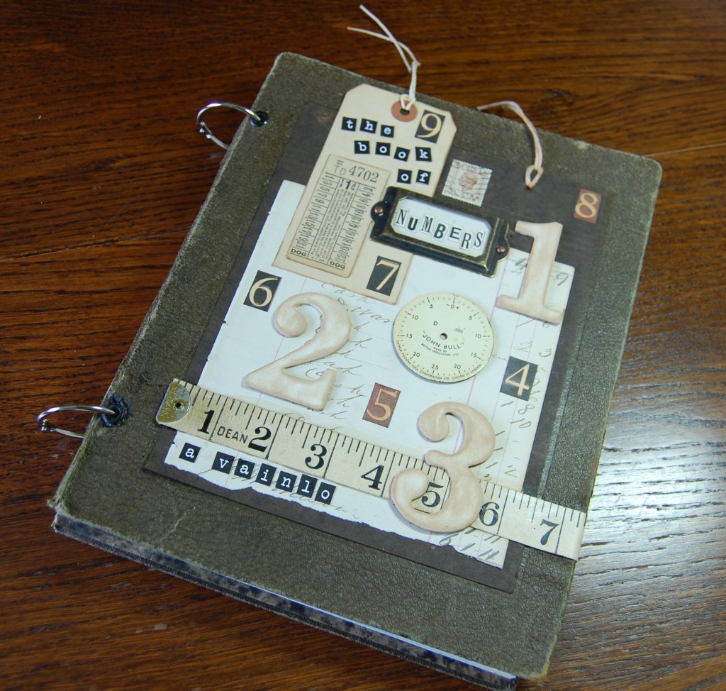
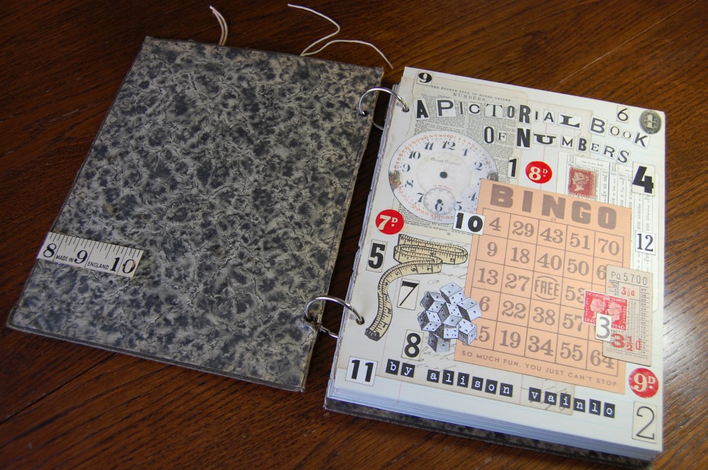
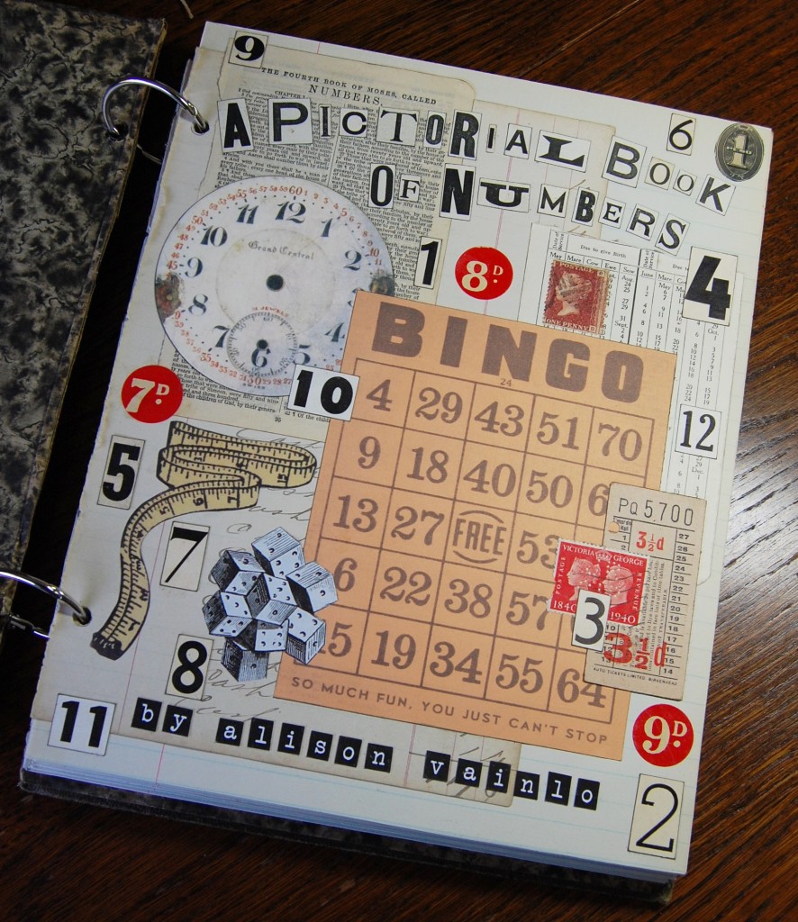
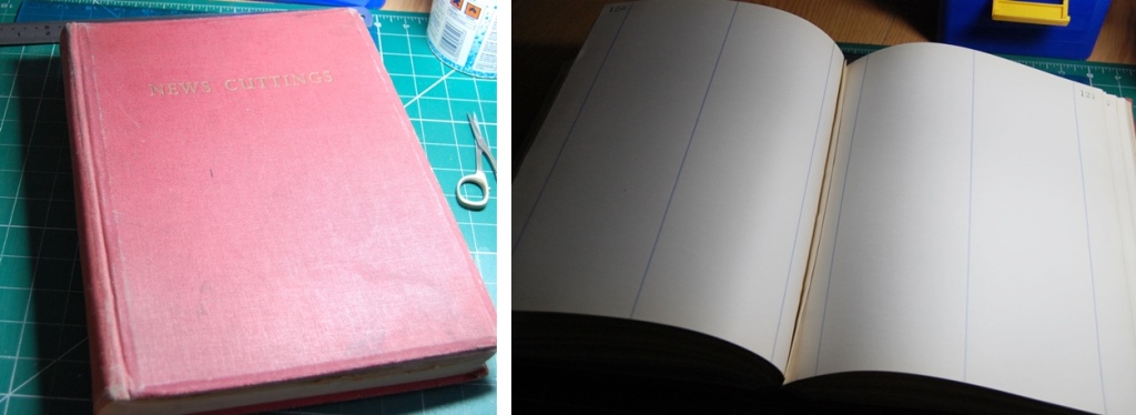
The book consists of twelve pages (24 sides) decorated with collaged ephemera to represent the numbers one to twelve. There is also a title page and an end page. The hand made pages are presented in an adapted vintage ring bound file folder, also decorated to reflect the number theme.
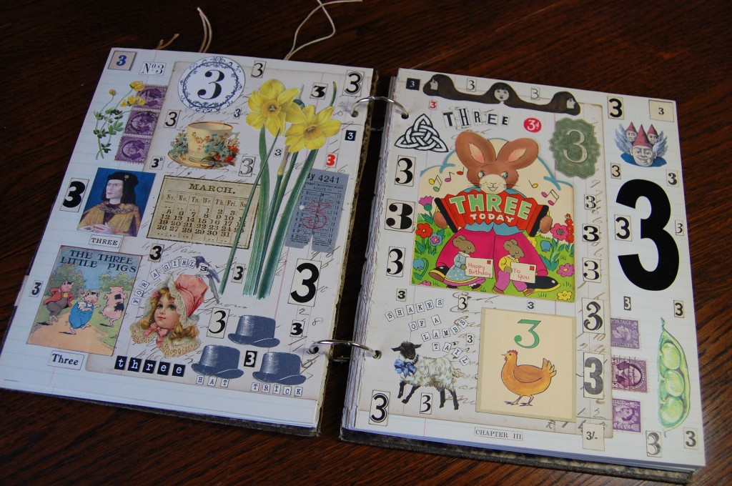
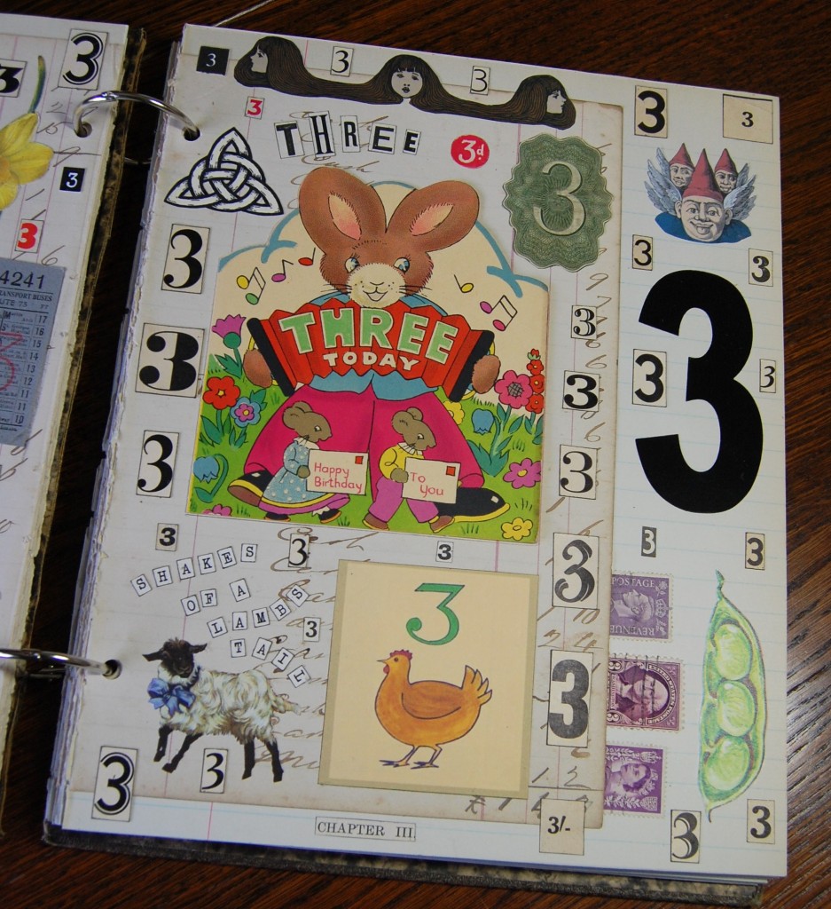
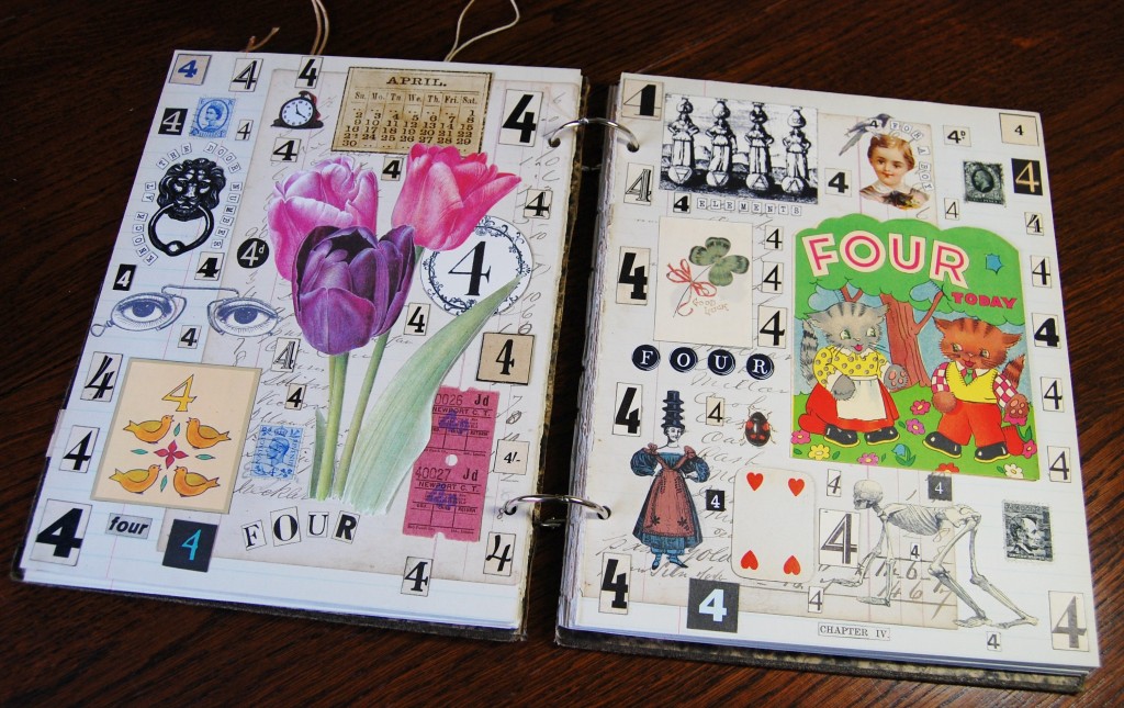
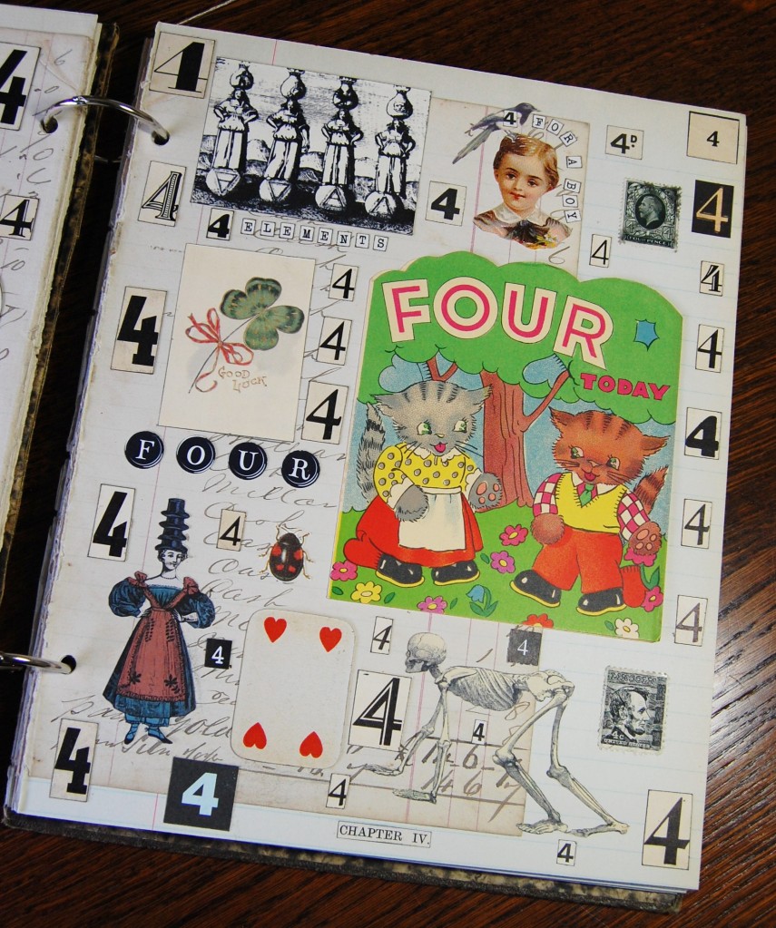
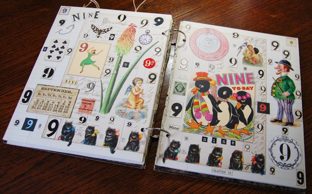
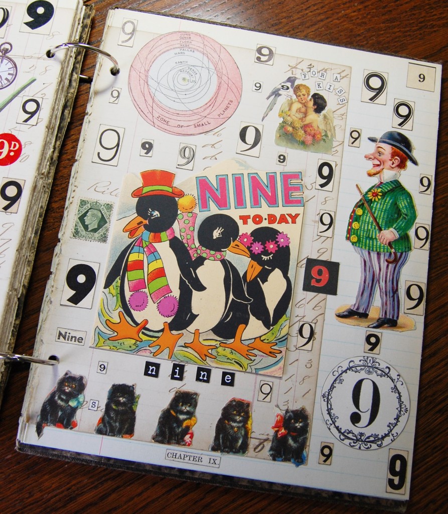
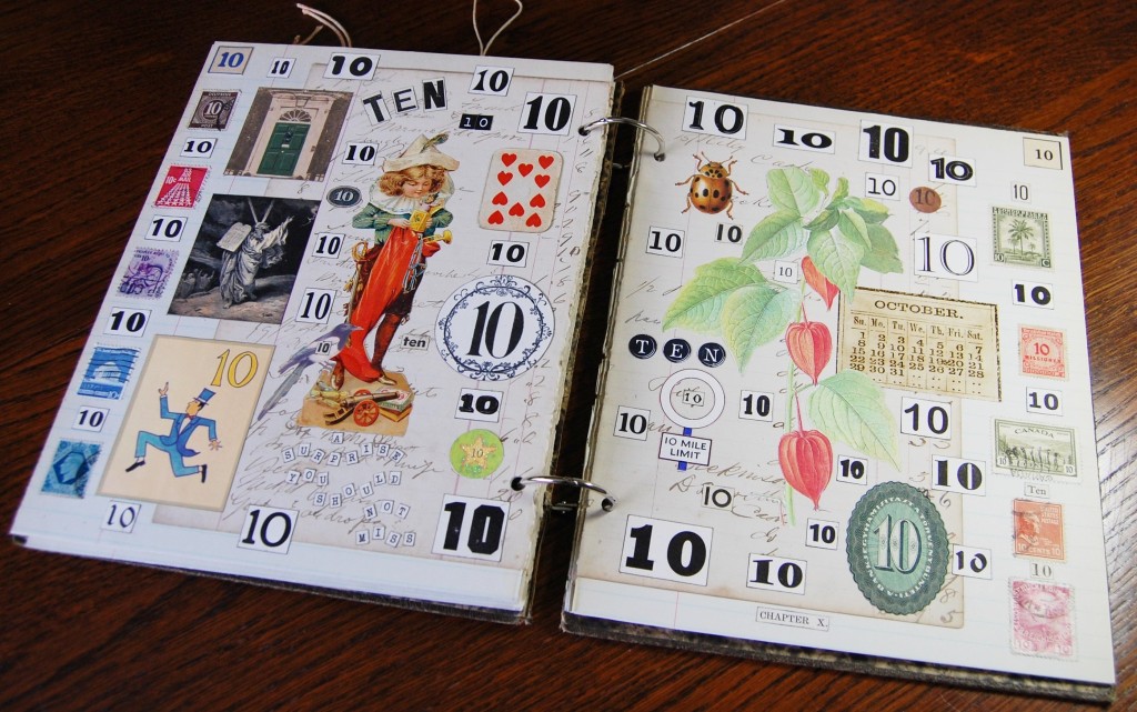
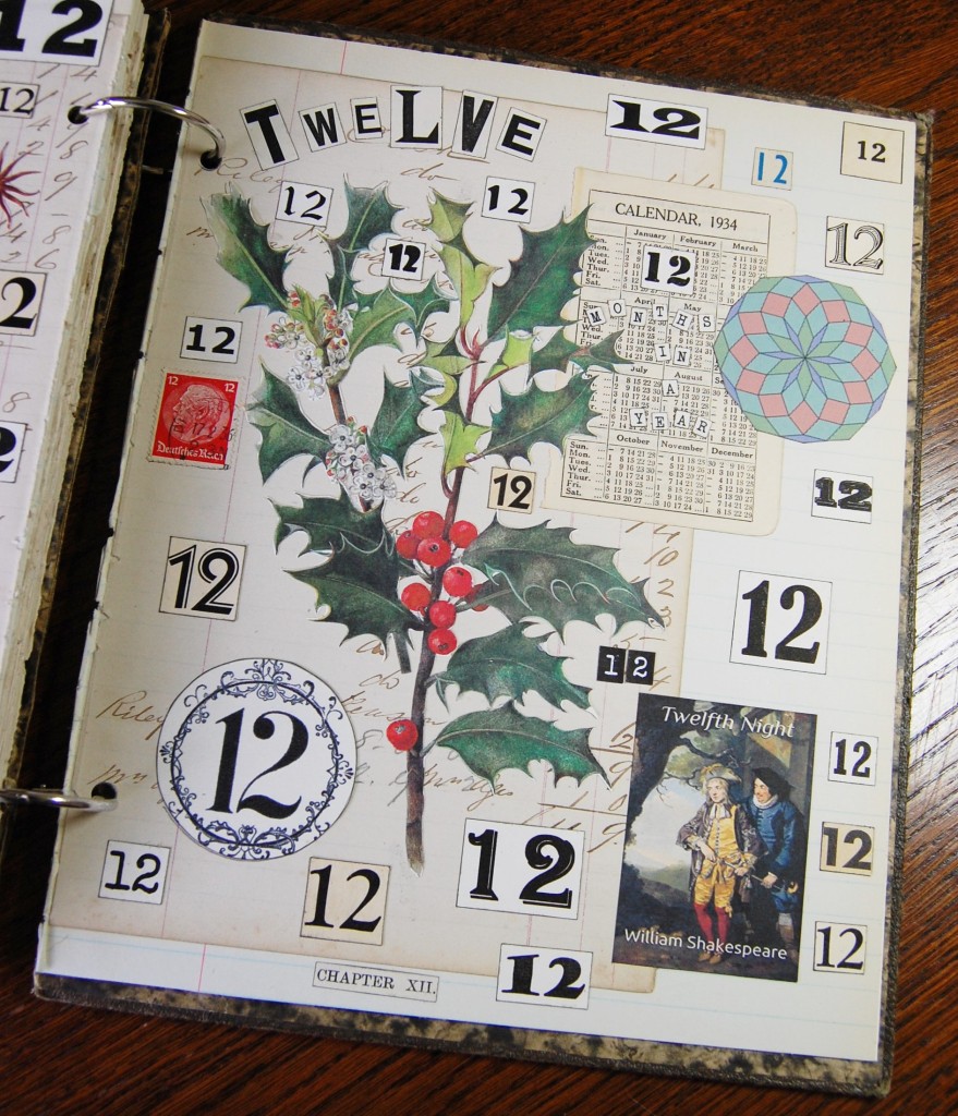
The illustrations have all been chosen to reflect the numbers they represent, for example, rhymes and sayings about or containing a number were sourced to illustrate them, such as – THREE blind mice, lucky SEVEN, or cloud NINE. There are also themes running through the book, such as The Twelve Days of Christmas. I found illustrations to represent each day of Christmas, so I included one on each page. I didn’t realise until after I made the book that from nine onwards, the order of the Ladies Dancing etc is different to the accepted version.
A calendar is included on each page making each number represent a month of the year, so January on number one, February on number two etc. And keeping with the month theme, each number / month has a floral representation, purely because flowers always look good on a collaged page, they soften the many straight lines and add interest.
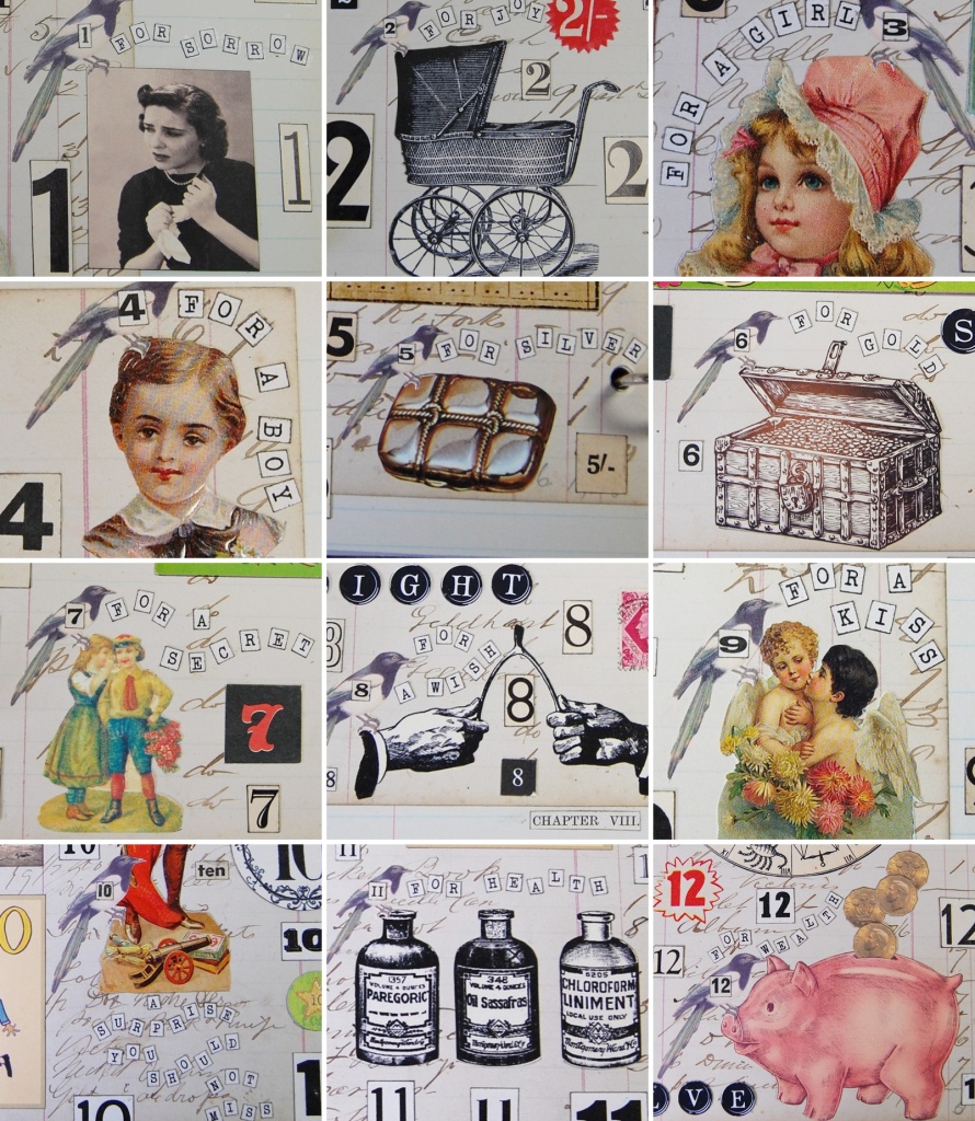
There is also the Magpie rhyme (One for Sorrow etc), which has also been represented on each page. Every image has a little magpie perched on it with a number, and then the portion of the rhyme to go with it, quite appropriate for this blog!
All the magpie references
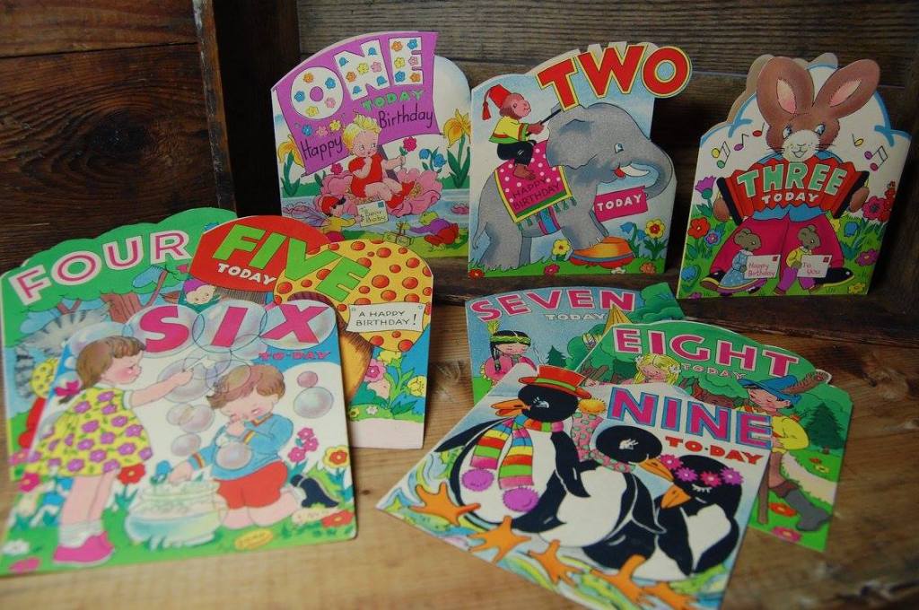
I also had a collection of old children’s birthday cards, ages one to nine, so these were incorporated into the designs of those pages.
Vintage birthday card collection
So, here is the finished book, page by page with captions explaining all the number references.
The Book
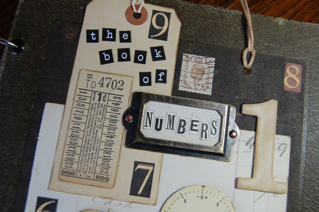
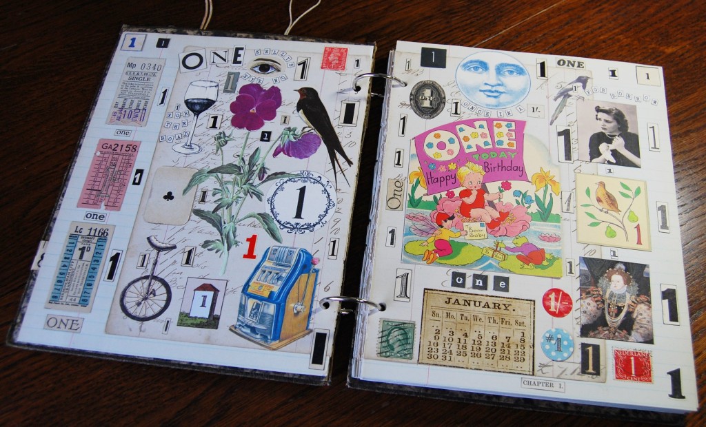
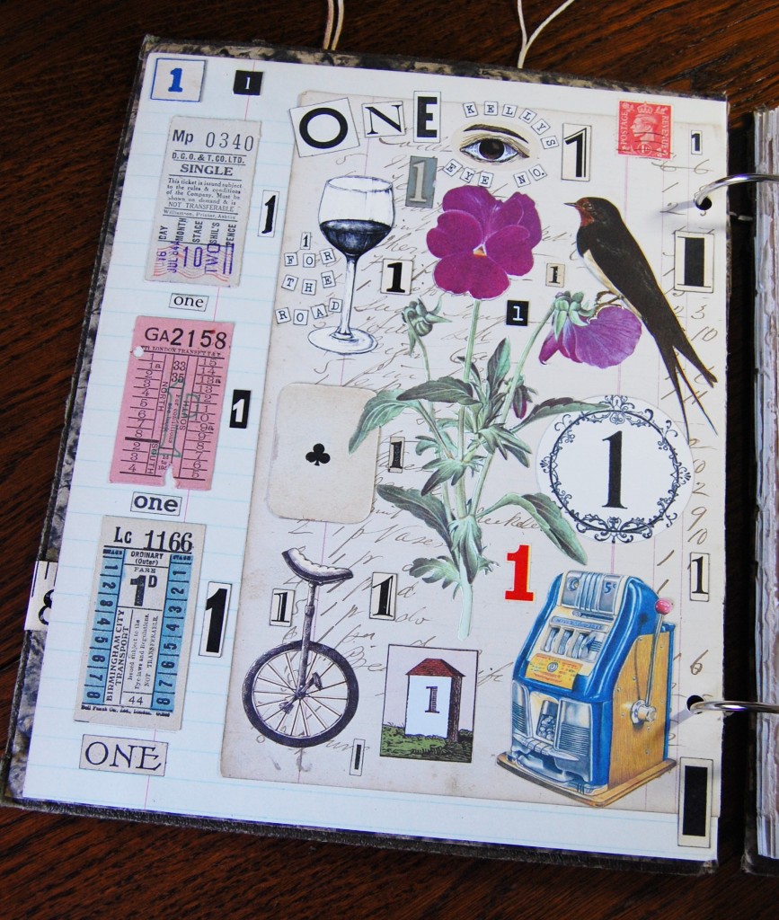
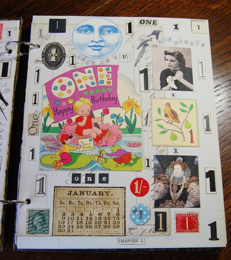
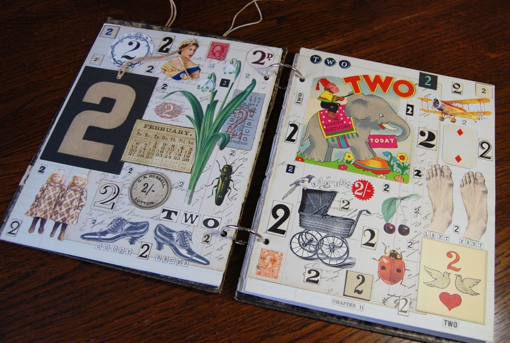
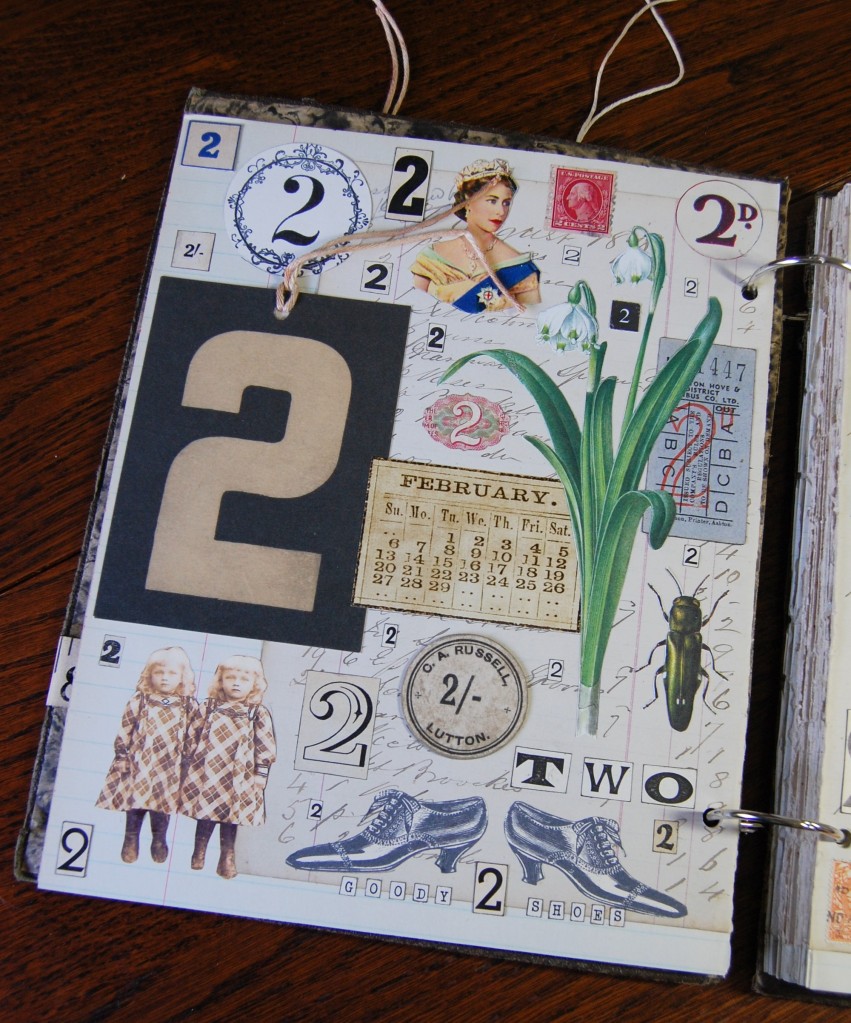
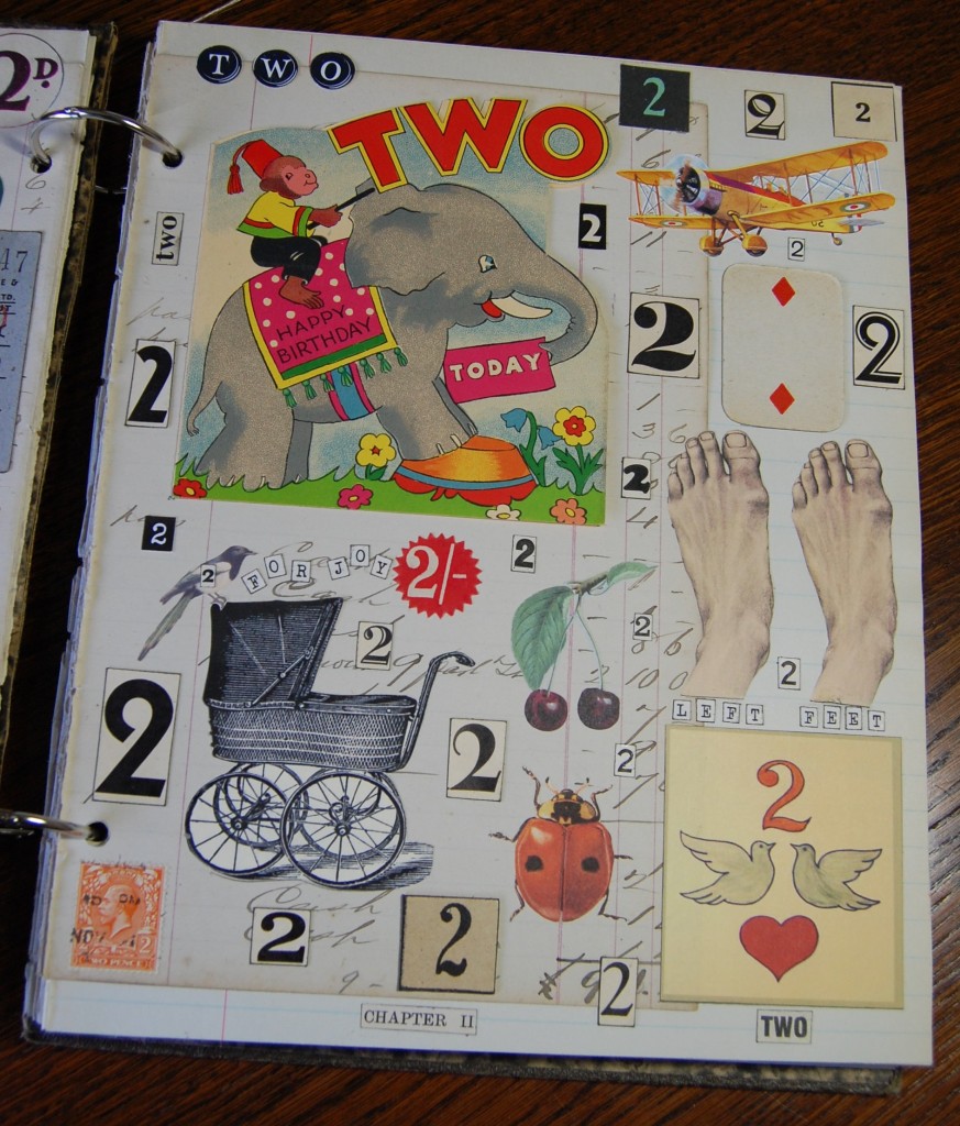
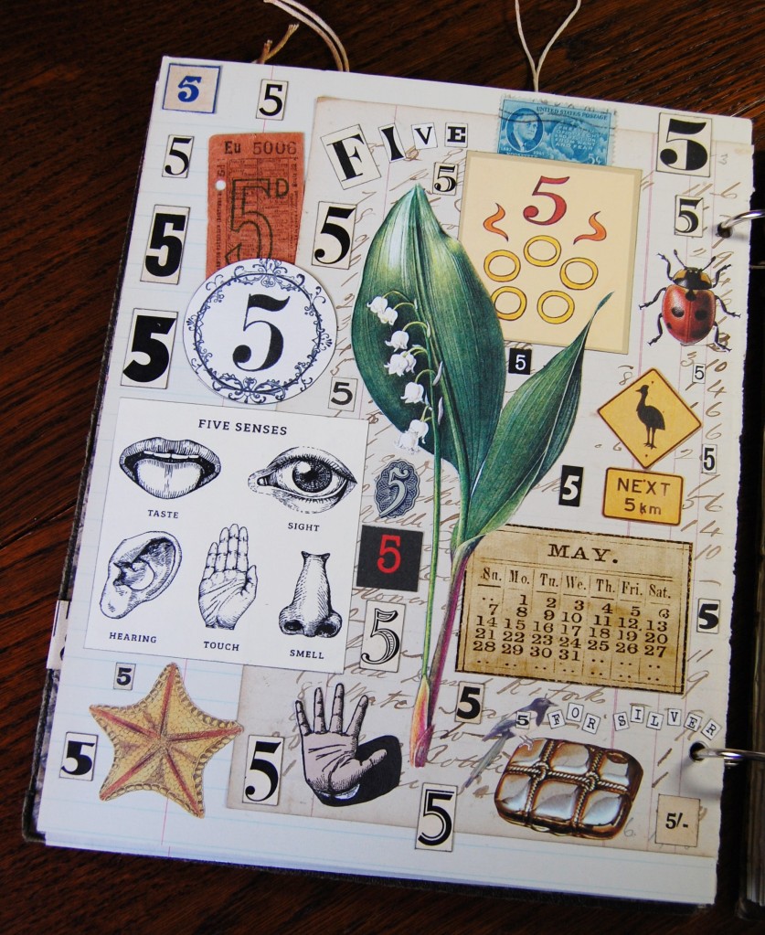
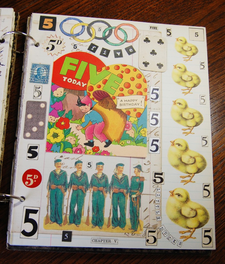
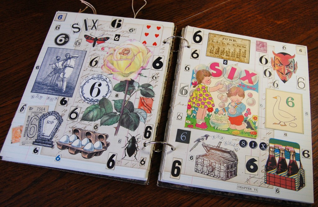
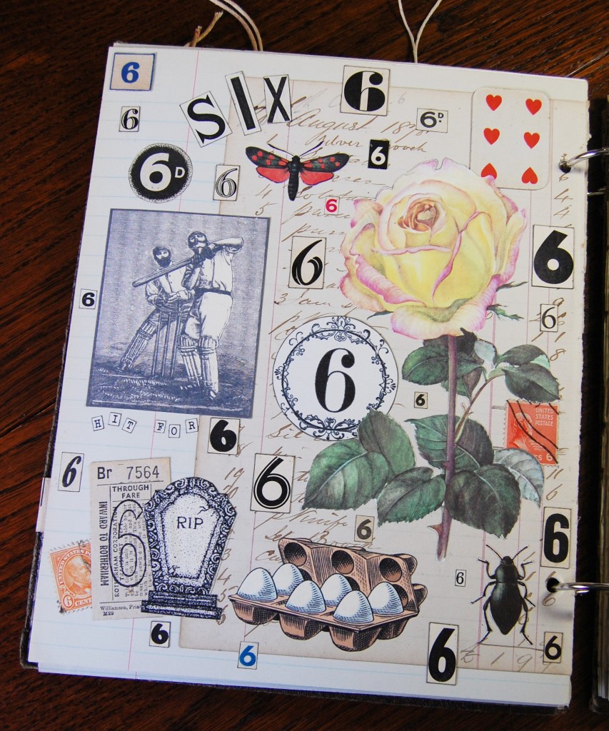
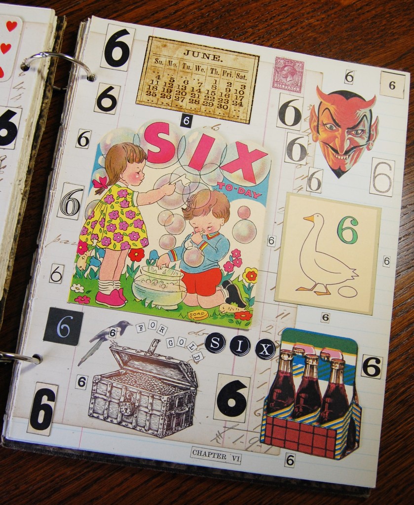
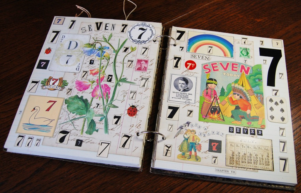
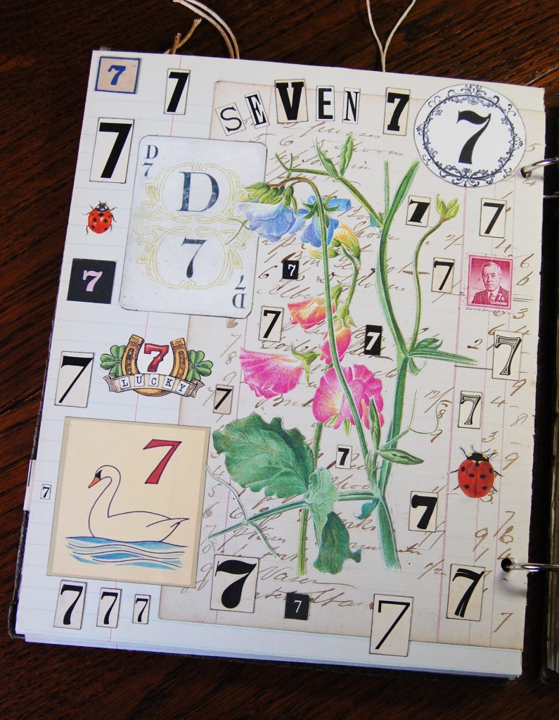
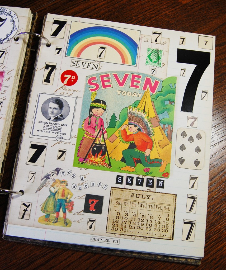
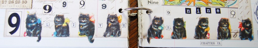
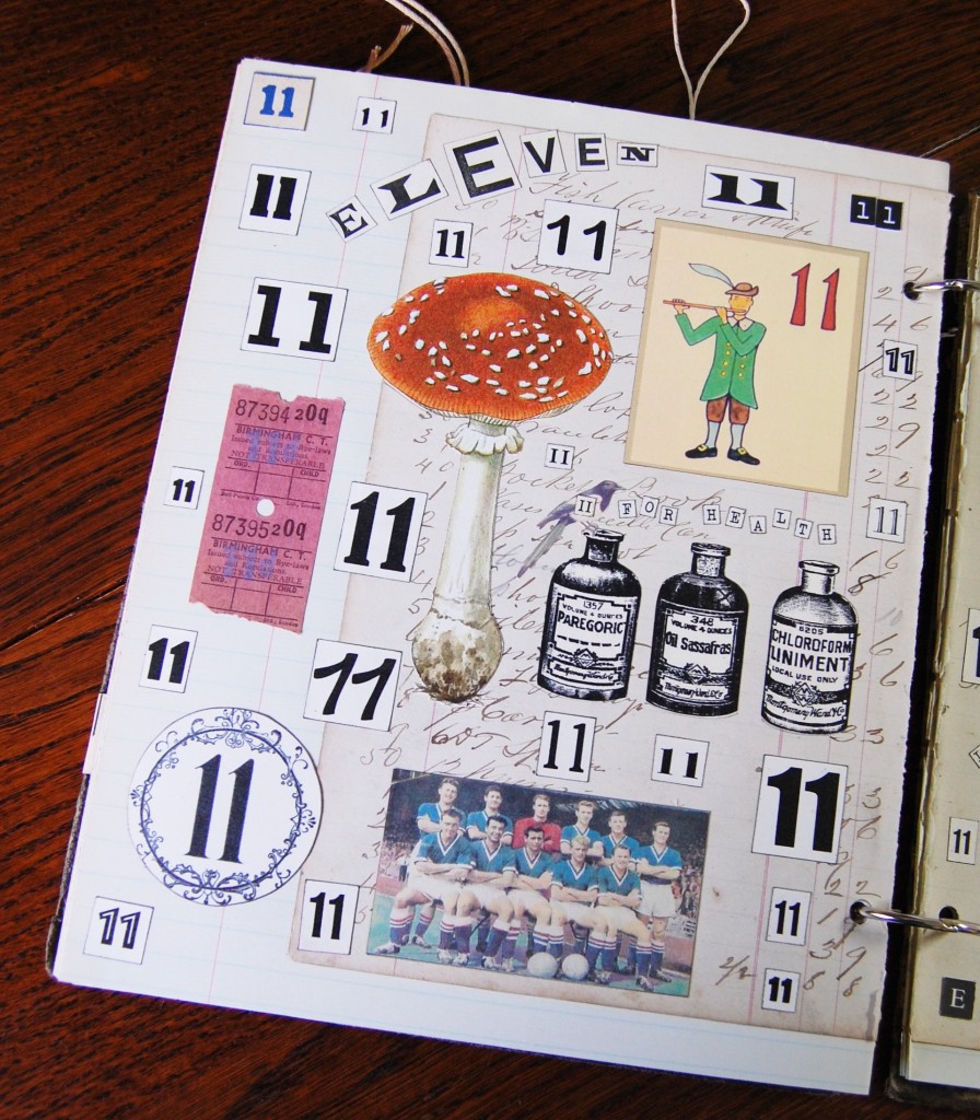
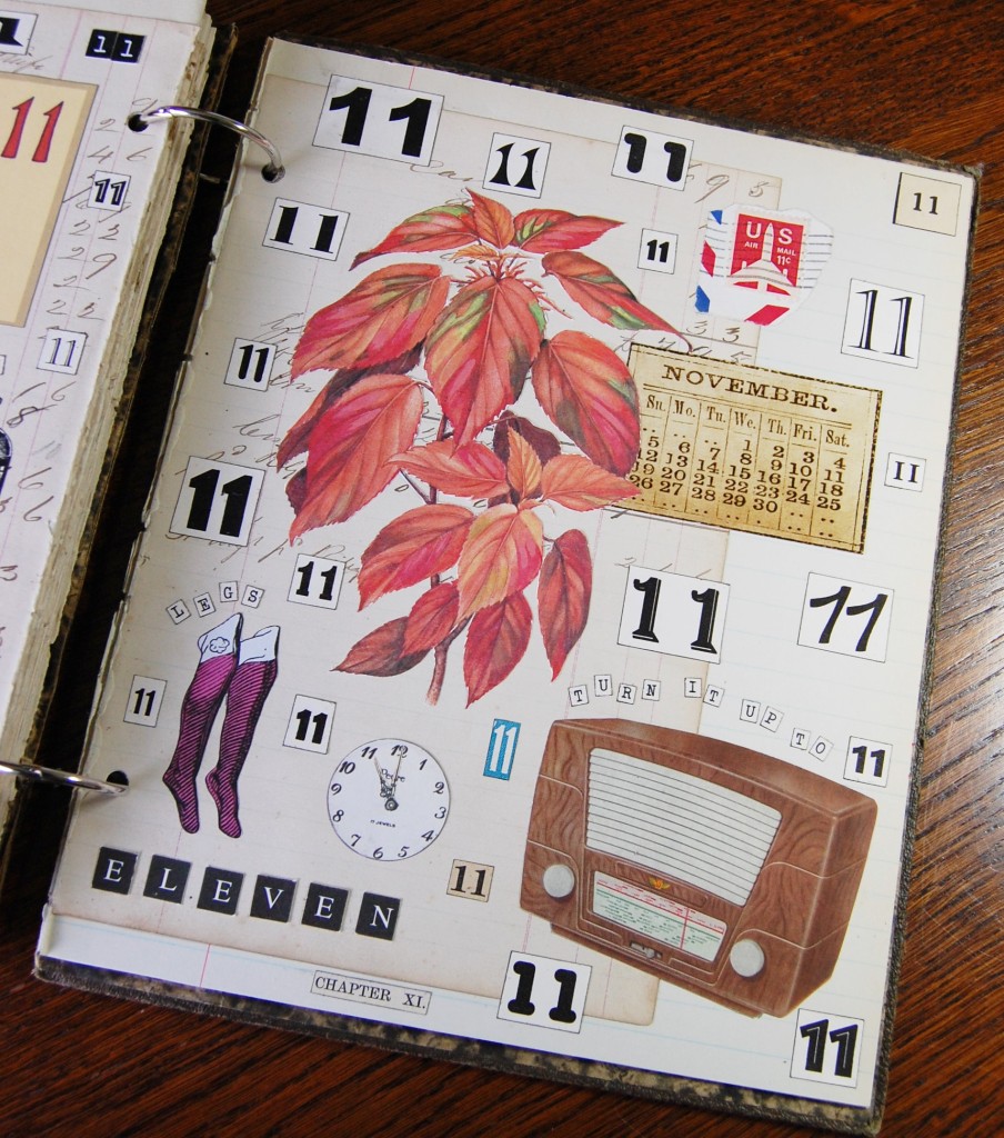
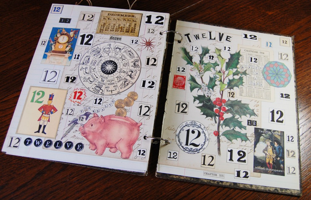
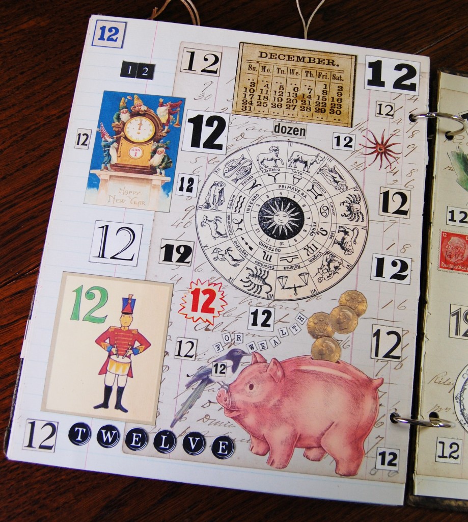
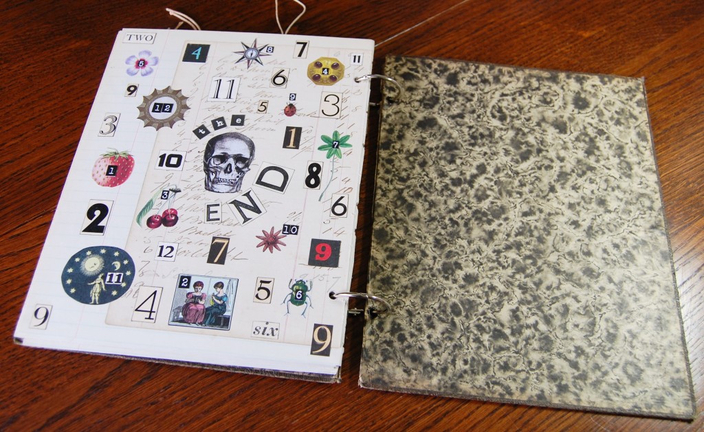
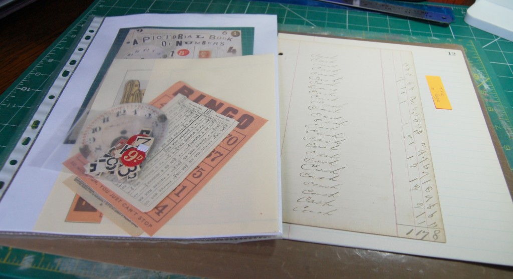
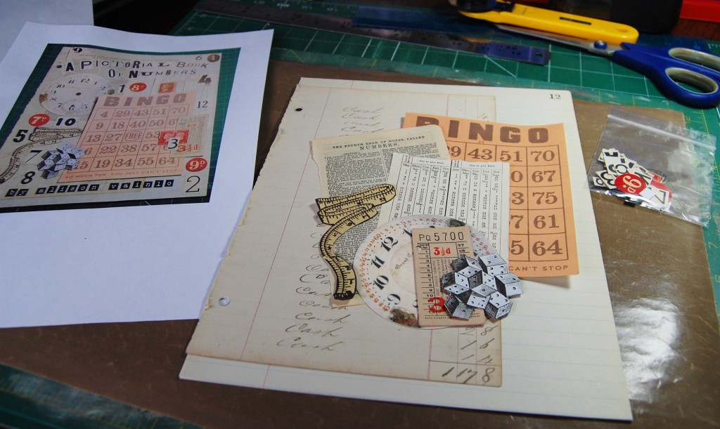
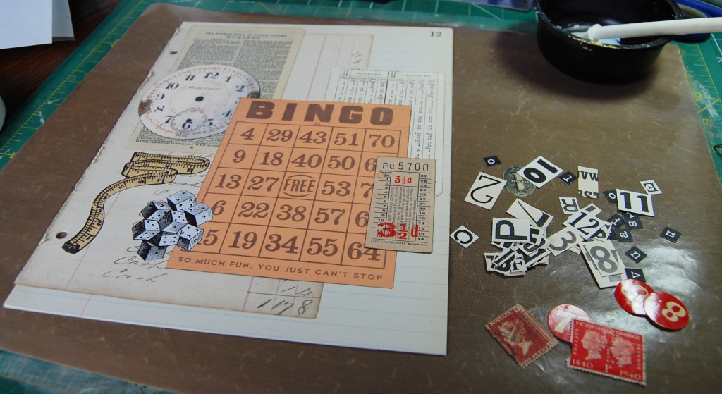
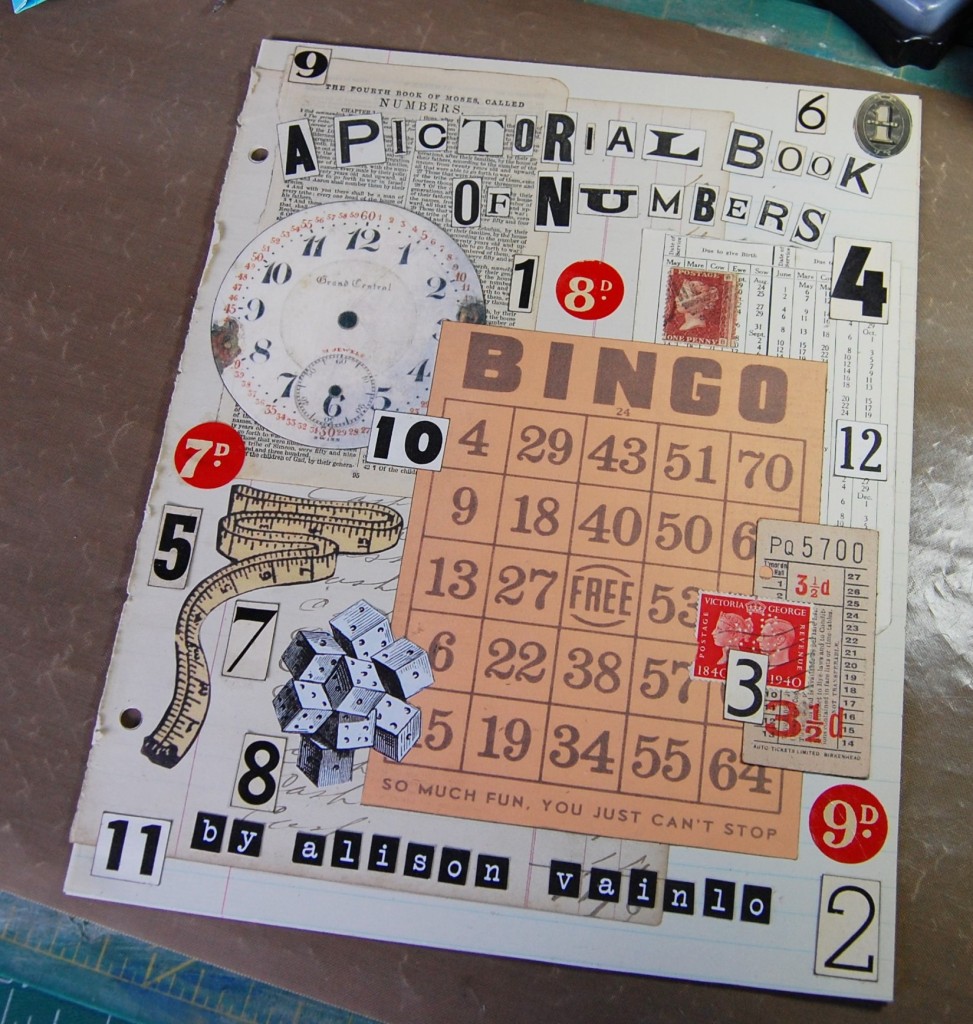
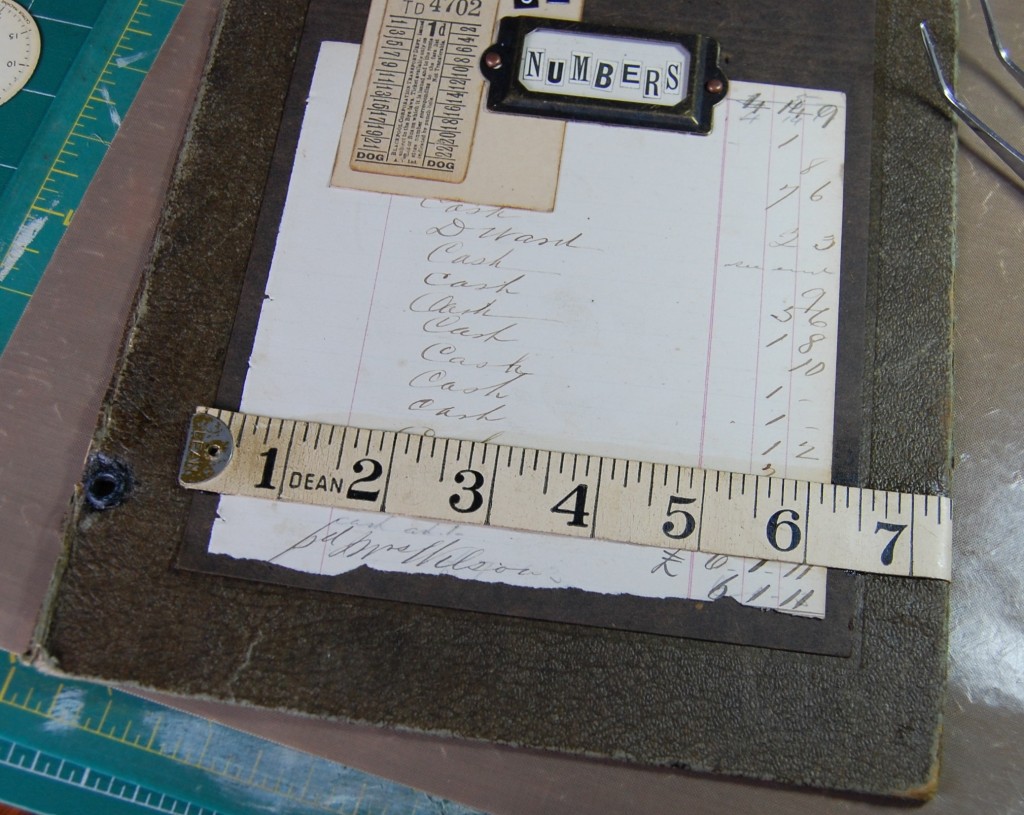
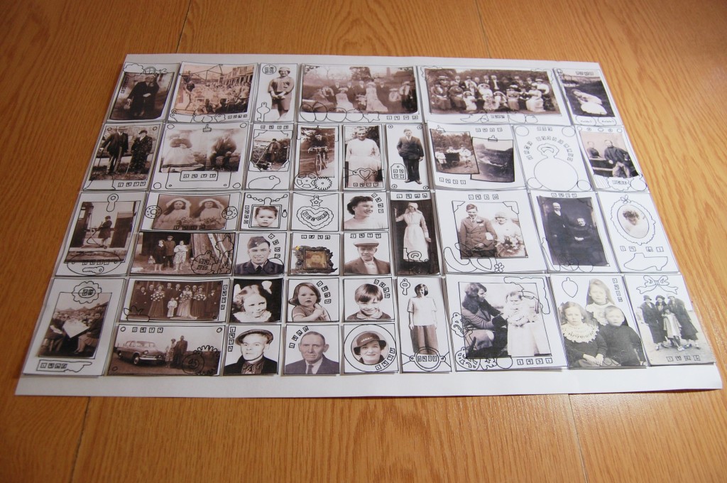
Front cover.Inside the front cover and the title page.Title page. Includes – Bible page from The Book of Numbers, a diary page with numbers, a bingo card, a clock face, tumbling dice, tape measure, tickets, price labels, stamps, piece of old bank note, letters and numbers.Number One. Number One, left side. Kelly’s Eye, No. 1 (Bingo call reference). One swallow doesn’t make a summer. One for the road. January pansy. One armed bandit. Unicycle. Ace of clubs. Building with a number one (random image).Number One, right side. Once in a blue moon. One for sorrow. A partridge in a pear tree. Queen Elizabeth I. January calendar. First birthday card.Number Two.Number Two, left side. Queen Elizabeth II. February snowdrops. February calendar. Two spot wood borer (beetle). Twins (random image). Goody Two Shoes. Fruit token (above the shoes).Number Two, right side. Second birthday card. Bi-plane (random image). Two of diamonds. Two left feet. Two for joy. Two spot ladybird. Two Turtle Doves.Number Three.Number Three, left side. Cup of tea, number three (bingo call reference). Bird’s Foot Trefoil (yellow flower top left). March daffodils. March calendar. Richard III. Three Little Pigs. Three for a girl. Hat Trick.Number Three, right side. Triangle. Three heads (random image). Three more heads (random image). Third birthday card. Three shakes of a lamb’s tail. Three French Hens. Three beans in a pod (random image).Number Four.Number Four, left side. April Calendar. Four o’clock (random image). April Tulips. Knock at the door, number four (Bingo call reference). Four eyes (nickname for someone who wears glasses). Four Calling Birds. Number Four, right side. Four elements. Four for a boy. Four leaf clover. Fourth birthday card. Four spot ladybird. Four hats (random image). Four of hearts. On all fours (skeleton). Number Five.Number Five, left side. Five Gold Rings. Five spot ladybird. May Lily-of-the-Valley. May calendar. Five senses. Australian road sign (random image). Five pointed star fish (random image). High five (hand). Five for silver.Number Five, right side. Olympic rings (Olympic logo). Five of clubs. Domino tile (random image). Fifth birthday card. Five little ducks (went swimming one day). Five soldiers (random image).Number Six.Number Six, left side. Six spot burnet (moth). Hit for six (cricket). Six of hearts. June rose. Six feet under (RIP). Half a dozen (eggs). Six legged beetle.Number Six, right side. June calendar, Sixth birthday card. 666, the number of the Beast (Devil). Six geese a laying. Six for gold. Six pack (random image).Number Seven.Number Seven, left side. D7 card (random image). July sweet peas. Lucky Seven. Seven swans a swimming. Seven spot ladybird.Number Seven, right side. Seven colours of the rainbow. Seven deadly sins. Seventh birthday card. Seven for a secret. July calendar. Seven of spades.Number Eight.Number Eight, left side. Henry VIII. August Rudbeckia flower. August calendar. Eight of diamonds. Octopus. Stem of eight leaves (random image).Number Eight, right side. Eight ball (pool). Octagon (random image). Eight legged spider. Eighth birthday card. Garden gate, number eight (Bingo call reference). Eight for a wish. Eight maids a milking.Number Nine.Number Nine, left side. A stitch in time saves nine (needle and thread). Nine spotted moth. Nine o’clock (random image). Nine ladies dancing. Red hot poker (Kniphofia) flower for September. Nine of clubs. September calendar. Cloud nine (cherub on a cloud). Nine lives (cats which extend on to right side page).Number Nine, right side. Nine planets (random image). Nine for a kiss. Ninth birthday card. Dressed to the nines (gentleman on right). Nine lives (rest of the cats).Number Nine. All the cats for Nine Lives.Number Ten.Number Ten, left side. Number Ten Downing Street. The Ten Commandments. Ten Lords a Leaping. Ten, a surprise you should not miss. Ten of hearts. Number Ten, right side. Ten spot ladybird. October Pysalis (Chinese Lantern plant). October calendar. Road sign (random image). Number Eleven.Number Eleven, left side. November mushroom. Eleven pipers piping. Eleven for health. Eleven players (football team). Number Eleven, right side. November foliage. November calendar. Legs eleven. Eleventh hour (clock). Turn it up to eleven (radio).Number Twelve.Number Twelve, left side. December calendar. Twelve armed starfish (random image). 12 midnight (New Year). Twelve signs of the zodiac. Twelve drummers drumming. Twelve for wealth.Number Twelve, right side. December holly. Twelve months in a year. Dodecagon (twelve sided shape). Twelfth Night.End Page and Back Cover.End Page. One strawberry. Two ladies. Three cherries. Four jewels. Five petals. Six legs. Seven leaves. Eight points. Nine spots. Ten arms. Eleven stars. Twelve points. The skull – The End.
Back in 2018 I made an alphabet book (which you can find here). Once completed I thought about doing a similar book, but with numbers this time. Well it took me four years, but I finally got around to it. So here is the making of it. See the link here for the completed Book of Numbers.
Materials
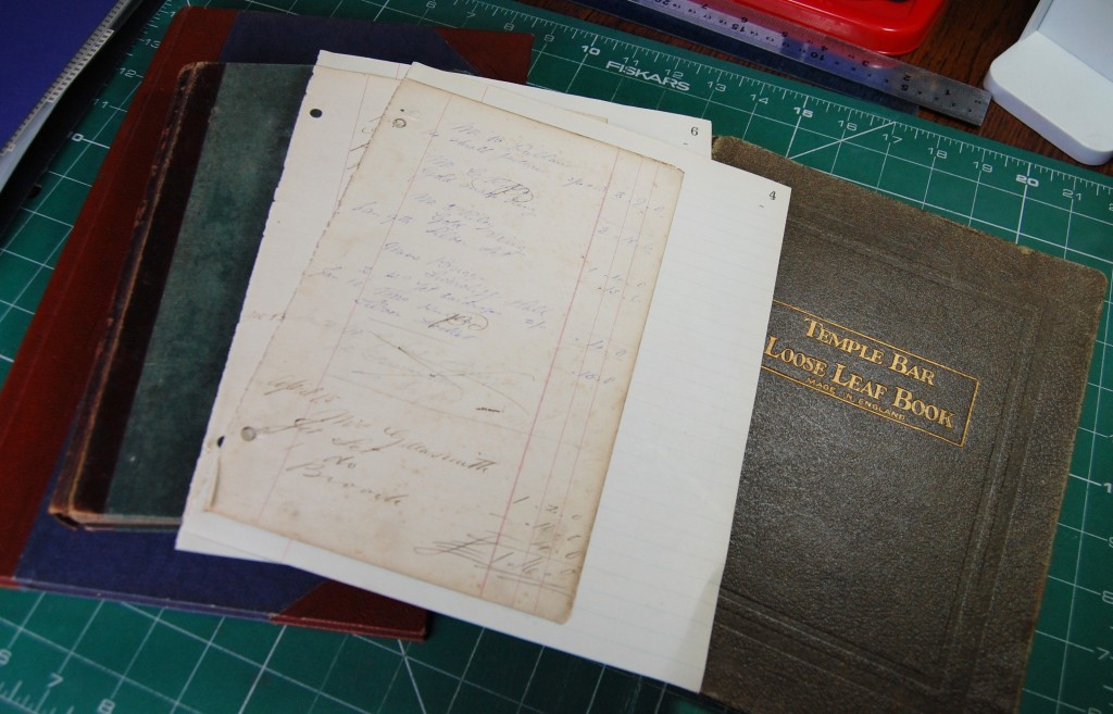
I always like to choose my basic materials first – e.g. – what will the actual book look like? With the alphabet book I was lucky enough to have an old blank book which I’d picked up at an antiques fair. The book had been partially used as a scrapbook, but there were enough blank pages to work around that, and the pages were lovely and thick too, so I’d been hoping to find something similar again. Sadly, that was not to be, so I began looking at other options in my stash.
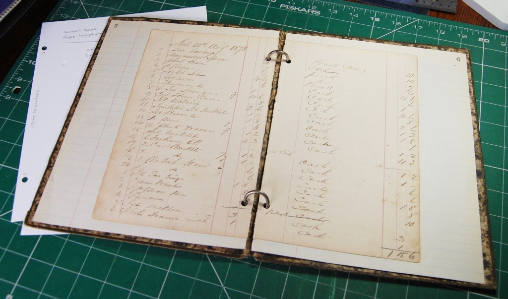
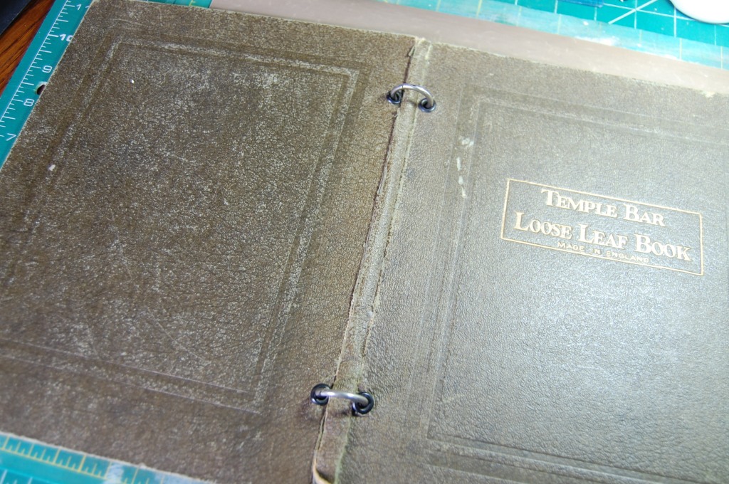
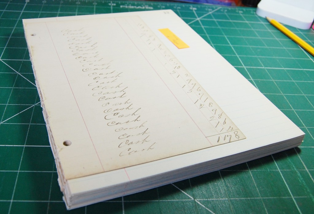
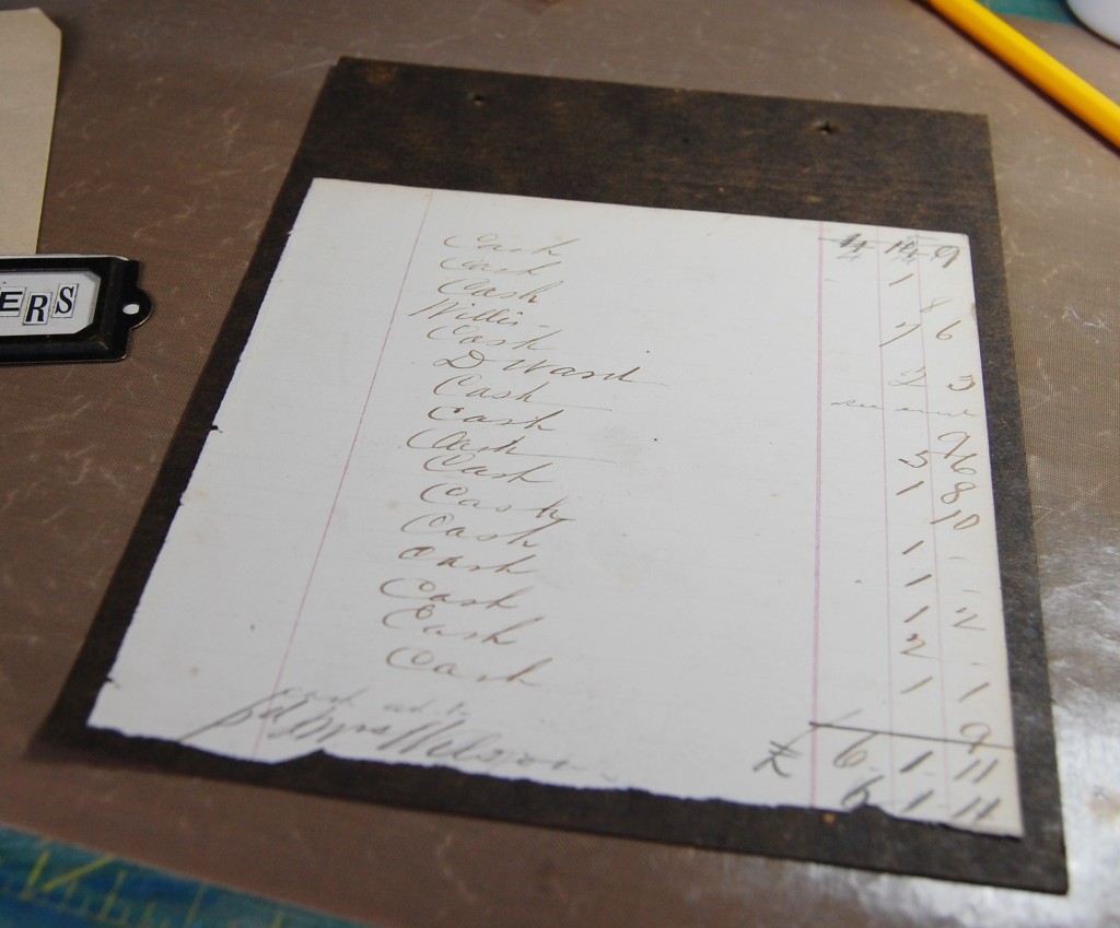
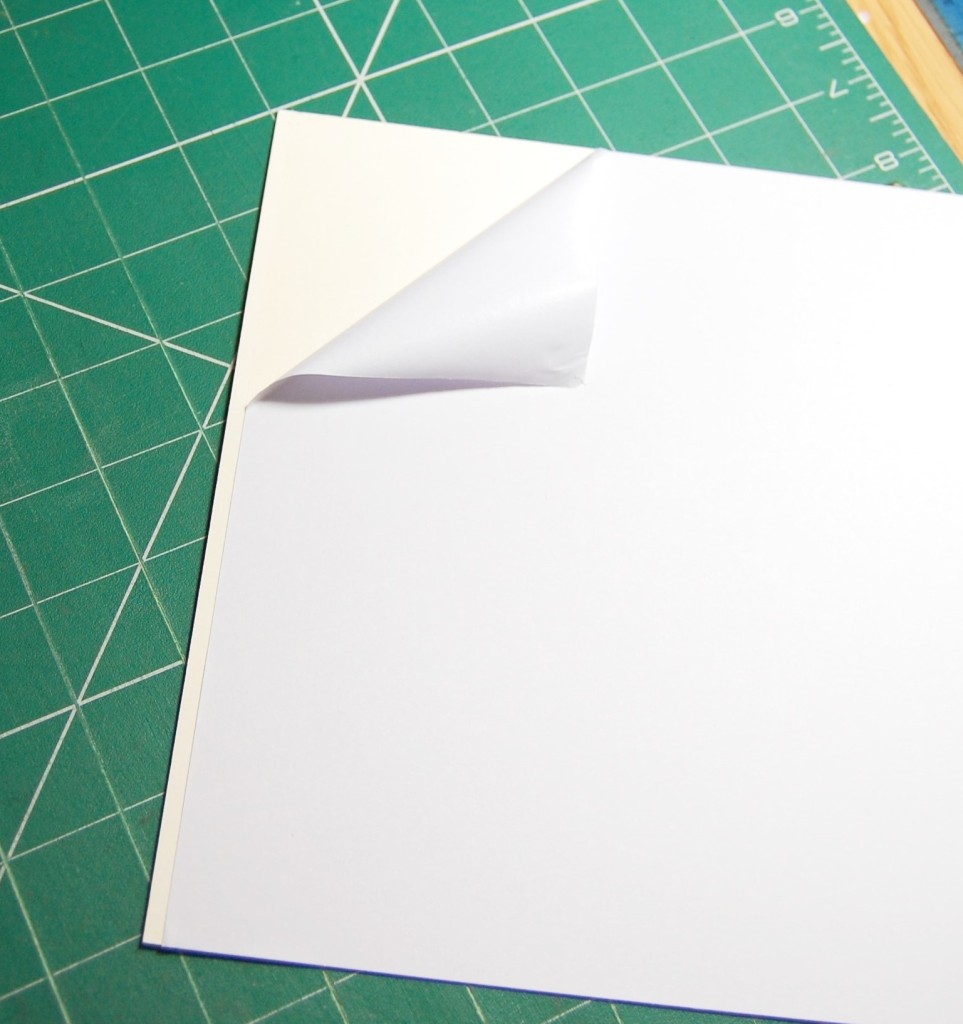
In the end I decided to use an old ring bound folder (Temple Bar Loose Leaf Book in photo), and pages from an old ledger which would reflect the number aspect of the book. As the ledger pages were quite a bit smaller than the folder I decided to use them as a centre piece and mount them on lined paper from another old book (as shown in the photo above).
Making the Pages
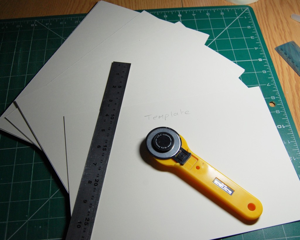
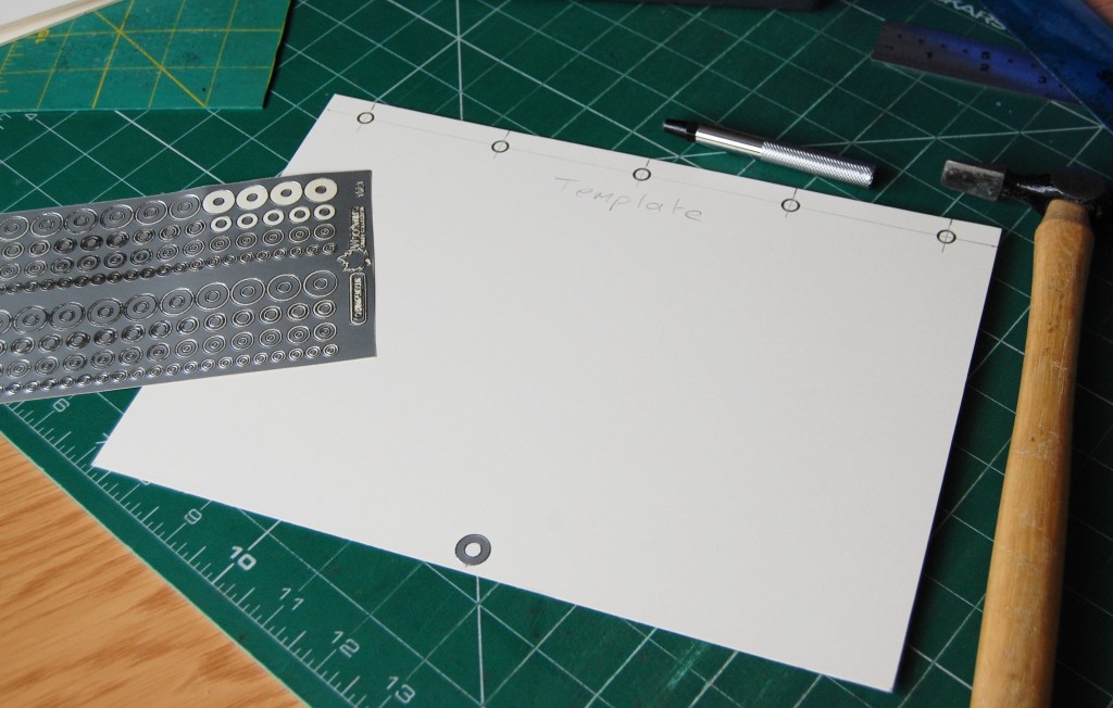
I made two card templates, one to fit the size of the folder and one the same size as the ledger paper, holes were punched in the template to allow all holes in the pages to align. I then assembled two pages to make sure it worked and these could be used during the design process.
As you can see from the photo above, the lined paper has been cut to size and the ledger paper has been stuck to form a centre panel when the book is assembled. I could now make all the pages I would need for the book in advance.
Before I could make the pages I had to decide on the amount of numbers to be included in the book. So, page making was paused until an image search was completed.
Images
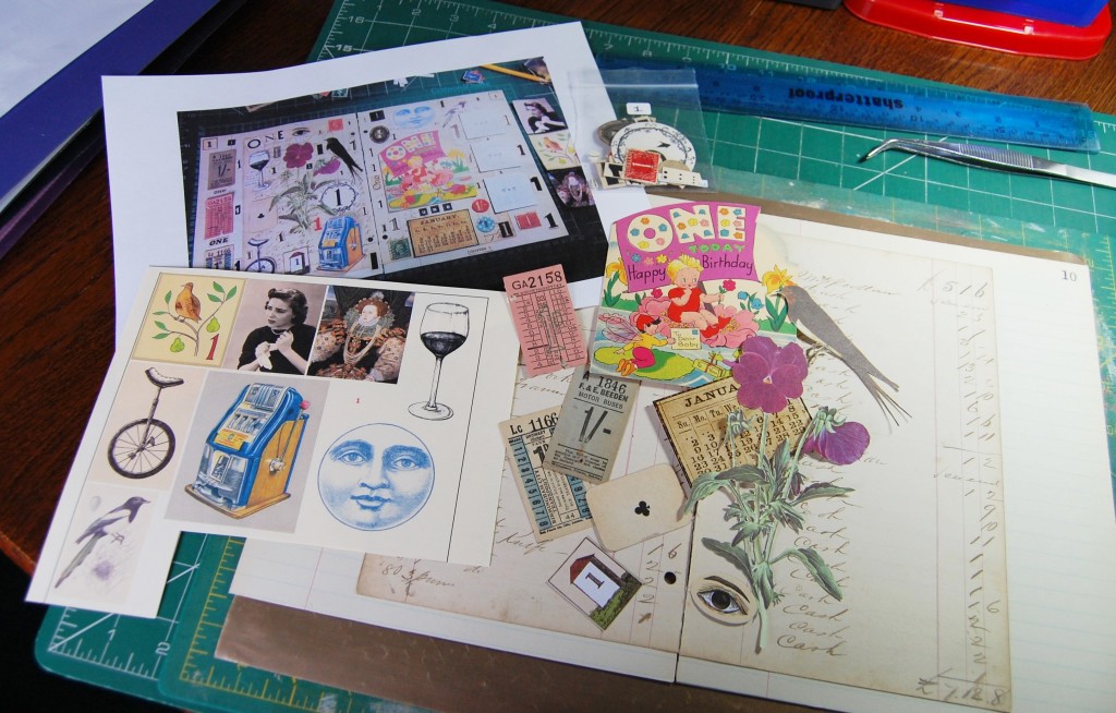
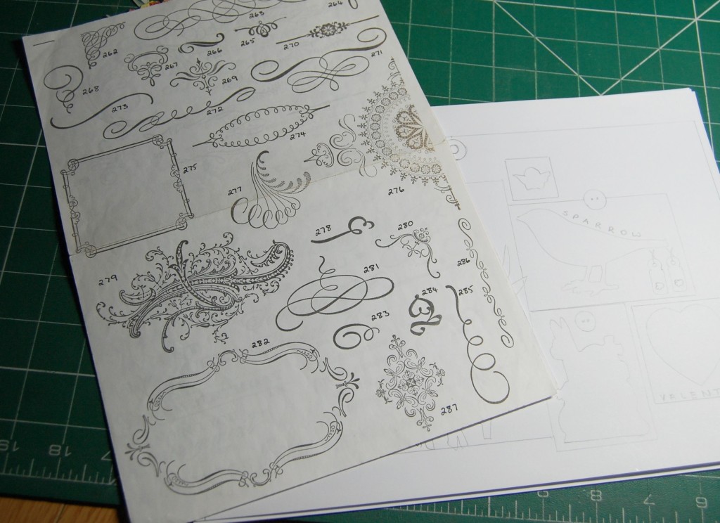
I started out by looking through my huge collection of images, scraps and ephemera for anything associated with or illustrating numbers. I collected as much as I could then did a search online for rhymes and sayings about numbers in an attempt to add more interest to the project.
It was whilst searching for images and sayings that I came across quite a few references to the number twelve – twelve months in a year, twelve signs of the zodiac, the Twelve Days of Christmas etc. So it was at that point I decided to illustrate numbers one to twelve and do a double page spread for each number.
Designing
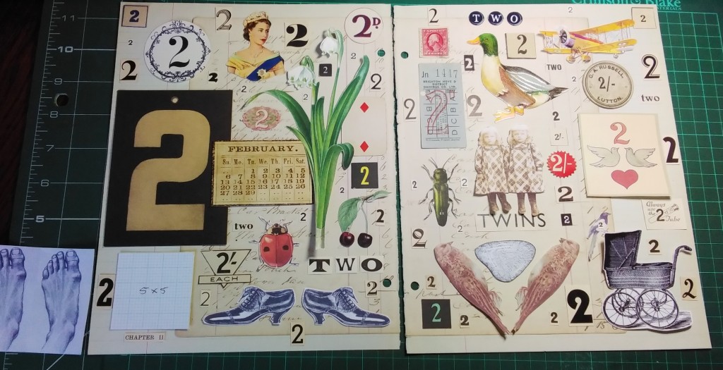
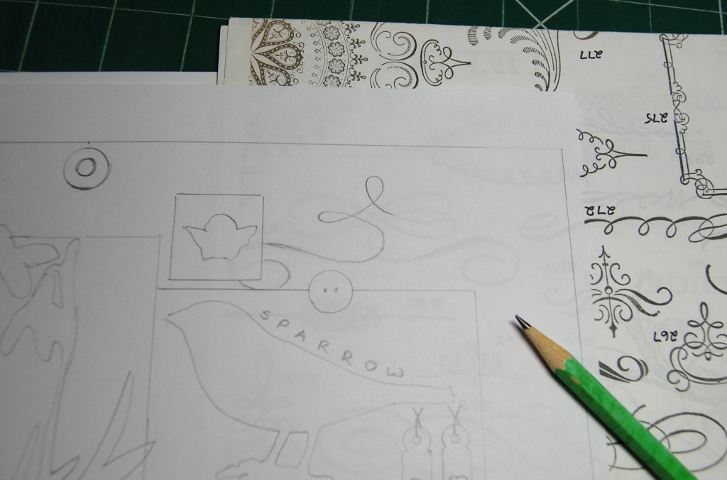
Using the first two sample pages I had made I set out all the images I wanted to use, using graph paper templates to fill in for images that would need resizing. I also included lots of single numbers cut from old books and magazines to fill all the gaps. The above photo is just a first draft design, with some images not making the final book.
Once all the designs had been finalized they were put into a file folder ready to be made into the book.
Making the Book
So, it was finally time to start making up pages. As the lined paper was quite thin I was concerned that images might show through on the pages behind, so to stop that and to add strength to the pages I decided to sandwich pairs of pages together with a card core.
The photo above shows plain cream card as it would be inserted between two sheets of lined paper, with the ledger paper layered on top of each side.
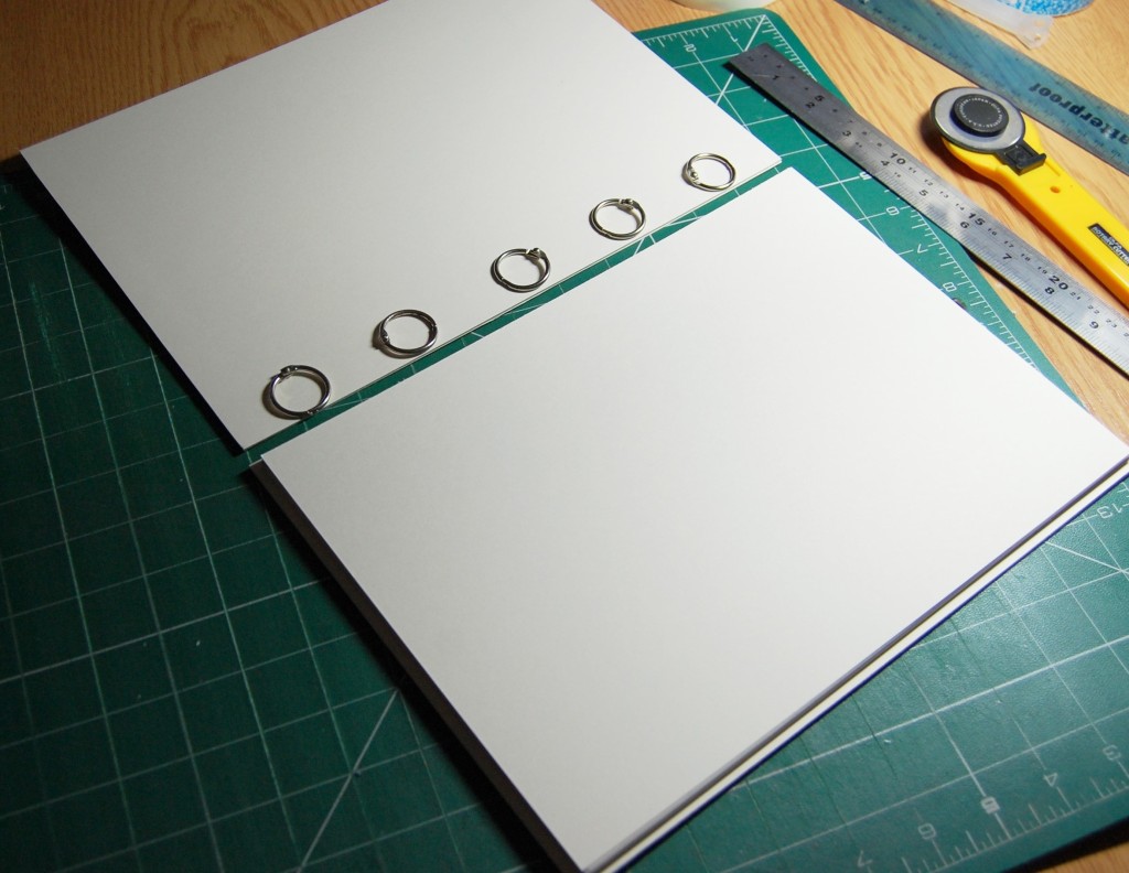
Everything was then cut to the sizes of the templates made earlier, stuck together and holes punched through in their correct places. Incidentally, I used a plain old glue stick like Pritt (other glue sticks are available) to glue the card and paper together as it was quick, not messy and gave better coverage than using double sided tape. You could used double sided A4 sticky sheets, but this would work out more expensive in the long run.
I made twelve double sided pages (twenty four sides) in all as can be seen above. The sticky notes were a record of each page number to help me whilst making up.
The first page to be made up would be the introductory page. As you can see from the photo above, everything I needed to complete the page is contained in a file pocket, including a photo of the draft design which I had printed out.
Here we see the images ready to be placed on the page plus a grip seal bag with all the small items to be added later. There is also the printed photo of the draft design.
In this photo all the large images have been applied, either with double sided tape or PVA glue, and the small items are just waiting to be added.
The finished introductory page.
All the remaining pages were finished in a similar way until the file folder was full of finished pages instead of designs.
The Book Cover
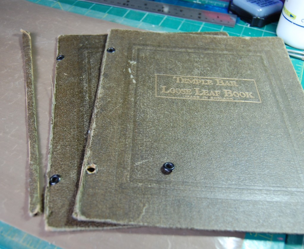
It became apparent that the number of pages I had made would not fit into the ring bound folder as it was, so I had to adapt it.
The folder with a narrow spine and small rings.The pages without images, much thicker than the spine of the file folder.
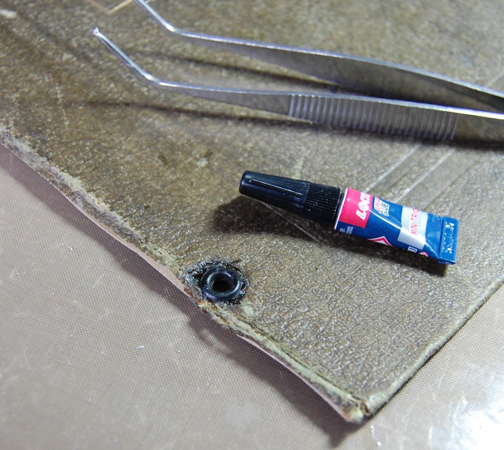
There was only one solution – cut the spine of the book off and use some larger book rings. Another problem with the folder was that one of the eyelets had come out, so that would need sticking back in.
It would be impossible to reset the eyelet as it was and I didn’t have a suitable replacement, so I stuck the original back in the hole using some super glue. As you can see it did make a bit of a mess, but as the folder was already distressed I could live with that.
This is the draft design for the front cover. Wherever possible I like to retain as much of the original surface as possible. In this case the Temple Bar title would need covering, so I found a piece of stiff brown card from an old photo album and used sideways, it just fitted into the indented oblong on the cover. The rest of the design just fell into place from there. Here is how it was made in pictures and captions.
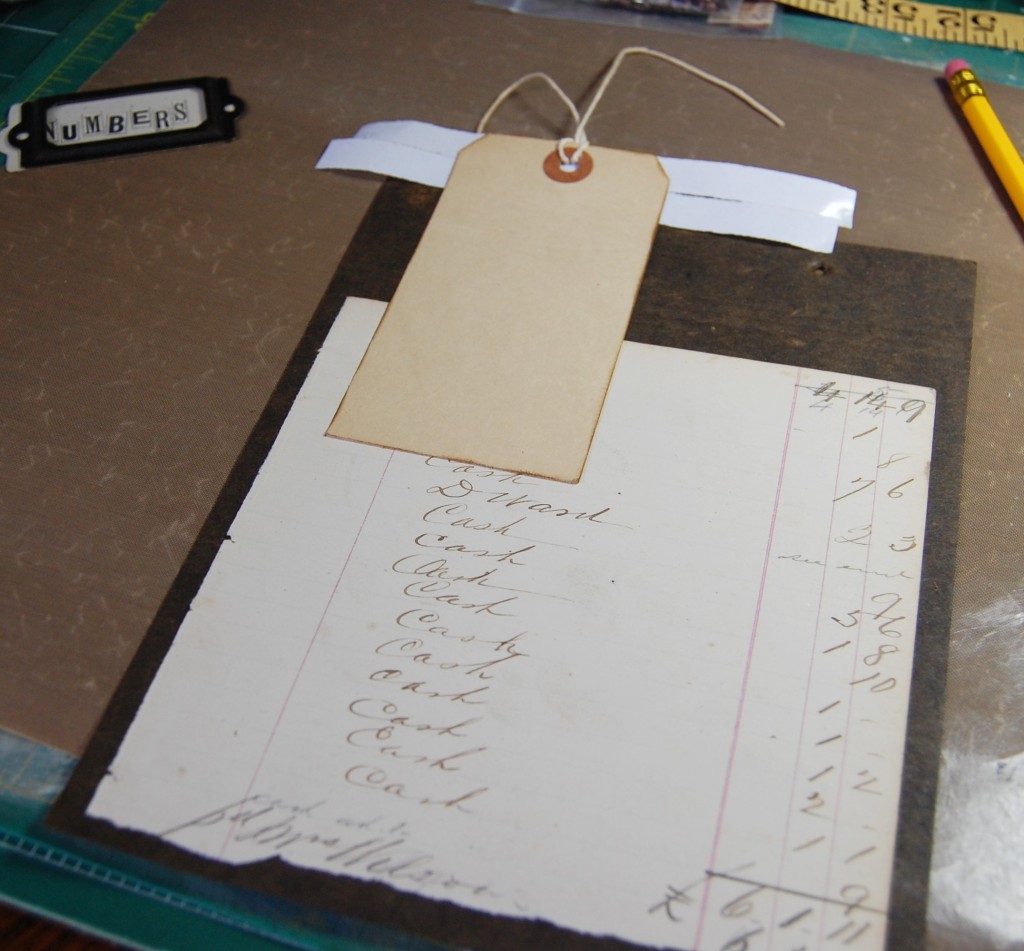
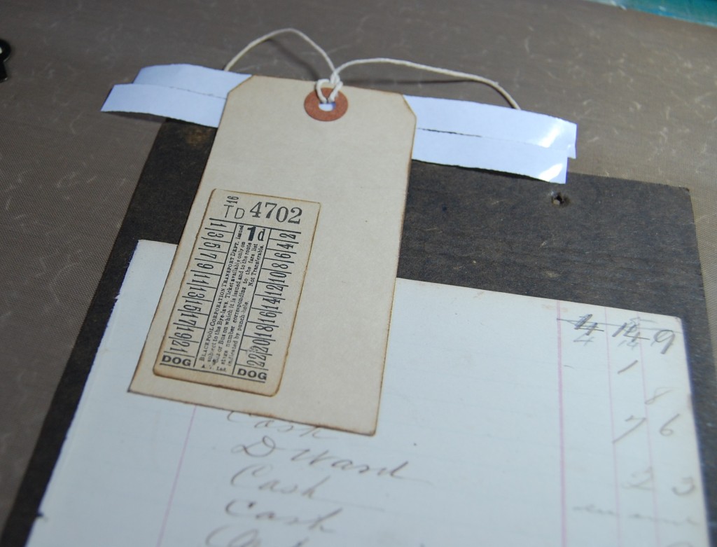
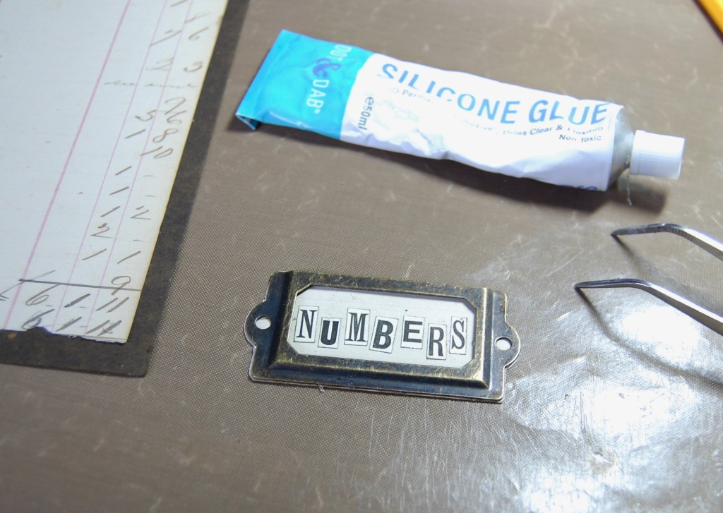
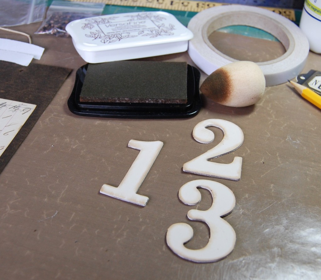
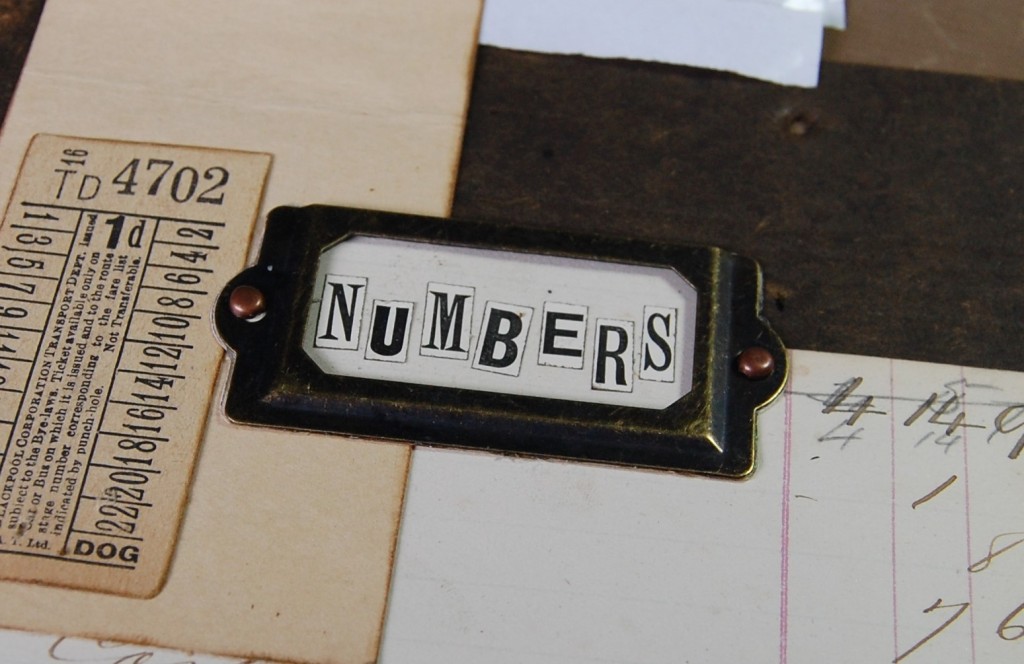
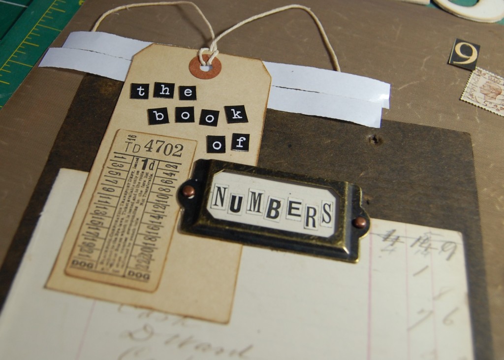
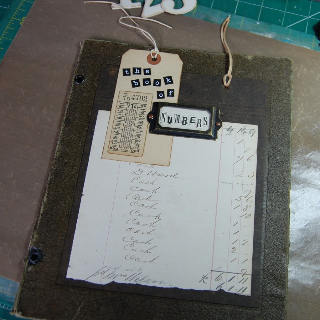
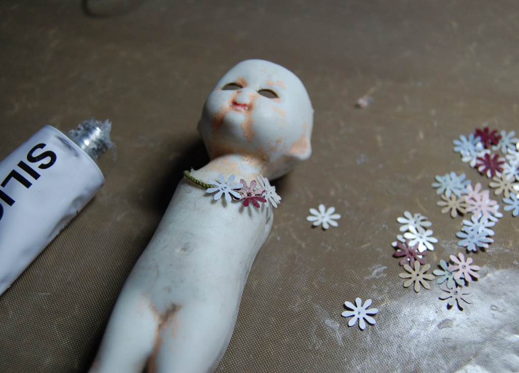
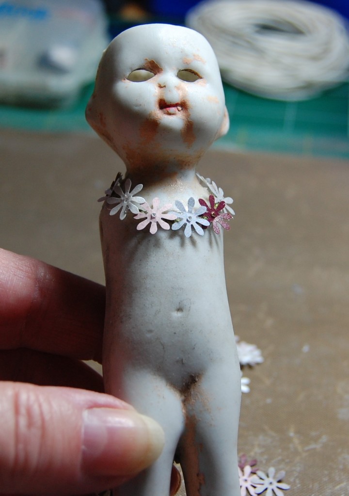
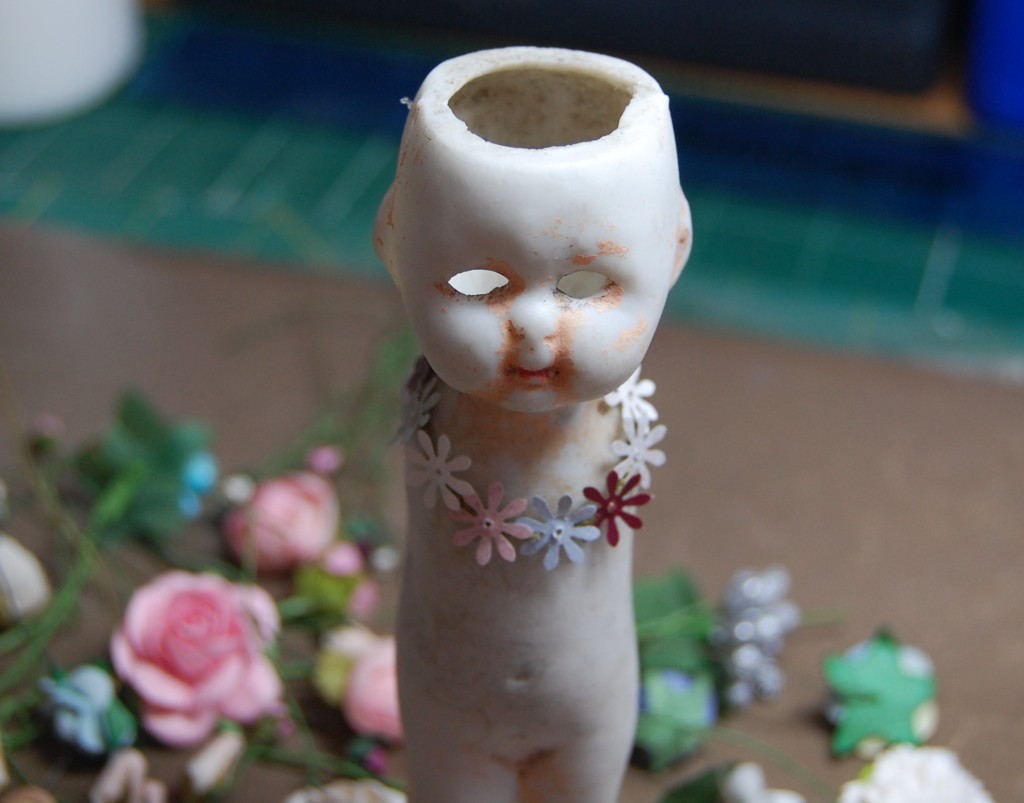
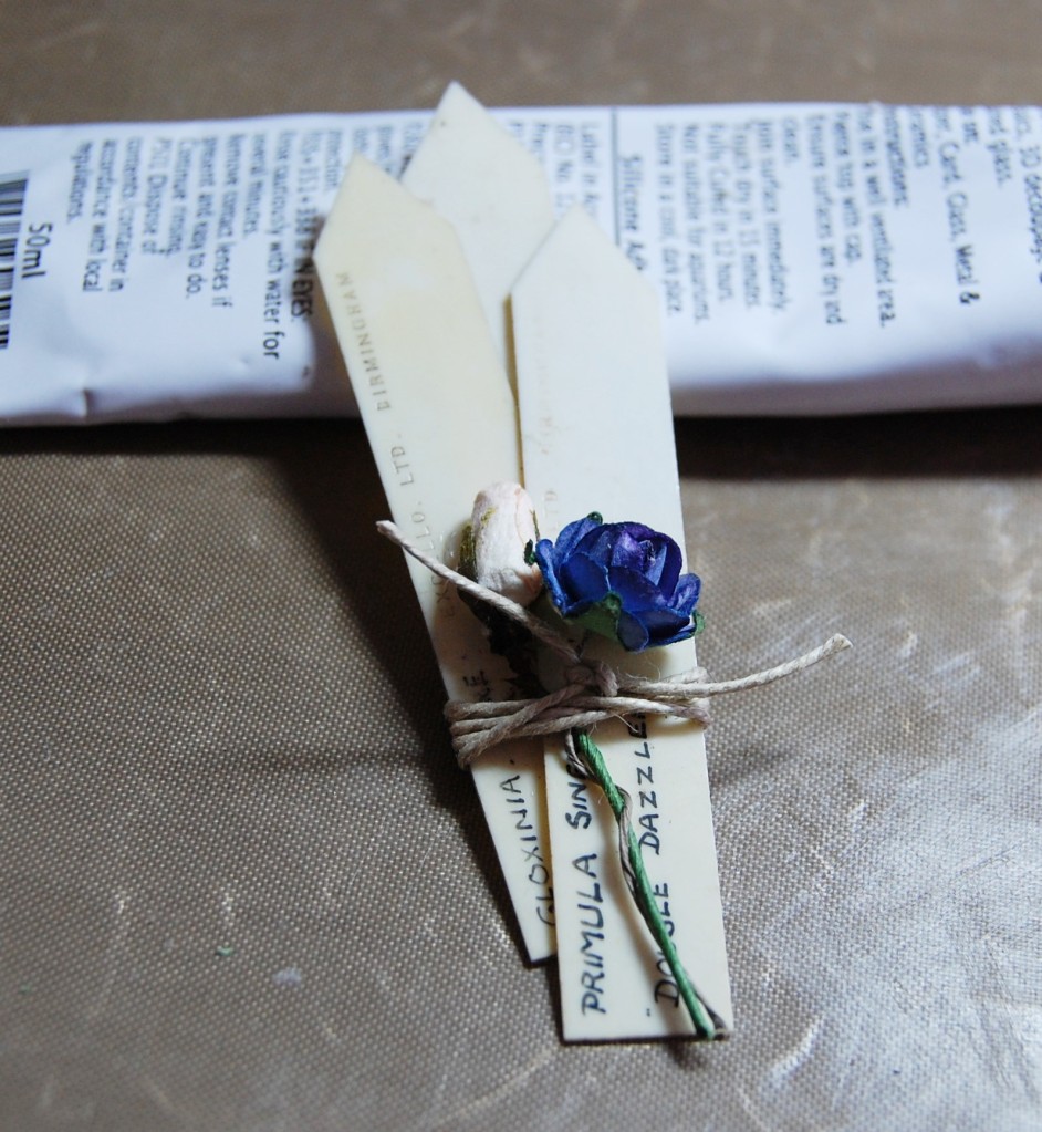
A torn piece of the ledger paper covers most of the brown photo album page.An old luggage label (with inked edges) was stuck to the upper left side. The pieces of tape backing are just to stop the sticky tape on the back of the label sticking to things before it’s applied to the book cover.An old ticket with inked edges is applied to the luggage label.A title plate made up of plain old paper, lettering cut from old magazines, and a brass drawer plate.Chip board numbers were painted in cream emulsion paint (from a sample match pot) then sepia ink was sponged on to distress them and add depth.The brass drawer plate was stuck in place with silicone glue and finished off with a couple of brads pushed right through to the back of the brown card.Small number tiles make up the remainder of the title.A piece of vintage string was tied through the hole in the brown card and then the card was stuck down to the front cover.A length of old tape measure was added to the lower section of the cover, which wraps around the opening and ends inside the front cover.The large chip board numbers were added and letter tiles to the bottom.Small paper numbers, a stamp and a metal dial complete the front cover.
With all the pages and the cover now complete, it was just a case of assembling the book and it would be finished.
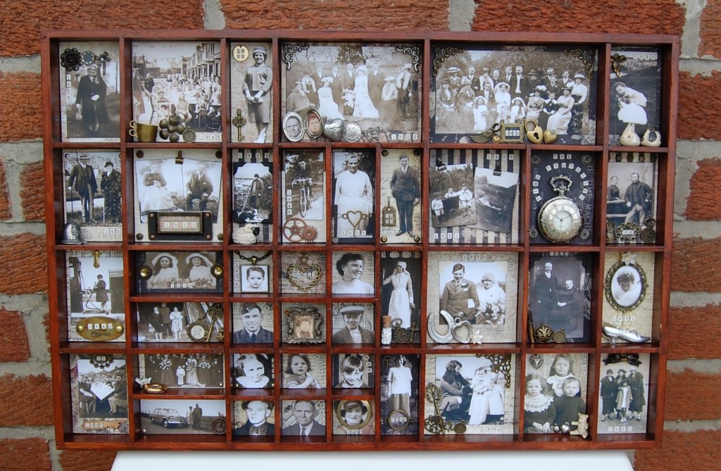
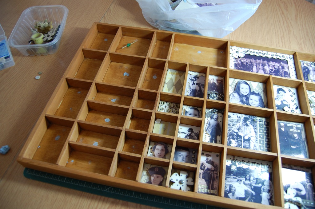
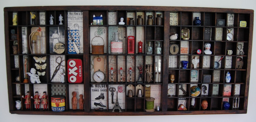
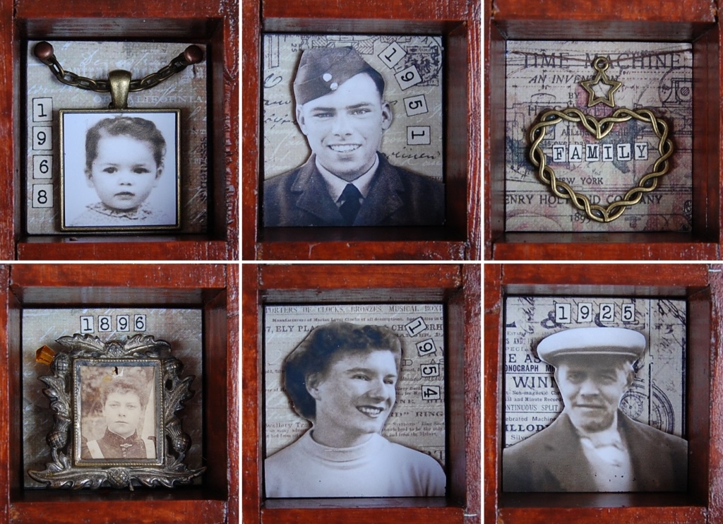
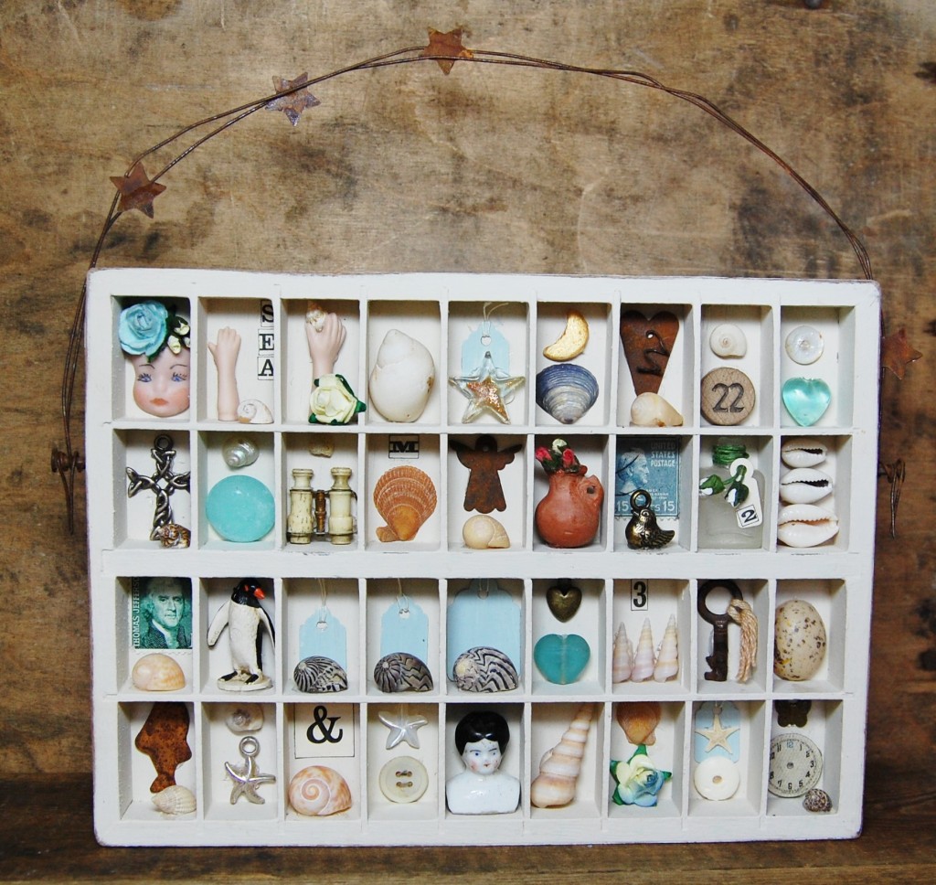
The Time Traveller is a large scale photo box. Filled with old family photos, trinkets and charms, it is a virtual time trip through family history.
Old Box, New Project
The wooden box used in the Time Traveller project is far from new. I bought the box from Danish craft retailer Panduro Hobby about 30 years ago. It has had a couple of previous incarnations, but thought it was time to give it a revamp and display some of my favourite old family photos. As a keen genealogist I seem to have become chief archivist for old family photos, and using a box like this is a great way to display a bunch of them all at once, and turn it into a work of art at the same time.
Before we delve in the Time Traveller project, let’s have a look at how the box has been used previously.
Random Display
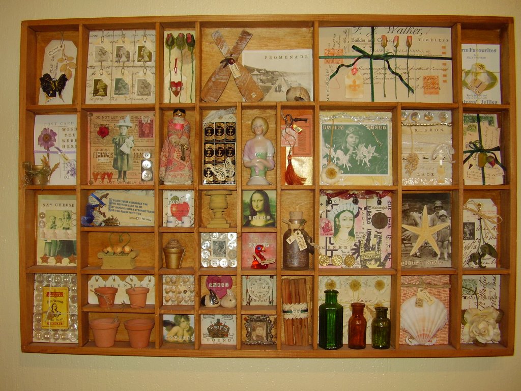
Untitled
This was my first attempt at a project of this type, in a sectioned box; and to be honest, I just wanted to experiment with different themes and styles, using what I had available at the time. So the box is seen here in its original unpainted state. I think I rubbed some beeswax into the wood before I started, but that was as much as I did.
The individual sections were made up as I went along. I would have an idea, make up a section and then move on to the next. It’s all a bit random, there are some Sarah Lugg influences, beach themes, Indian styles, historical and nature led designs as well as a collection of miniature items I wanted to use.
The box looked good for quite a number of years, but gradually things started to unstick, dried flowers curled, and photos faded. So eventually it was time to empty it all out and start again.
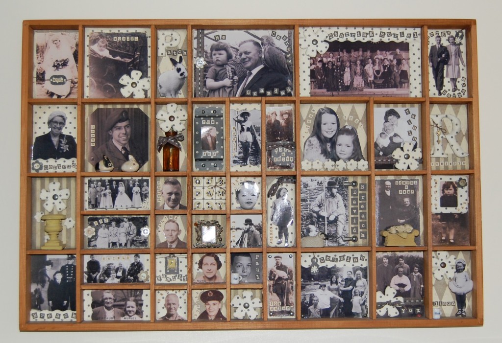
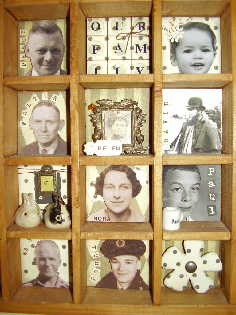
Our Family
Our Family
This second incarnation for the box isn’t too far removed from the new display. Here I chose one theme, family photos, but unlike the new display I included newer photos as well as old ones.
I chose a ‘family’ of craft papers which I used as backgrounds, borders and decorative embellishments. Not every section held a photo, some had titles or little pots in them to break up the design a bit.
There was a problem with this design which didn’t present itself until I was taking photos of it later. I had printed all the photos on glossy paper and this created shine on all the photos, whichever angle I took them from! I had also used a mix of sepia and greyscale photos which, on reflection, wasn’t the best idea. However, I did like the presentation of the sections, and enjoyed making up all the borders, card flowers and decorative bits. I also added block letters to make up the names of those in the photos.
Detail from the centre section
After almost 15 years this design started to look tired too, so it was time for a another change, and I knew exactly what I wanted to do.
The Time Traveller
I’m glad to say that in the past 15 years I have developed a style and skills I am comfortable with, and have amassed a good quantity of craft products, as well as vintage items, that meant I could make this the best box make-over to date.
I would treat it as I would any other craft project – plan it all out on paper, design each section, and make up the sections afterwards.
Designing
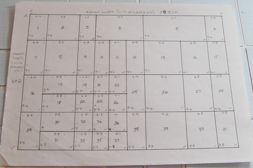
Last time I gave the box a make over I made a plan of it on paper, making note of all the measurements. Luckily I had kept the plan, so I didn’t need to measure all the sections again.
The original plan of the box with measurements
As you can see from the plan, the box measures approximately 60cm by 42cm and there are 41 sections, the largest being just over 16cm by just over 9cm, and the smallest roughly 4cm square.
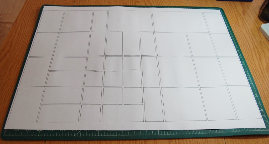
I decided to draw up a full size plan on A3 paper so that I could stick my designs to it as went along. I also cut some graph paper templates to the sizes of the sections to aid design.
The full size plan
The graph paper templates laid out in order
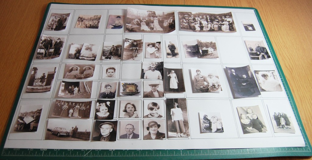
Next I went through my collection of old photos and printed some thumbnails of ones I wanted to use; this was just an initial choice and some of the ones on the plan below didn’t make it to final production.
Laying all the thumbnails on the plan to decide what should go where
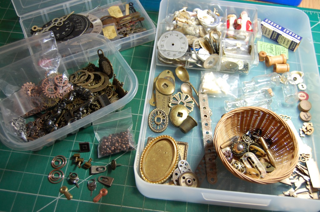
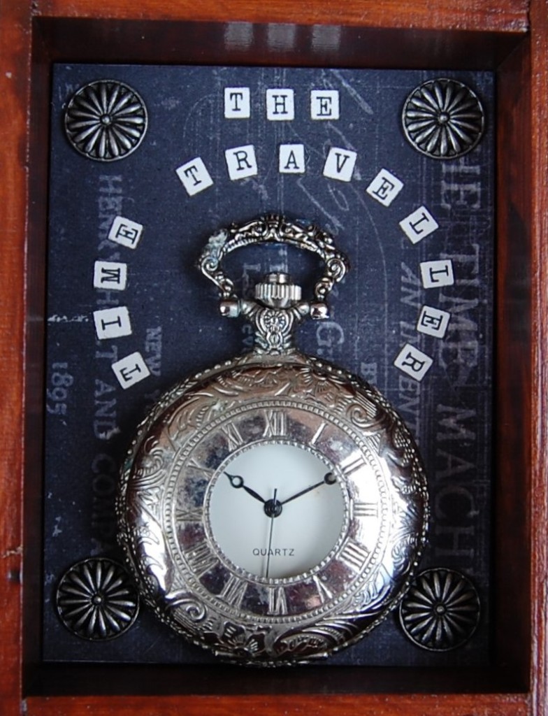
I wanted to put a variety of items with the photos so I gathered together a collection of the sort of stuff I could use. I had it in mind to make it look slightly Steampunk, so I chose lots of metal items.
Embellishments
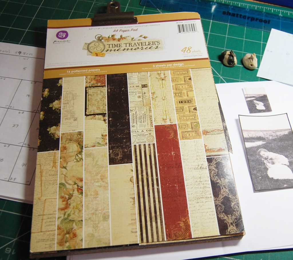
As I would be making backgrounds for the sections I wanted a ‘family’ of papers I could use. I chose a collection called ‘Time Traveller’s Memories’. I’ve had this paper pad in my stash for a few years now and only used a few pages. It seemed the perfect fit for using with old photos and had a slight Steampunk twist to it too. It also led to me choosing the title of the project.
Paper pad for making backgrounds
With all the materials chosen it was finally time to start designing. I did this one section at a time, choosing a background paper, sizing the photo, and choosing the embellishments.
Example of one of the designs
Once a design was settled on, I drew it out twice, once with notes attached for making up, and the second for cutting out and sticking to the plan.
Drawing the design up
Once drawn, the paper was cut in half, the design and all associated pieces went into a file folder, while the other drawing was cut out for the plan.
A file folder with all the designs
When all the sections had been designed, the paper plan gave the first impression of how the finished box would look.
The completed paper plan
Deconstruction
With all the designing complete the first thing to do was to take all the old items out of the box. This was quite easy as everything was stuck in with Blu Tack.
Removing all the old items
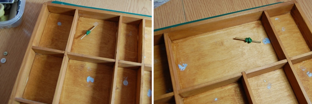
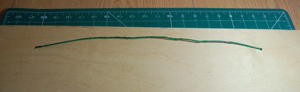
I wasn’t satisfied with the way the hanging wire was fixed to the box. When I purchased the box it came with two holes drilled into two of the top sections. I suppose the idea was to thread thick cord through them and make a feature of the knot. I had previously twisted some green garden wire together to act as the hanger, which I had wound on to short wooden sticks at the front. The problem was the bulkiness of the unsightly wire fixing and I had found myself mounting photos further forward in those sections to be able to cover them up, not ideal.
The old hanging wire wound on to sticks
The hanging wire as seen at the back of the box
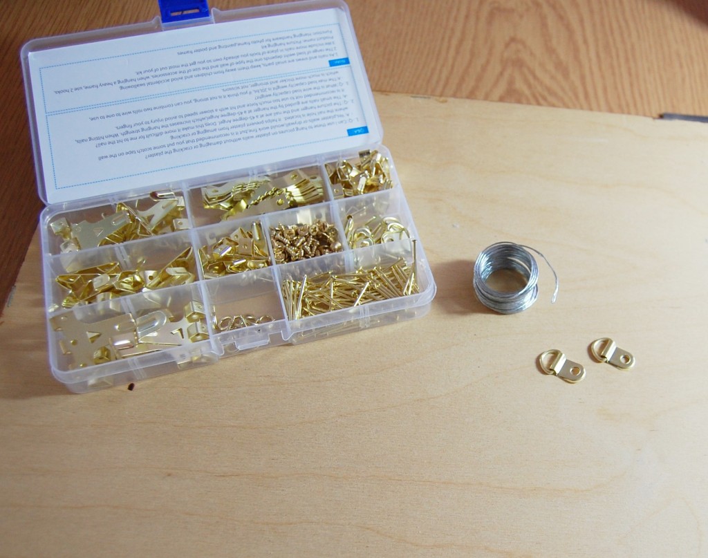
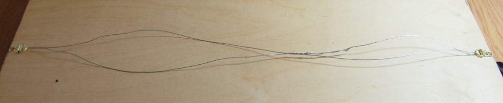
I decided to fix proper picture hanging brackets to the back of the box and use picture wire to hang it.
Picture hanging accessories
The brackets and picture wire fixed in place
Restoring the box
The box itself needed some work before it could be decorated again, it was looking a little tired and bland. It would need sanding, repairing, cleaning and staining, a messy but necessary job.
Preparation
Some of the partitions had split, so a bit of wood glue was required to get them back up to scratch. All the Blu Tack residue would be sanded away while keying the surfaces for wood stain.
The prepared box
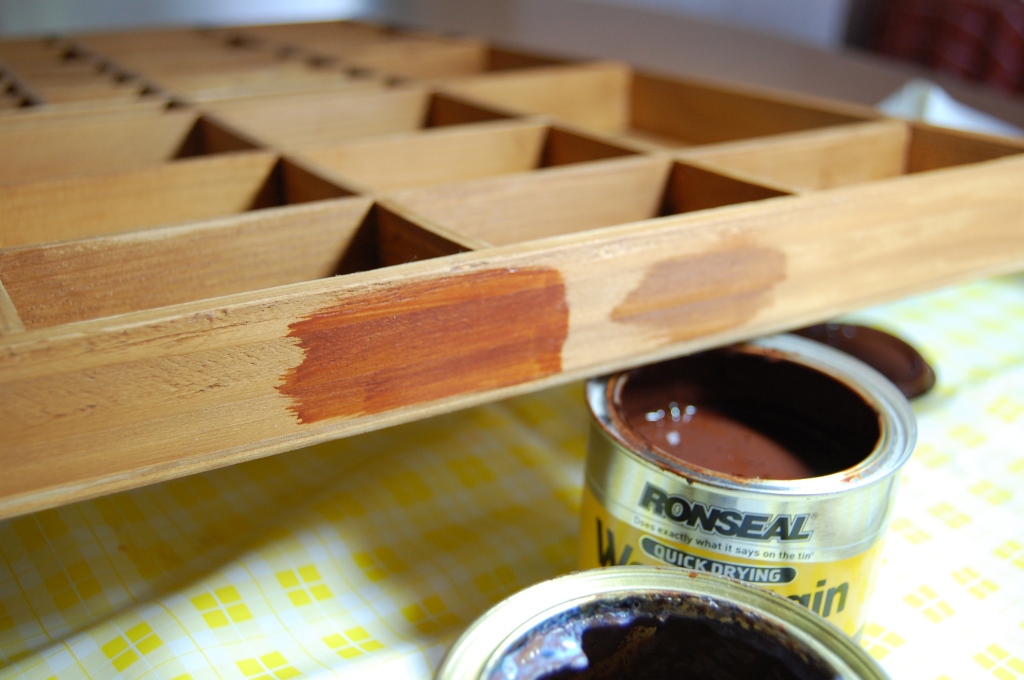
The next step was to add some wood stain to the box.
Wood stain
I had the choice of two wood stains in the house, a teak one or an antique pine wood dye. I decided to try them both out on one of the outer edges of the box.
Trying out the wood stains
I decided the teak one would look best, especially with old photos. The box hangs in the same room as the printer’s sort tray I did a few years ago (featured on this blog), so it made sense to darken it to match that one.
With the first coat going on the difference was clear to see.
The first coat of wood stain going on
The box was left to dry overnight and then recoated the next day. Finally, it was ready for decorating.
The wood stain finished and dry
Making up the Designs
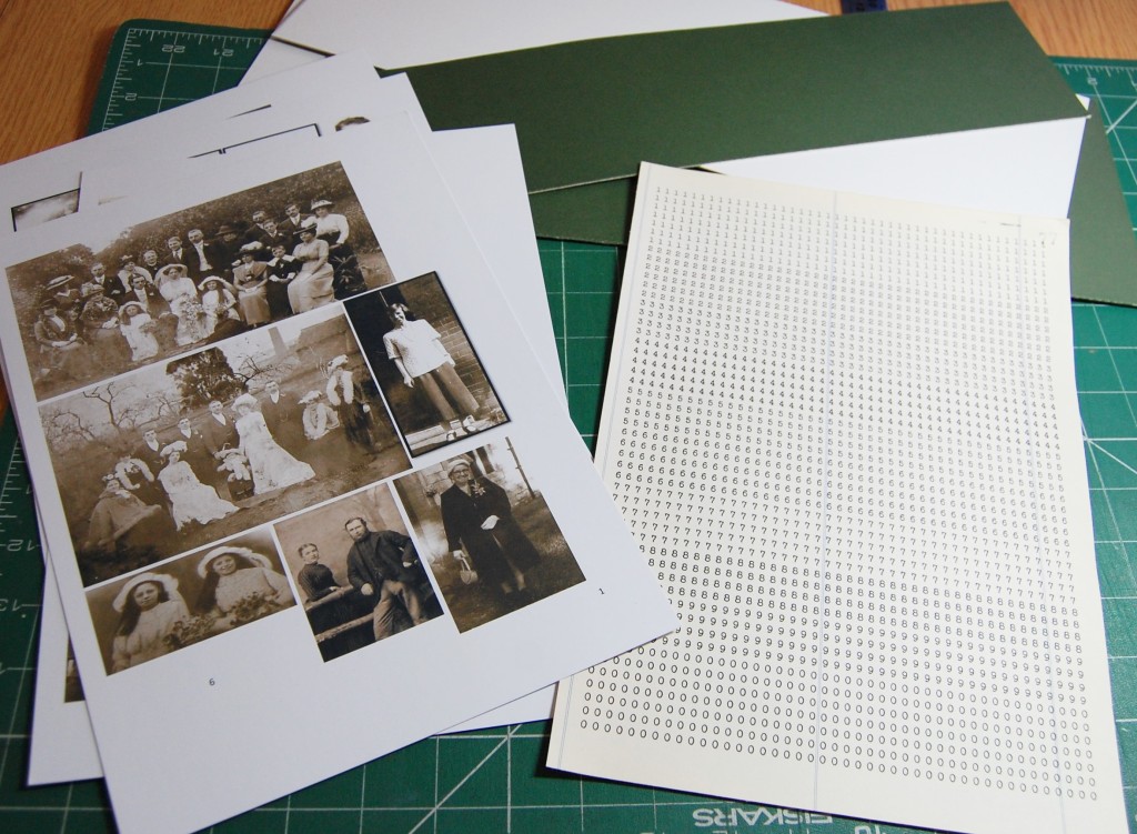
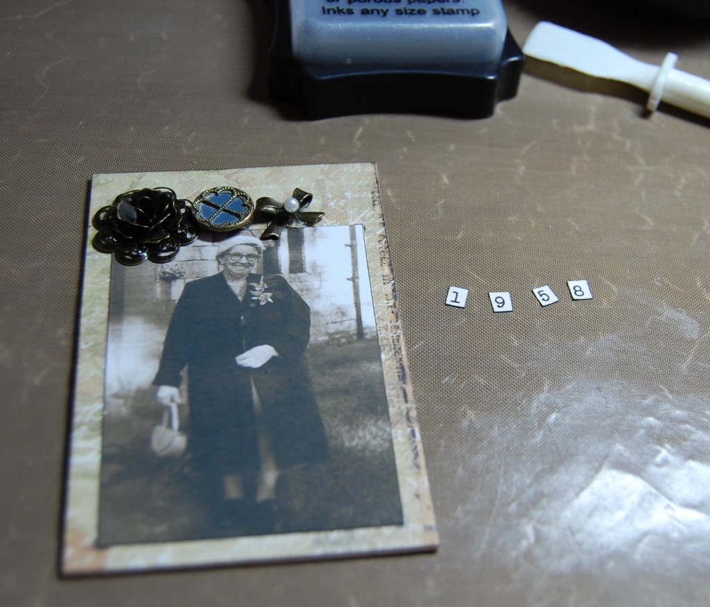
With the box finished I could now start to fill it. I printed all the photos onto matt photo paper (to prevent the shine I mentioned earlier), found some off cuts of mount board to back all the designs, and printed a number sheet, to cut up for the dates. The number sheet was created in Word, using an old typewriter font, and printed on old ledger paper for an aged look.
Mount board and printed items
Each of the sections was made up as described under the following photos.
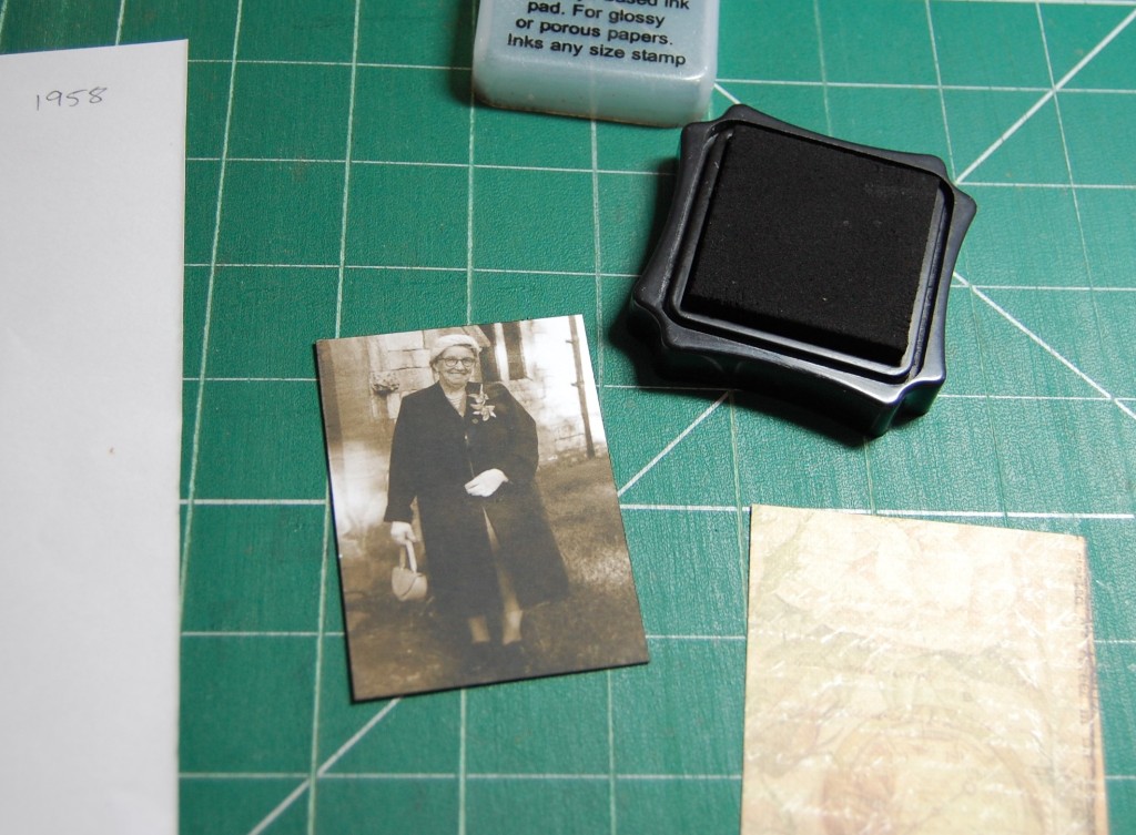
With everything gathered together, the photo was cut from the sheet as specified in the design.
The edges of the photo was run around a black ink pad to add some definition.
The background paper was bonded to a piece of mount board and cut out. The black ink pad was run around these edges too to disguise any white edges showing.
The background was inserted into its section to make sure it fitted. Any that were a little tight were trimmed down at this point.
The photo was stuck to the background and the embellishments were attached using silicone glue.
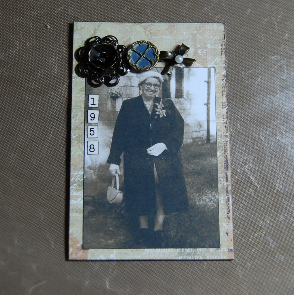
Number tiles were cut out and the edges inked to make up the year.
Once the numbers were stuck on the piece was finished and after leaving to dry for a while, it was ready to be inserted into the box.
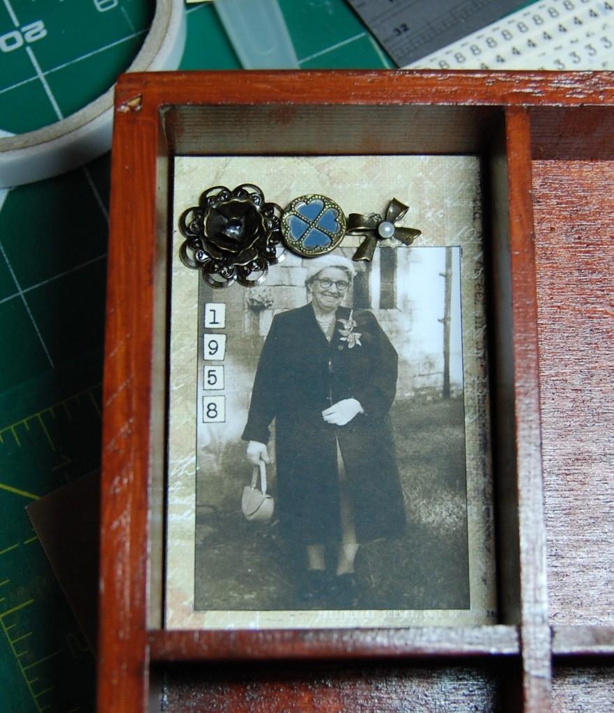
Blu Tack was attached to the back of the finished piece. Although the photo only shows two blobs of Blu Tack, I actually found I needed four, one in each corner, and I found that sticking the Blu Tack into the box first worked better as I could just press each corner into place.
The finished design now inserted in the box.
The Finished Box
The finished box photographed outdoors to avoid dark shadows
Photos
Here are photos of the rest of the completed sections in close up (not necessarily in the order they appear in the box), with a list of embellishments included..
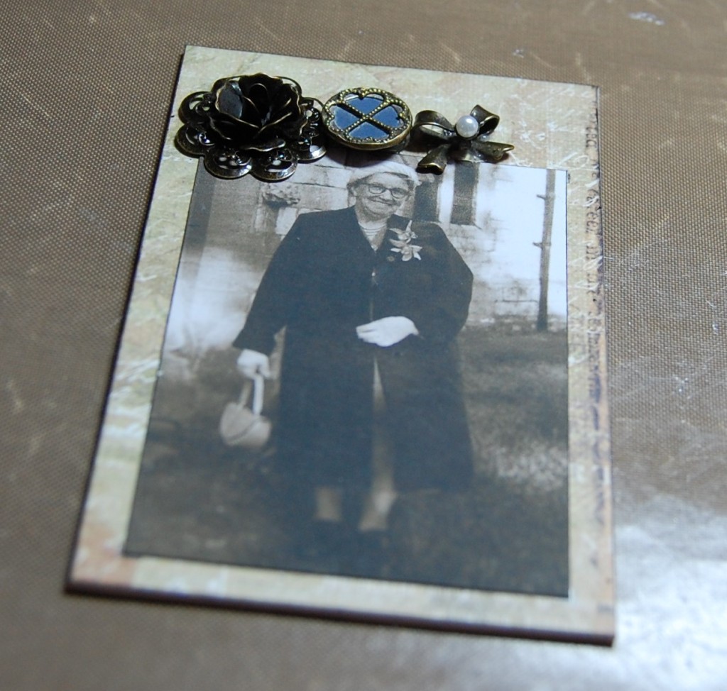
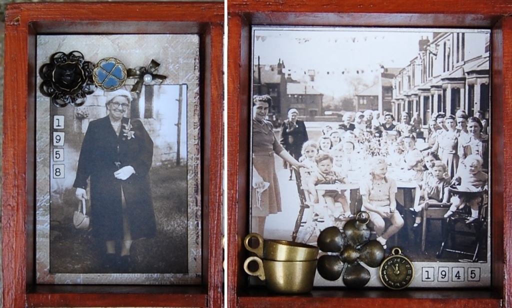
Left, Metal flower, button, brooch part. Right, Metal doll house cups, metal flower, metal watch face charm.
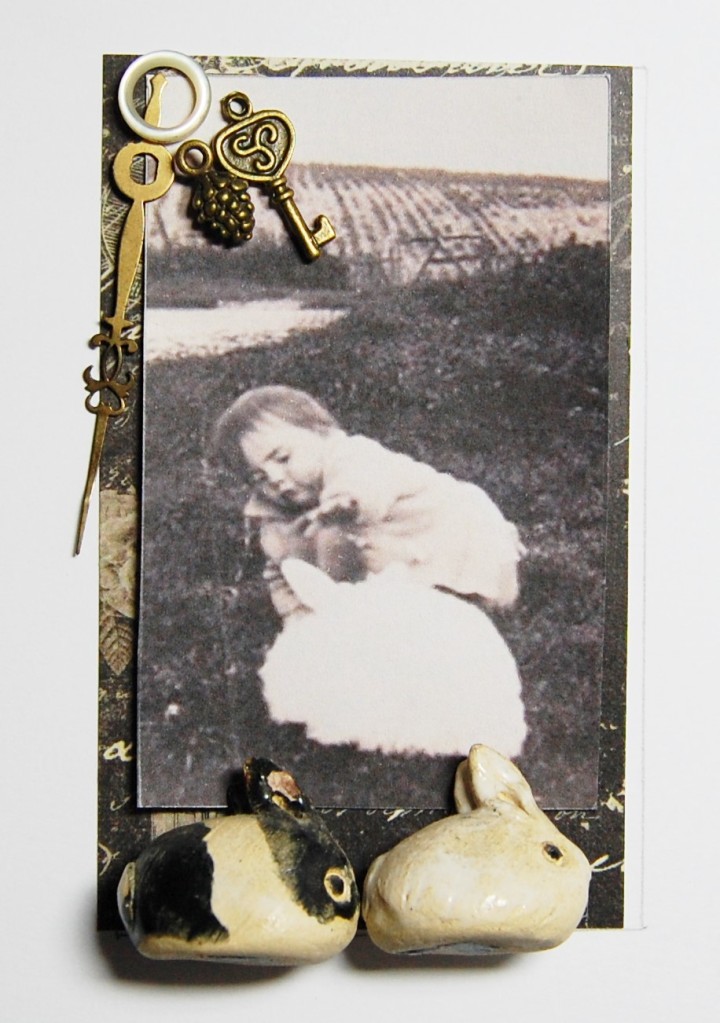
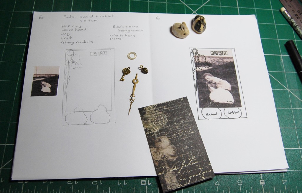
Left, Metal disc, metal key charm. Right, metal bow charm (changed from original plan), ceramic rabbits.
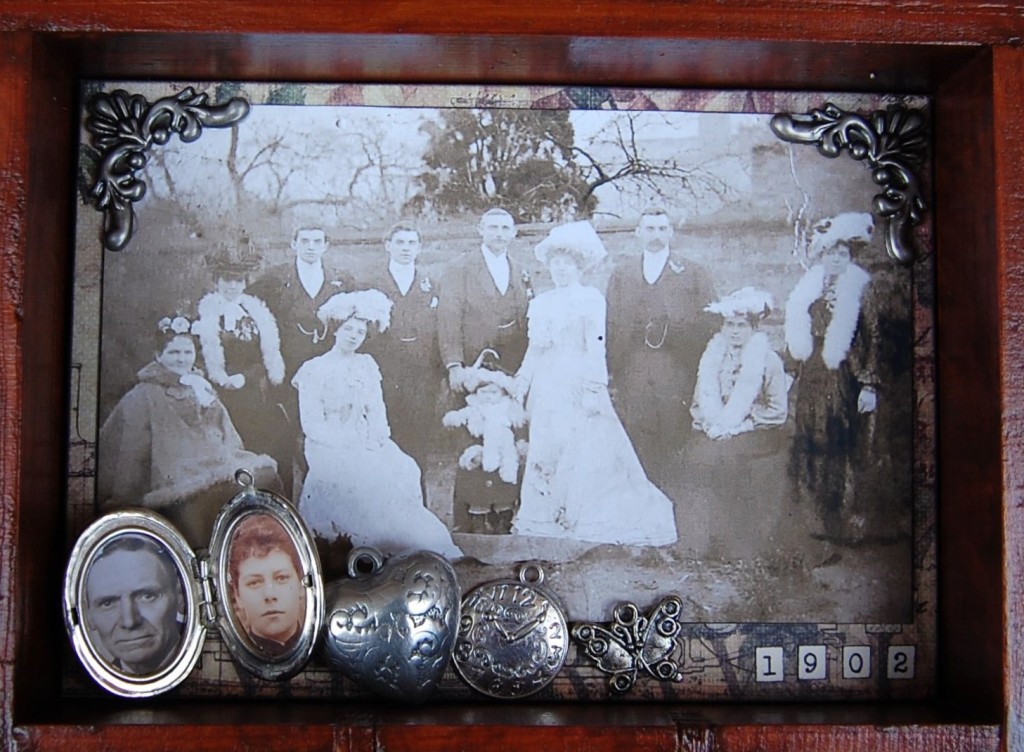
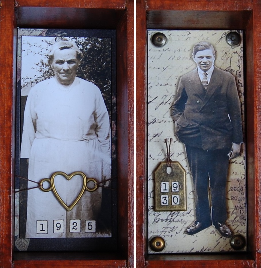
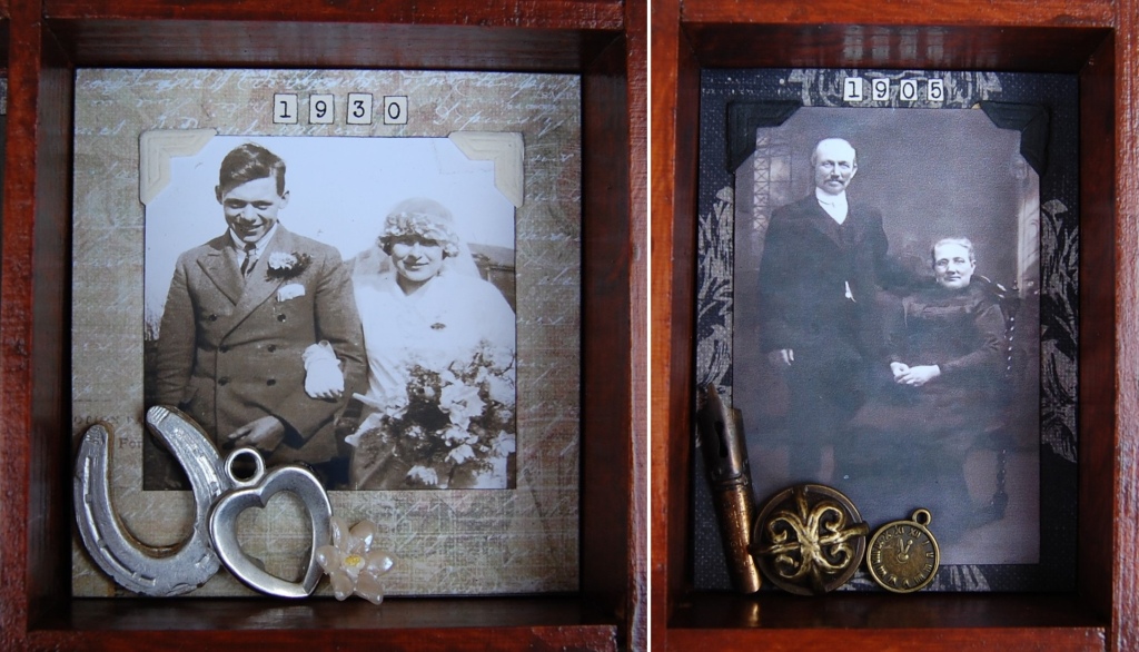
Metal corners, old locket, metal heart charm, metal watch face charm, metal butterfly charm. Note – The couple in the locket are the same couple just married in the photo.
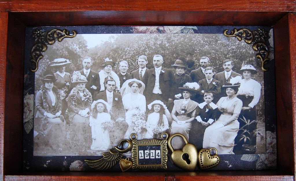
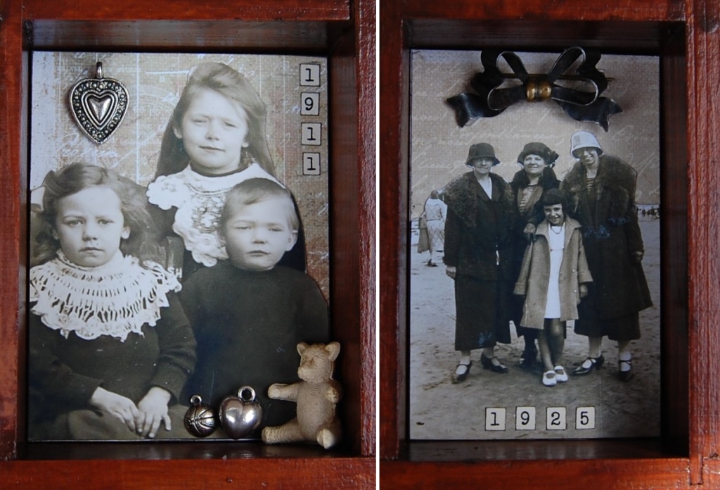
Metal corners, metal wing charm, metal frame, metal heart lock charm, metal heart charm.
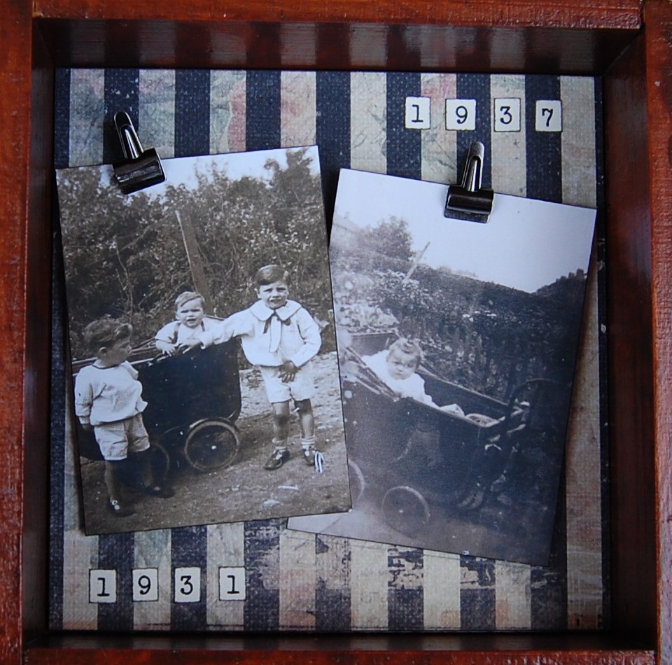
Left, silver brads, metal policeman’s helmet. Right, Metal finials, metal card holder, tiny metal bulldog clip.
Left, paper photo corners, ceramic sheep. Right, Metal corners, metal cogs.
Left, Metal heart charm on thread. Right, metal beads, metal tag.
Two tiny bulldog clips
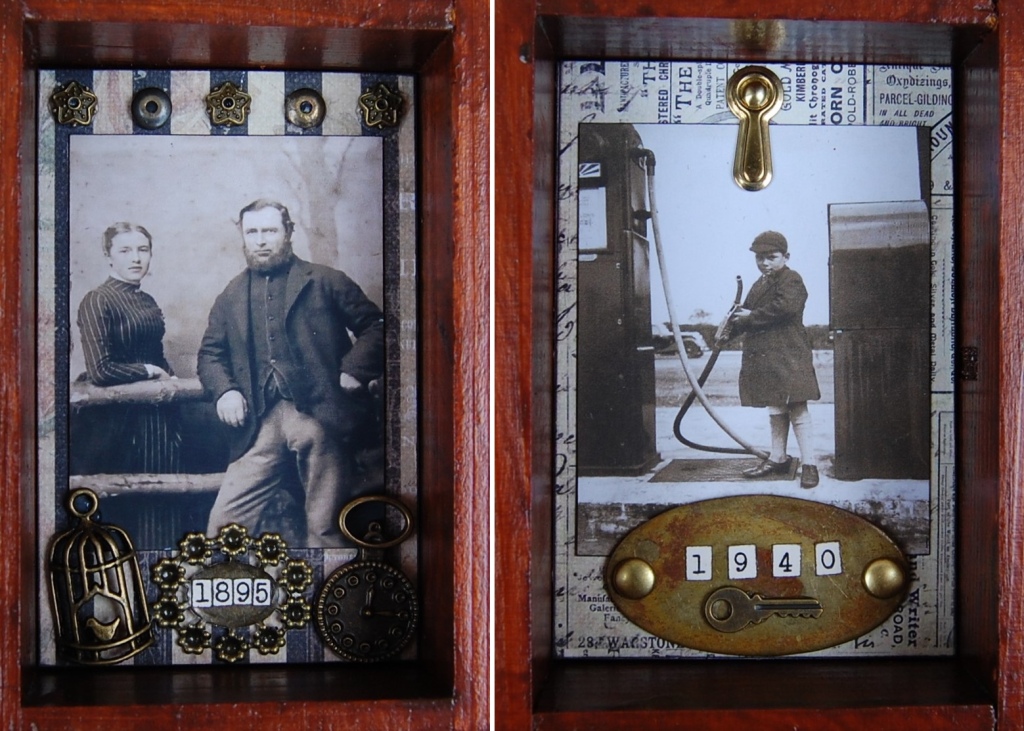
Left, Metal finials and beads, metal bird cage charm, metal frame, metal watch face charm. Right, metal photo anchor, metal plaque with paper fasteners, metal key charm.
Top, vintage buttons. Bottom, metal key charm, metal frame, metal star charm all on chain.
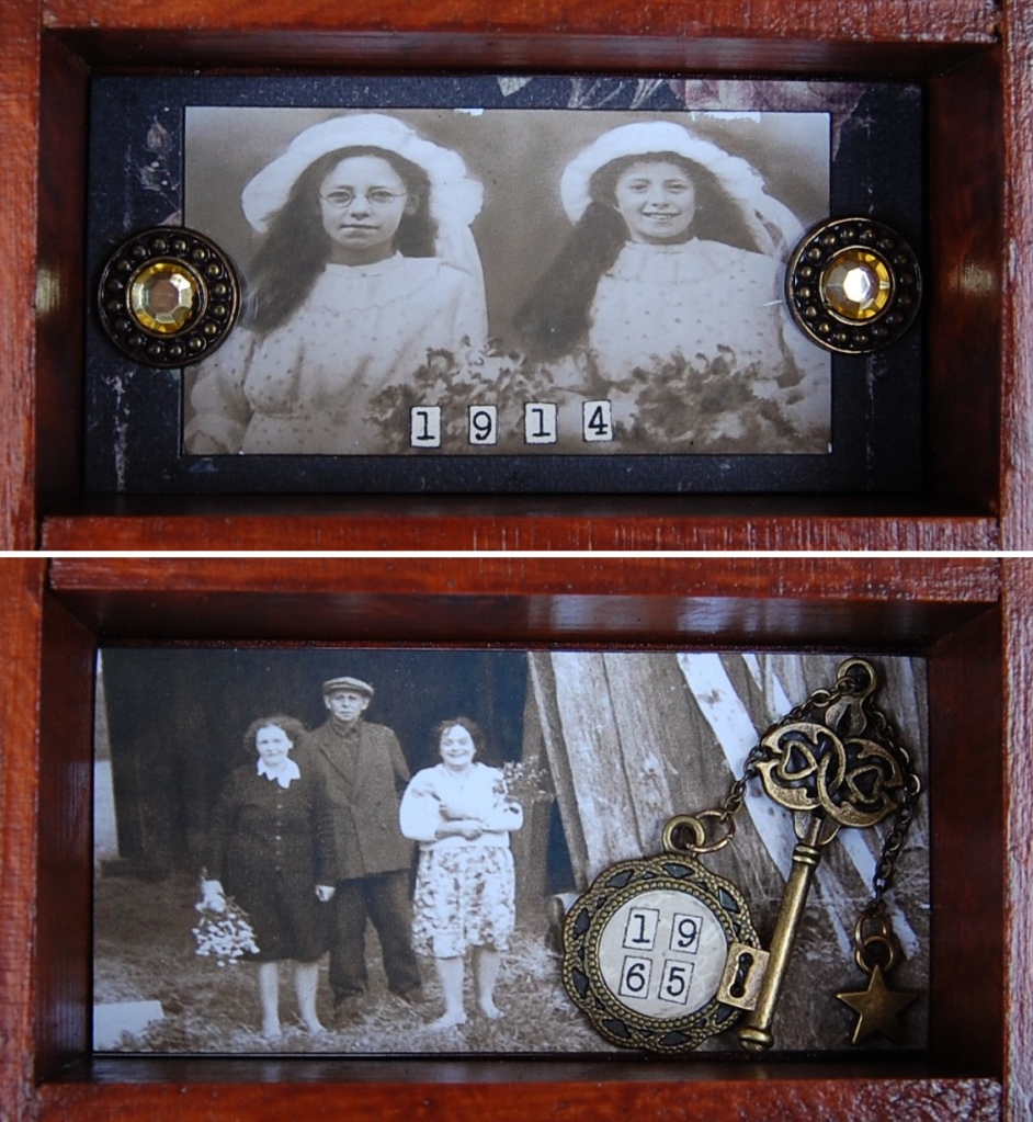
Top left, metal frame, chain, brads. Middle, nil. Right, Metal heart charm, metal star charm on thread. Bottom left, original frame. Middle, nil. Right, nil.
Left, glass bottle with sweeteners for tablets, metal watch face charm, metal cross. Right, metal frame on thread.
Left, paper photo corners, vintage card horseshoe cake decoration, metal heart, wax flower. Right, vintage pen nib, vintage button, metal watch face charm.
Left, metal frame, wax flower, vintage shoe cake decoration. Right, metal frame, wooden pointing hand.
Top, metal decals, vintage gold ring with bird cake decoration. Bottom, metal decals, metal watch face charm.
Top left, metal decals. Bottom right, metal disc. No embellishments on the the others.
Left, metal heart charms, metal ball charm, small vintage teddy. Right, metal bow brooch.
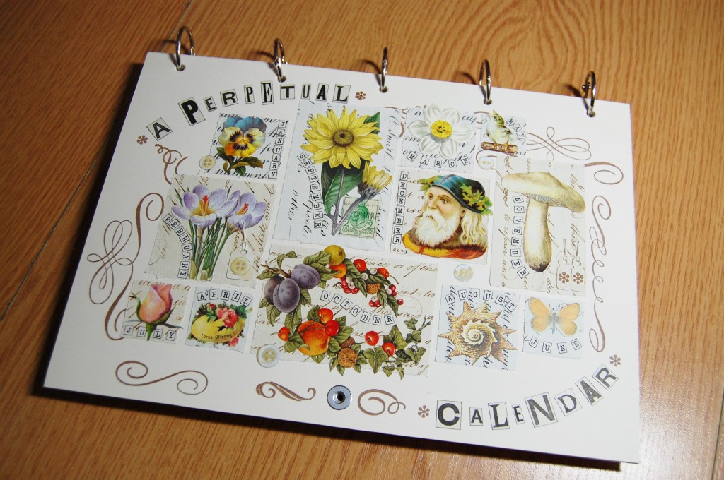
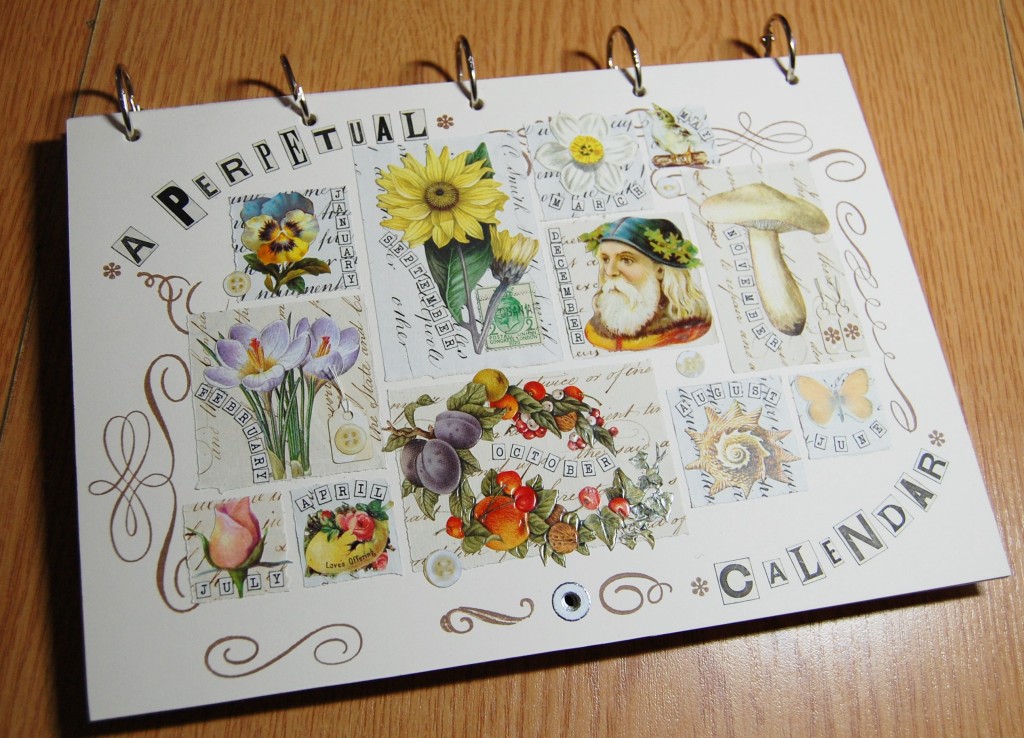
A Perpetual Calendar is a calendar that can be used for more than just one year. In this post I present a perpetual calendar that I made myself and describe the things included in it.
In a follow-up post I show just how the calendar was designed and made (link at the end of this post).
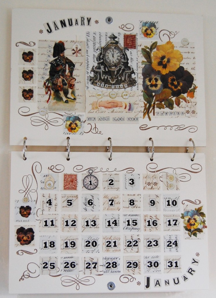
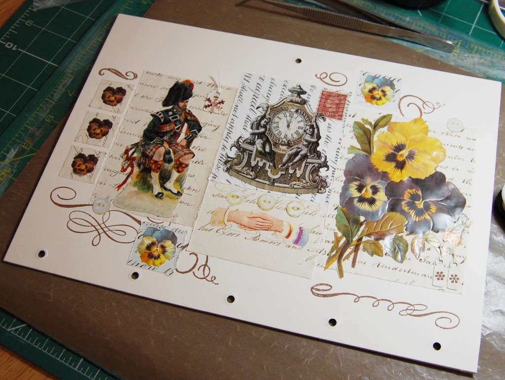
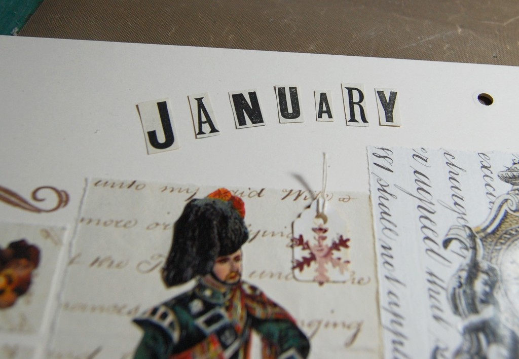
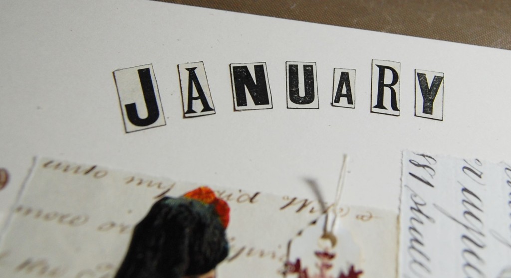
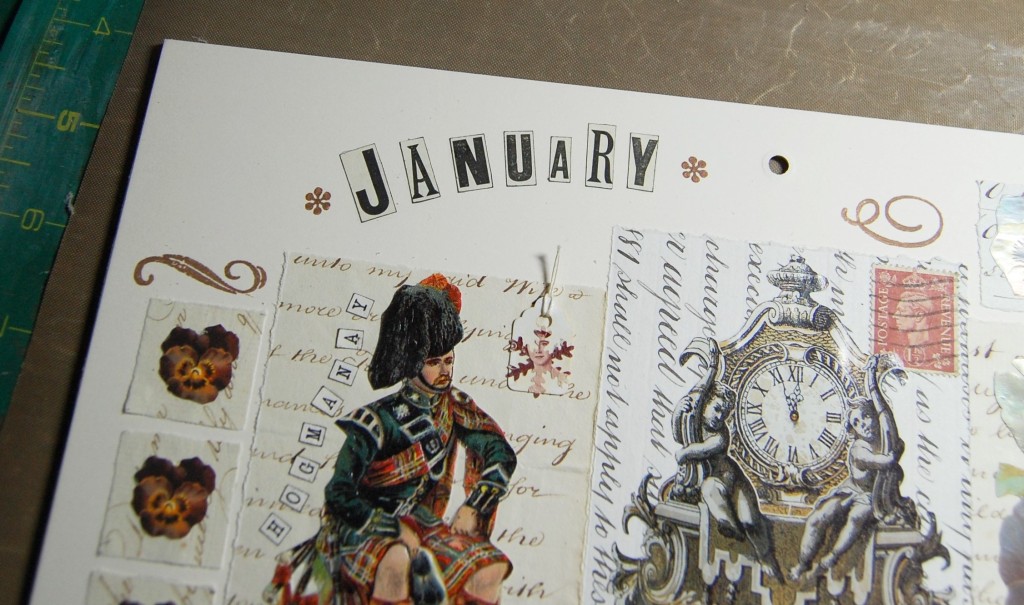
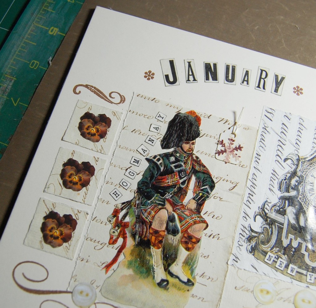
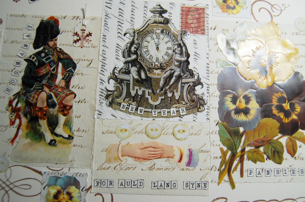
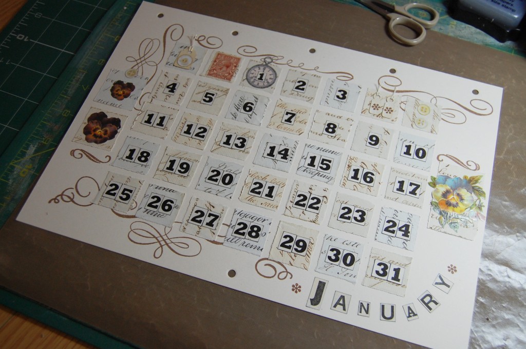
January
January decorative and date pages.
January decorative page in close up.
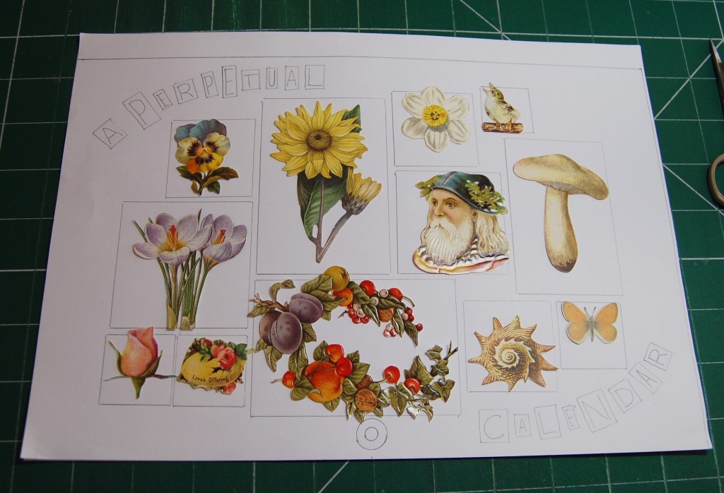
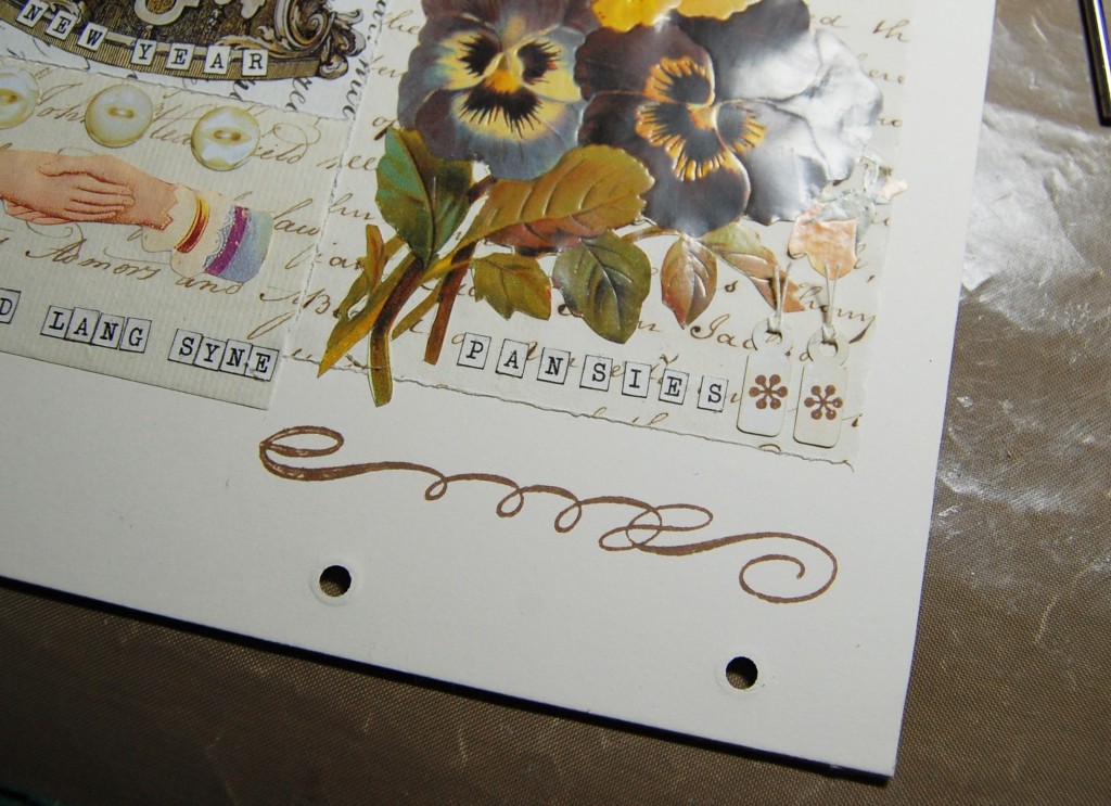
Images chosen for the January decorative page – winter pansies, Scottish piper (for Hogmanay), clock approaching twelve (for New Year), shaking hands (for Auld Lang Syne). Postage stamp, tags and paper buttons.
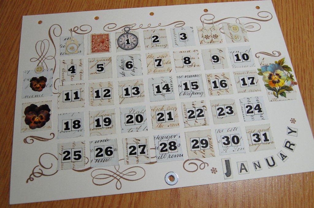
January date page in close up.
Images chosen for the January date page – winter pansies, pocket watch (for New Year on the 1st). Postage stamp, tags and paper buttons.
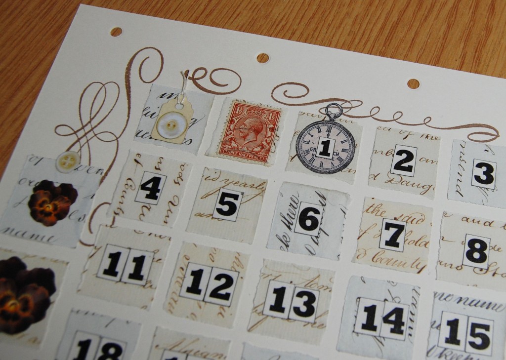
Detail from the January date page.
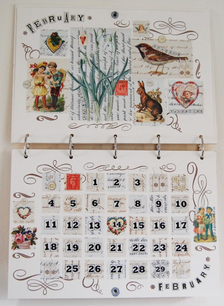
February
February decorative and date pages.
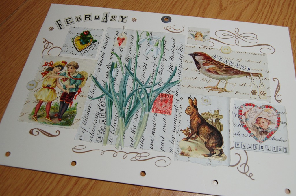
February decorative page in close up.
Images chosen for the February decorative page – snowdrops, rabbit in snow, sparrow, boy and girl scrap, heart scraps, angel scrap. Postage stamp, tags and paper buttons.
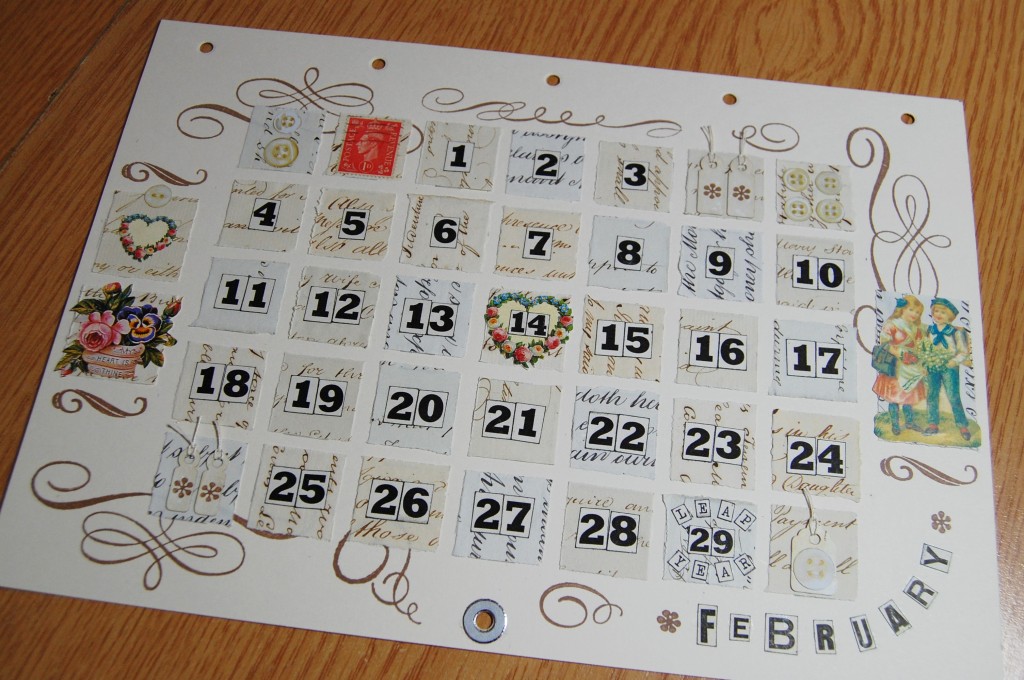
February date page in close up.
Images chosen for the February date page – basket of flowers, boy and girl scrap, heart scraps (one for Valentine’s Day on the 14th). Postage stamp, tags and paper buttons.
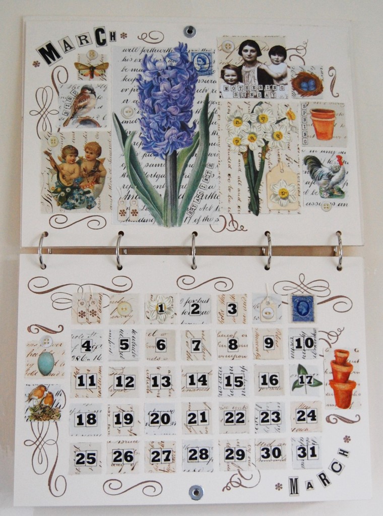
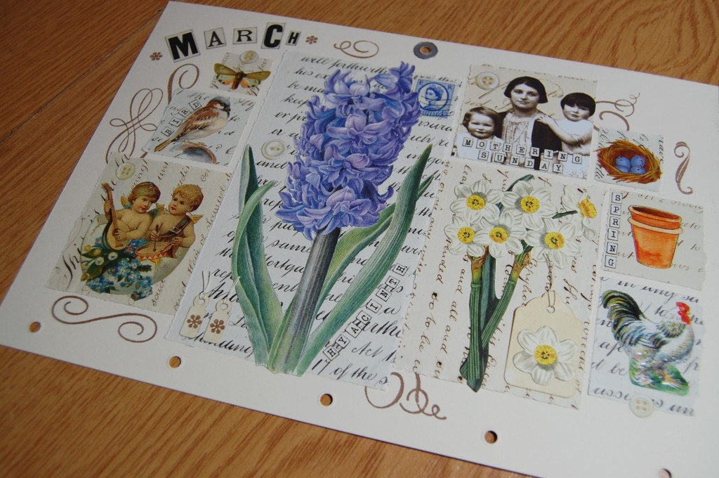
March
March decorative and date pages.
March decorative page in close up.
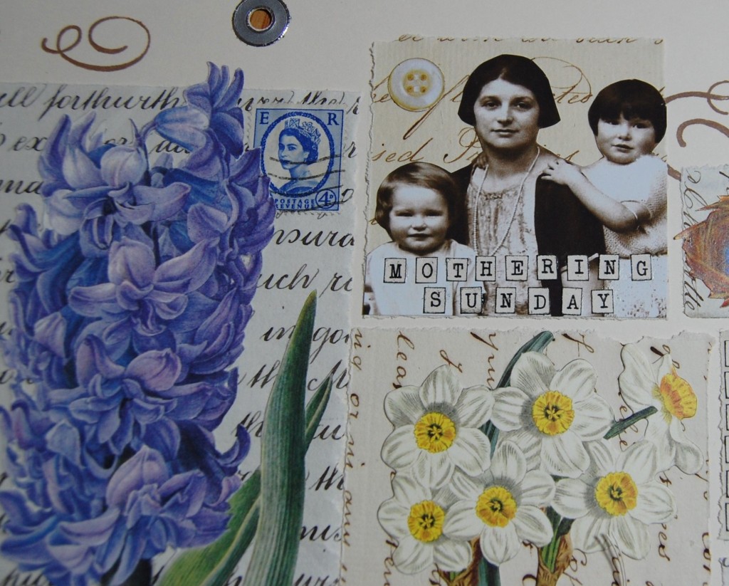
Images chosen for the March decorative page – blue hyacinth, daffodils, moth, bird, Easter scrap (sometimes Easter falls in late March), mother and children image (for Mothering Sunday), nest and eggs, garden pots, chicken.
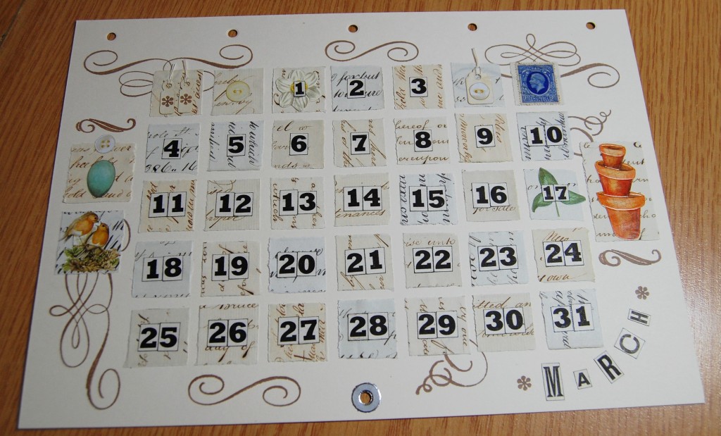
Detail from the March decorative page.March date page in close up.
Images chosen for the March date page – egg, nesting birds, garden pots, shamrock (for St Patrick’s Day on the 17th). Postage stamp, tags and paper buttons.
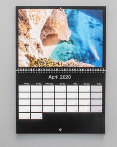
April
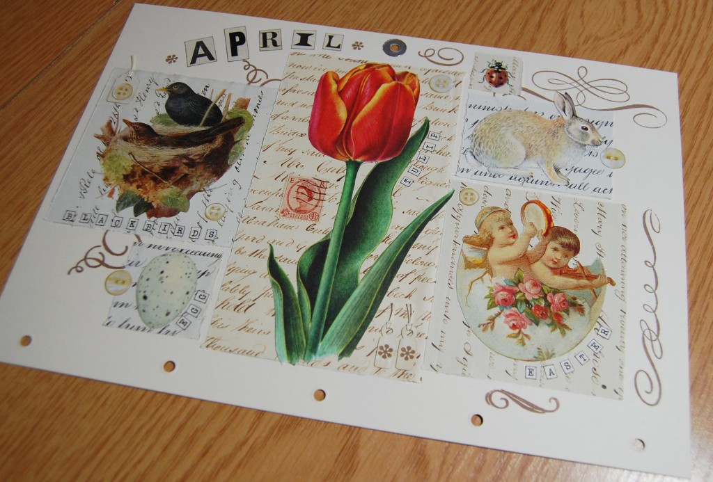
April decorative and date pages
April decorative page in close up.
Images chosen for the April decorative page – tulip, blackbirds nesting, egg, rabbit, Easter scrap. Postage stamp, tags and paper buttons.
April date page in close up.
Images chosen for the April date page – ladybird, Easter egg scrap, lamb, joker (for April Fool’s Day on the 1st), English flag (for St George’s Day on the 25th). Postage Stamp, tags and paper buttons.
May
May decorative and date pages.
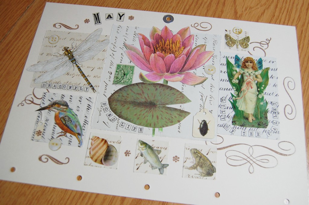
May decorative page in close up.
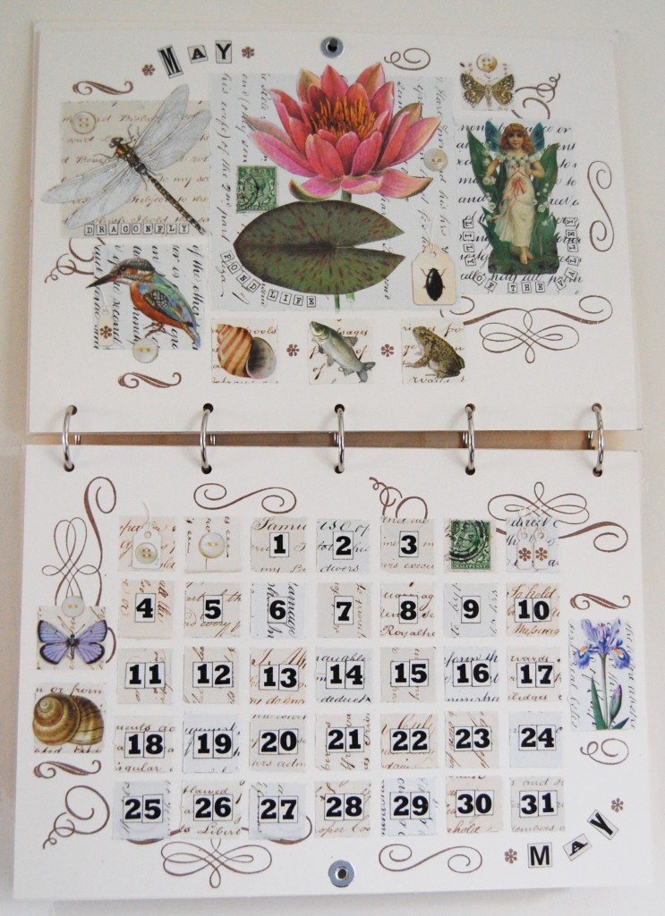
Images chosen for the May decorative page – water lily, dragonfly, kingfisher, pond snail, fish, frog, whirligig beetle, lily of the valley fairy, butterfly. Postage stamp, tags and paper buttons.
May date page in close up.
Images chosen for the May date page – butterfly, pond snail, iris. Postage stamp, tags and paper buttons.
June
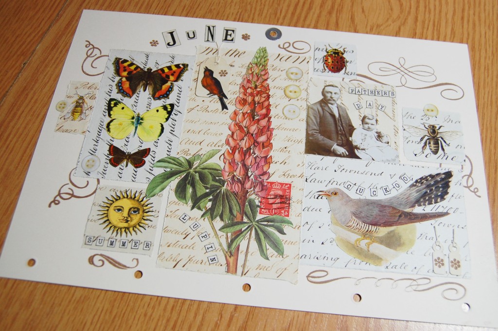
June decorative page in close up.
Images chosen for the June decorative page – lupin, butterflies, wasp, sun, cuckoo, father and child (for Father’s Day), ladybird, honey bee. Postage stamp, tags and paper buttons.
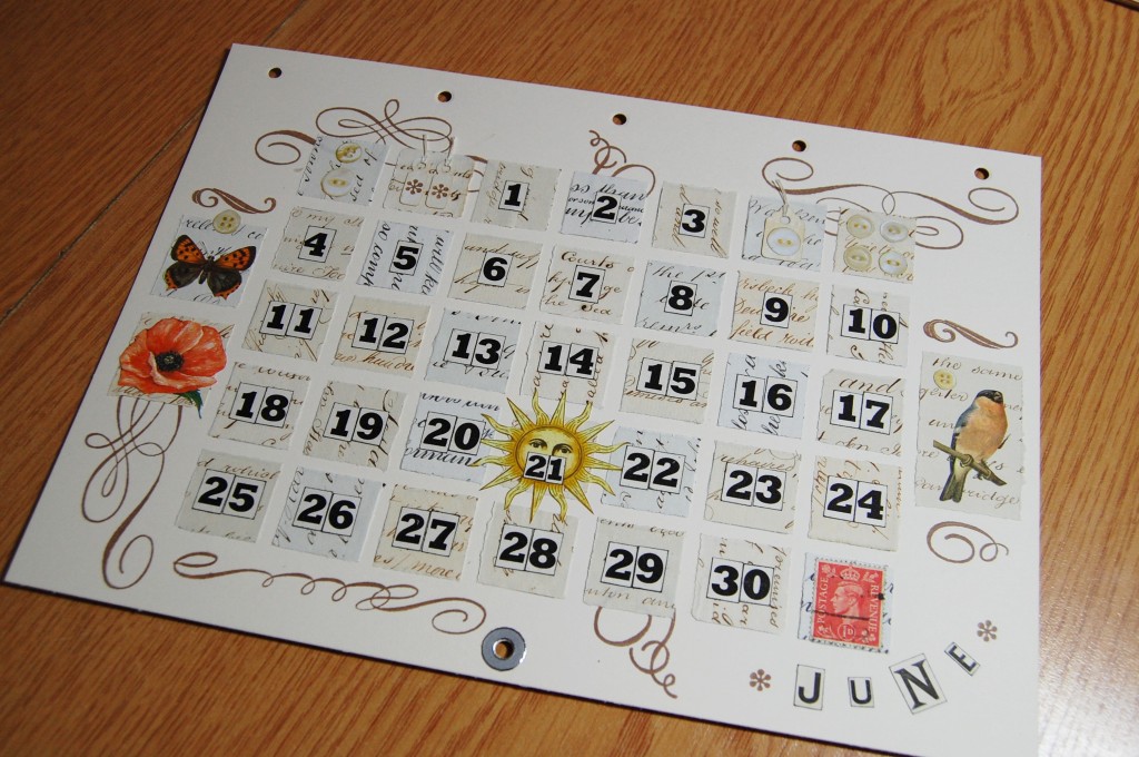
June date page in close up.
Images chosen for the June date page – butterfly, poppy, bird, yellow sun (for the summer solstice on the 21st). Postage stamp, tags and paper buttons.
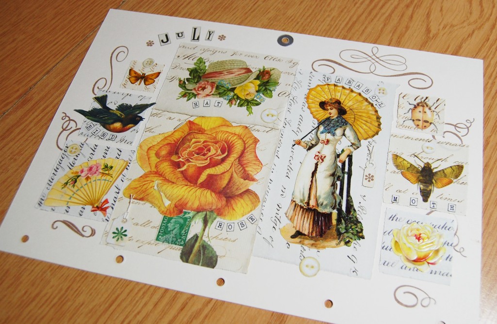
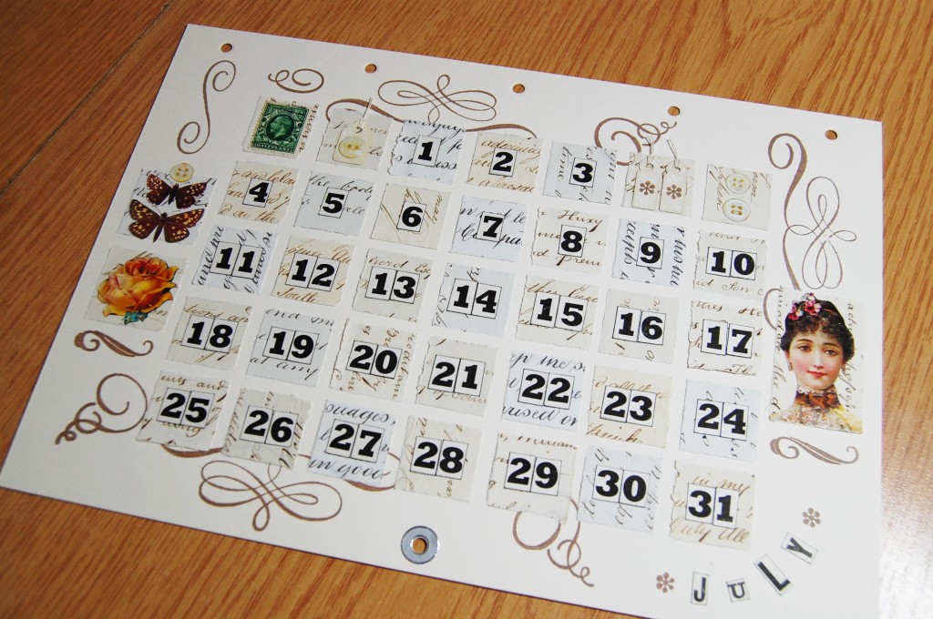
July
July decorative and date pages.
July decorative page in close up.
Images chosen for the July decorative page – rose, sun hat scrap, lady with a parasol scrap, fan, bird, butterfly, ladybird, moth, small rose scrap. Postage stamp, tags and paper buttons.
July date page in close up.
Images chosen for the July date page – butterflies, rose, lady’s portrait scrap. Postage stamp, tags and paper buttons.
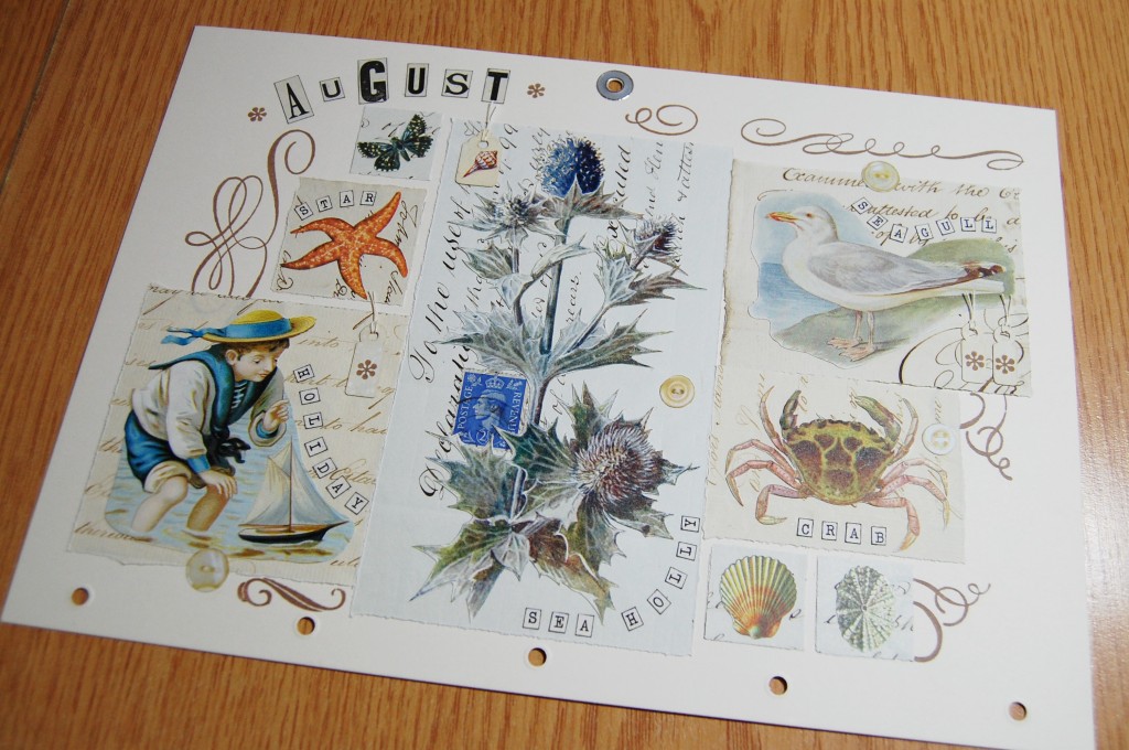
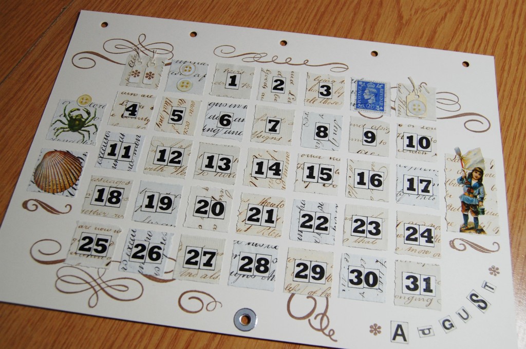
August
August decorative and date pages.
August decorative page in close up.
Images chosen for the August decorative page – sea holly, boy and boat scrap, star fish, butterfly, seagull, crab, shells. Postage stamp, tags and paper buttons.
August date page in close up.
Images chosen for the August date page – crab, shell, child scrap. Postage stamp, tags and paper buttons.
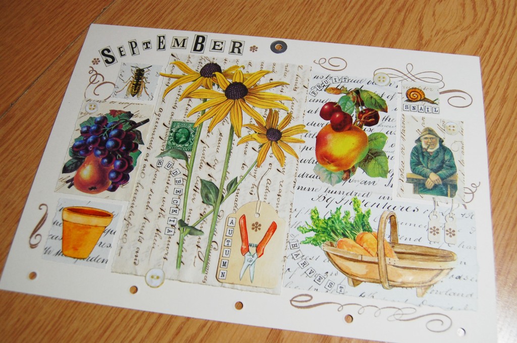
September
September decorative and date pages.
September decorative page in close up.
Images chosen for the September decorative page – rudbeckia, wasp, fruit scraps, garden pot, trug with carrots, old gentleman scrap, snail, garden shears. Postage stamp, tags and paper buttons.
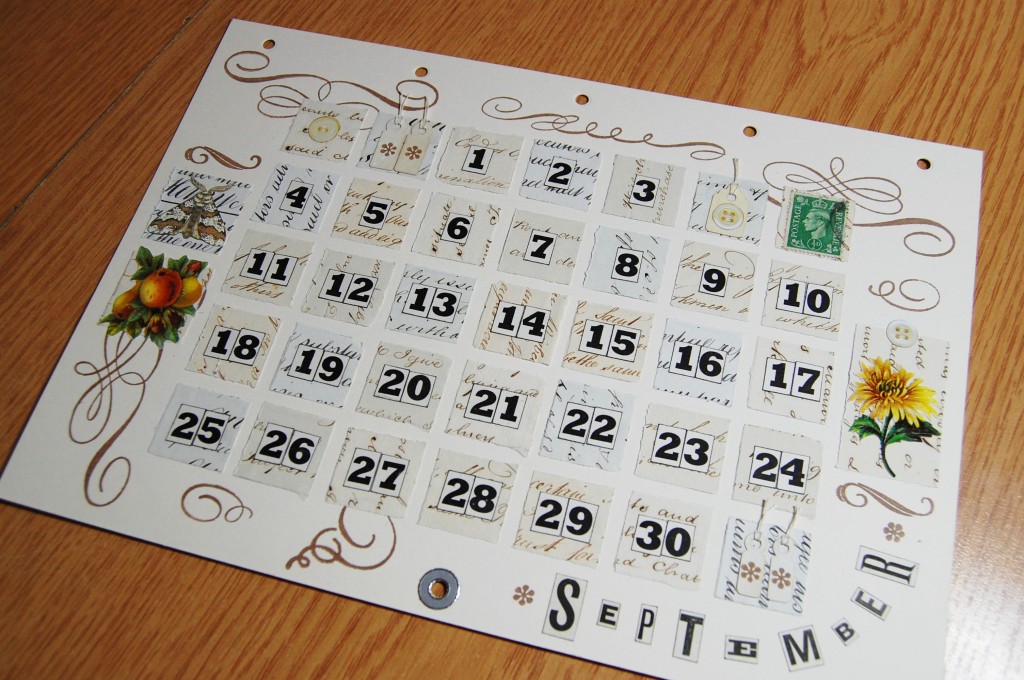
September page in close up.
Images chosen for the September date page – moth, fruit scrap, flower scrap. Postage stamp, tags and paper buttons.
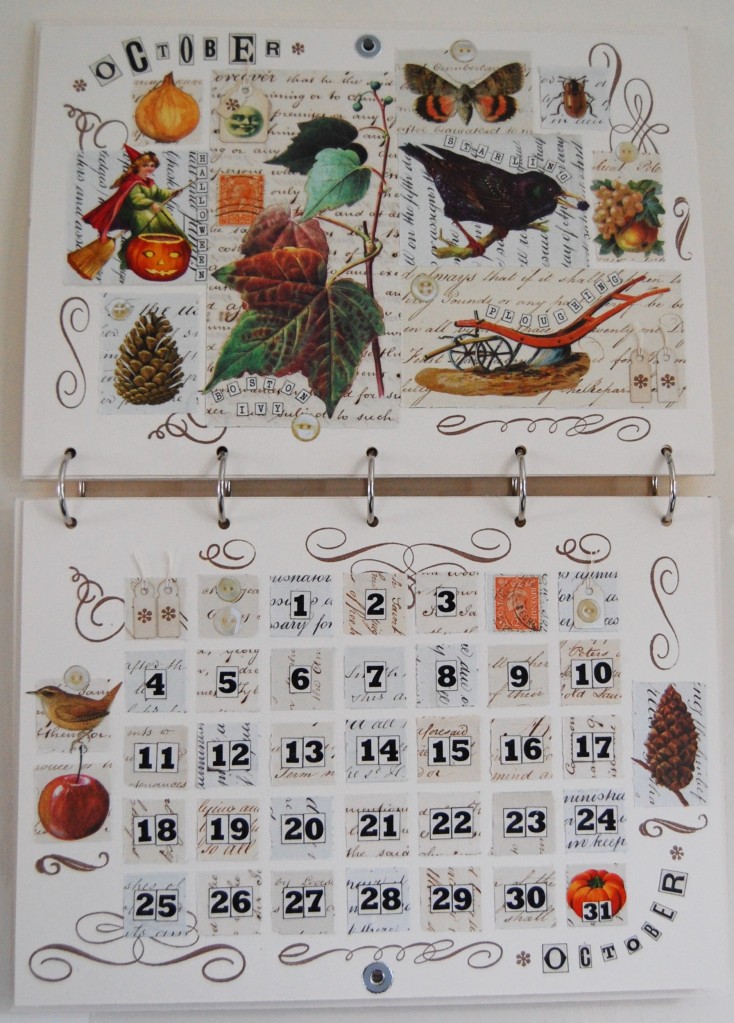
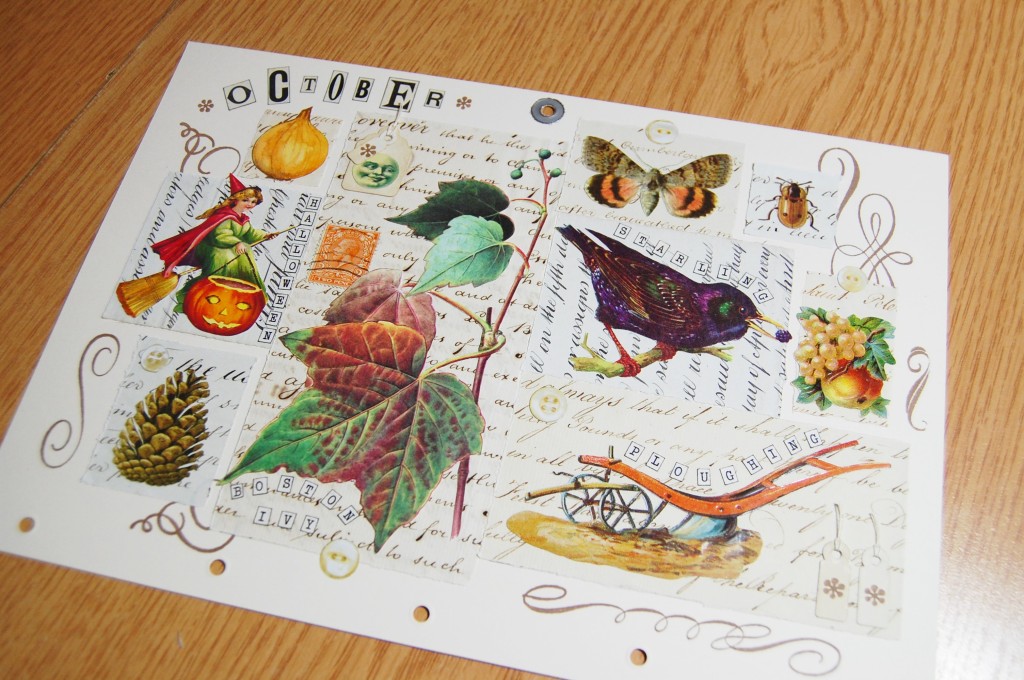
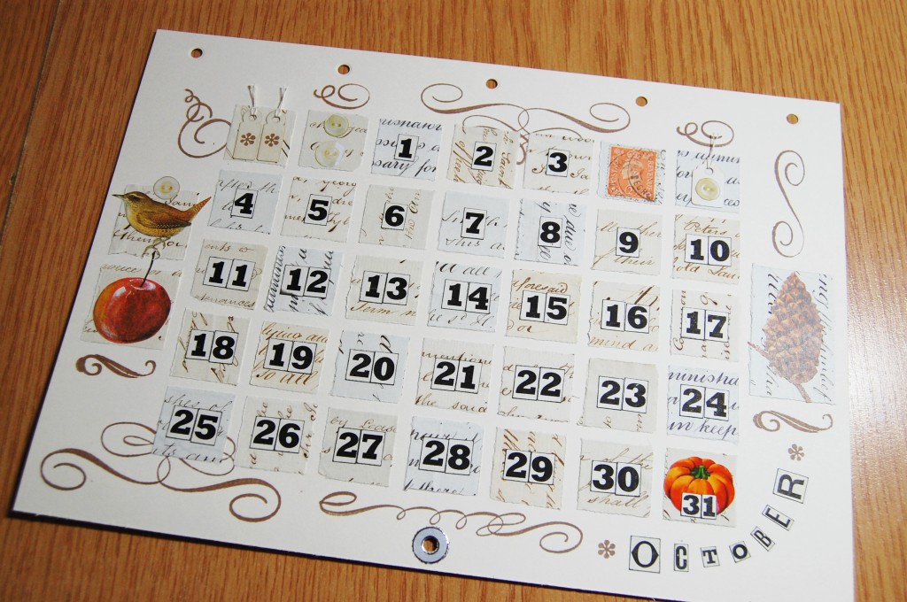
October decorative and date pages.
September decorative page in close up.
Images chosen for the October decorative page – ivy, plough, starling, fruit scrap, moth, ladybird, moon face, onion, witch (for Halloween), pine cone. Postage stamp, tags and paper buttons.
October date page in close up.
Images chosen for the October date page – bird, apple, pine cone, pumpkin (for Halloween on the 31st). Postage stamp, tags and paper buttons.
November
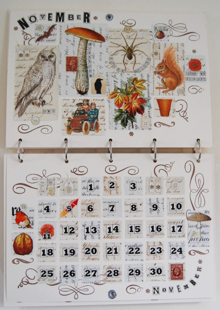
November decorative and date pages.
November decorative page in close up.
Images chosen for the November decorative page – owl, bat, mushroom, car scrap, autumn leaves scrap, spider, squirrel, garden pot, nut, poppy (for Remembrance Day). Postage stamp, tags and paper buttons.
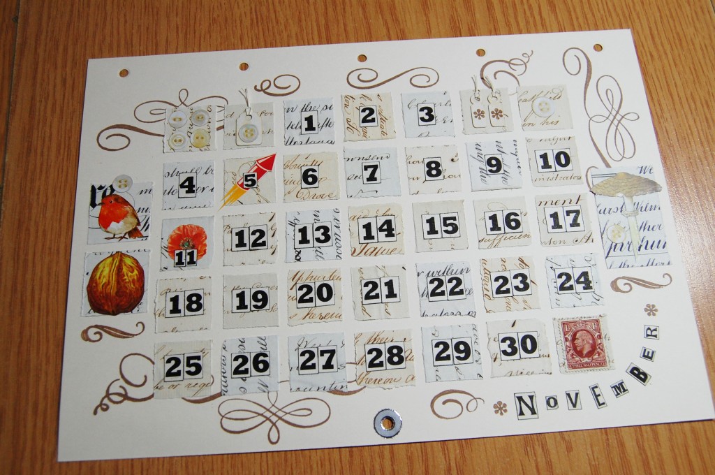
November date page in close up.
Images chosen for the November date page – robin, walnut, mushroom, firework (for Bonfire Night on the 5th), poppy (for Remembrance Day on the 11th). Postage stamp, tags and paper buttons.
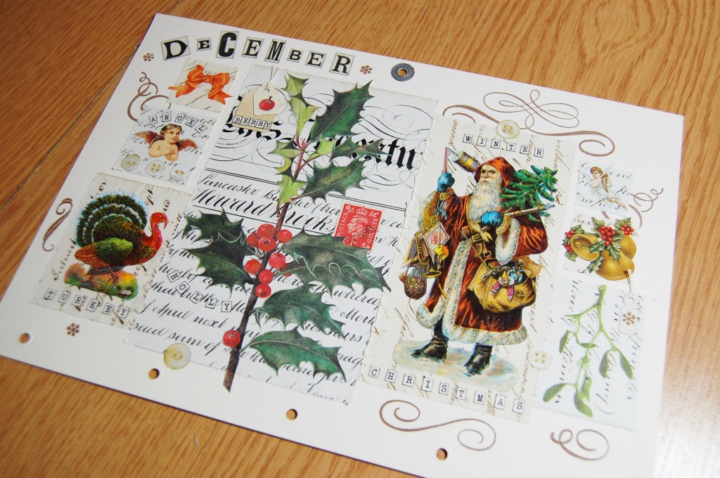
December
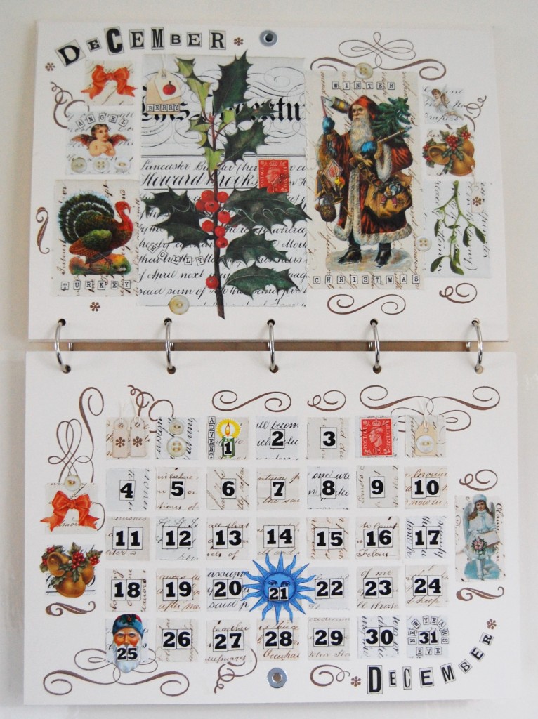
December decorative and date pages.
December decorative page in close up.
Images chosen for the December decorative page – holly and berries, Santa, turkey, angels, red bow scrap, bells, mistletoe. Postage stamp, tags and paper buttons.
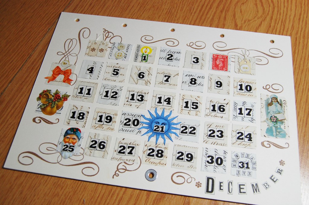
December date page in close up.
Images chosen for the December date page – red bow scrap, bells, Christmas angel, candle (for Advent on the 1st), blue sun (for the winter solstice on the 21st), Santa face (for Christmas Day on the 25th). Postage stamp, tags and paper buttons.
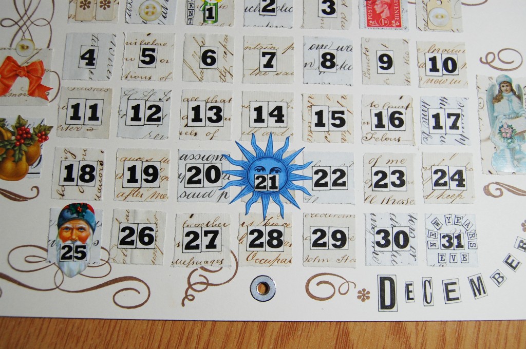
Detail for the December date page.
See Part Two for the making of this calendar project.
A Perpetual Calendar is a calendar that can be used for more than just one year. This is the story of how I made a Perpetual Calendar of my own.
Concept
Apart from various Advent Calendars I have never made a ‘proper’ calendar before so I thought it was about time I did so. My first idea was to design a calendar for the year 2022, as it was already October 2020 and too late to make one for 2021. After initially exploring how I would present the dates and days of the week it became apparent that if I wanted to make the best calendar I possibly could, it would be time consuming and more involved than I originally thought – a shame then to only have the calendar on show for one year. What I needed was to find a way of being able to keep the calendar up on the wall for many years to come. A Perpetual Calendar seemed the only way, so that’s what I decided upon.
Calendar Style
I had a clear idea of what I wanted the calendar to look like from the beginning. I wanted an A4 landscape oriented wall calendar. It would hang on a nail from a hole set near the bottom of the front cover, and once hung there would be a decorative page at the top and a page of dates underneath. To change the month, you would just flip the bottom page up and hook it onto the nail.
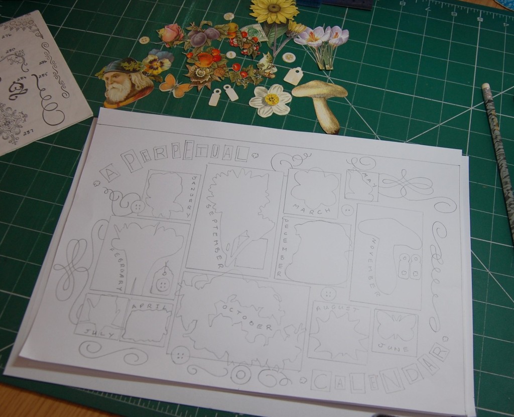
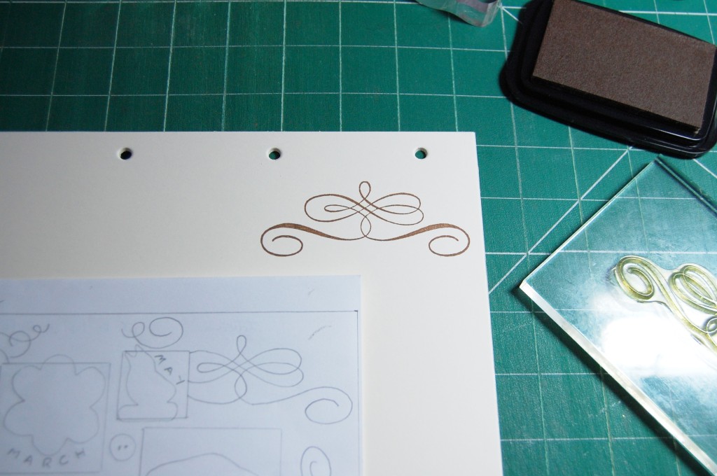
I decided to use card as the basis for the calendar, and join all the pages together with metal book rings. The front and back covers would be A4, while the inside pages would be slightly smaller. With this in mind I made a card template in the size of the pages (28.5 x 19cm) so I could design each page to the correct size.
Style of calendar I would make
Choosing Materials and Designing
When it came to the look of the calendar, again I had a clear idea from the outset. I knew I wanted to use a plain background with illustrations and scraps stuck on to script paper mats. The plain areas would then be stamped with old fashioned scrolls and accents. With this in mind, I started putting together my first design. In the next section we look at this process in detail with the ‘February’ page.
Designing a Decorative Page
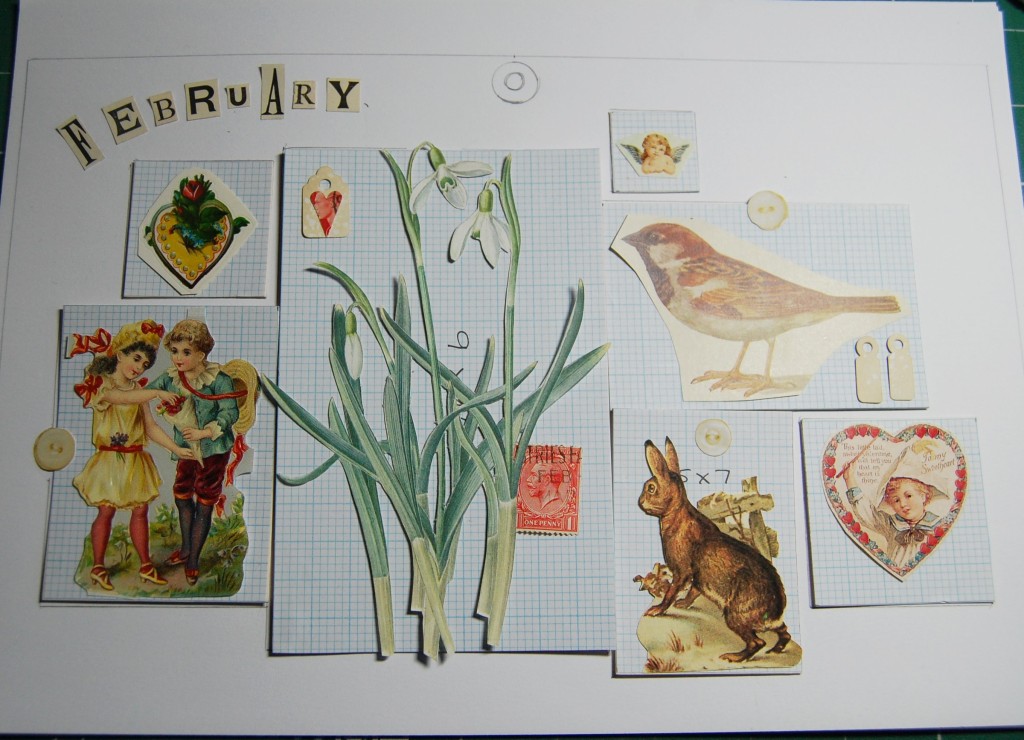
So, having established there are ‘decorative’ pages and ‘date’ pages, this first part focuses on the February decorative page – basically, things you would see in the month of February.
On a piece of A4 copier paper I drew around the page template I had made, then looked for appropriate images to use. I have a large collection of old books full of flower and wildlife illustrations, and a vast collection of Victorian scraps which I gathered together to find the images I wanted. Thinking also about calendar events for the month of February, I wanted to include something for Valentines Day. This would be something to think about for other months too.
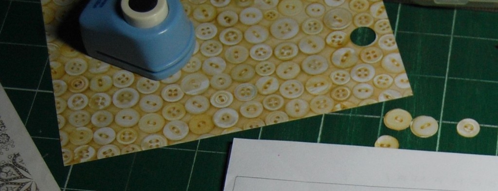
Button paper for cutting and punching.
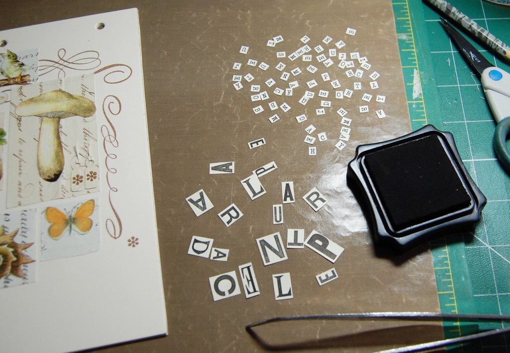
Once I had chosen a number of images I set them out on template blocks (that I made myself in various sizes from card and graph paper), to get the overall composition right. Some mats were placed so they were touching each other, while others were placed with a gap around them. I also thought about little details I could add to every page that would pull the whole calendar together. I chose old stamps, tea dyed tags and paper buttons – everything would need to be as flat as possible, so no real buttons could be used. I had some sheets of K&Co Life’s Journey button paper (above) which is ideal for punching and cutting out individual buttons.
I also decided on the title letters of each page at this stage. I used random letters cut from advertisements in a Victorian magazine. Below is the raw design as it looked at this stage.
First stage of designing the February decorative page.
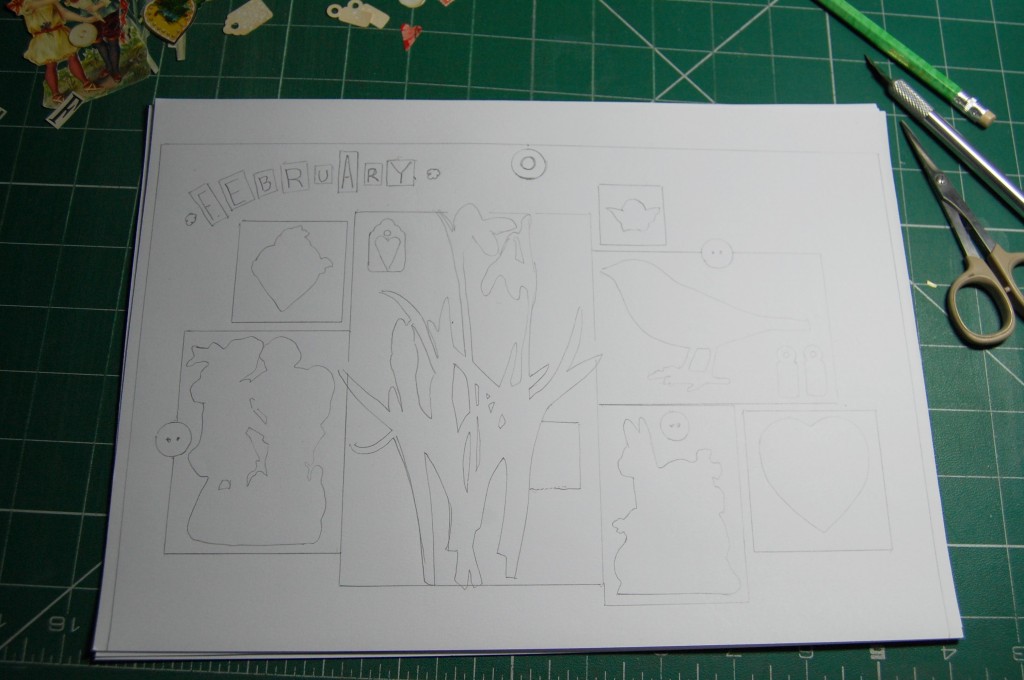
With the composition planned, the next step was to finish cutting around the images and then commit the design to paper. I drew around all the templates first and then the images, so I would have a record of where they were meant to go. The circle at the top of the page indicates where the hole would be punched on the finished page.
Transferring the design to paper.
As I would be adding some stamped images to the plain parts of the page it was necessary to choose the stamps I would be using and decide where they would be placed. I have a few sets of Anna Griffin scroll and accent stamps, and when I first purchased them I stamped one of each image on to sheets of paper so I can see at a glance what stamps I have.
My sheets of stamp samples.
The great thing about making a sample sheet of stamps like this is that you can use them under your design sheets to trace the images on to your design to really see how they will look. So, by tracing the images on to my design at this stage I was able to avoid the areas which would be covered by the script paper mats and plan where they should all go. I chose seven stamps in varying sizes and these seven would be used on every page in differing positions.
Tracing a scroll onto the design sheet.
With the scrolls added to the design, it was just a case of adding some ‘words’ to some of the images. These would be made up of individual cut letters and stuck in the positions indicated on the design. The design of the February decorative page was now complete.
The finished design.
Designing a Date Page
Thought processes for the date pages included printing off sheets of calendar pages from the internet, or making my own on the computer to print off, but in the end I knew I wouldn’t be happy with them unless I constructed them like I do everything else, with mats and cut numbers. I knew it would be time consuming and absolutely loads of numbers would be needed, but the end results would be worth it. As it was a perpetual calendar there would be no need to add days of the week as days and dates change every year.
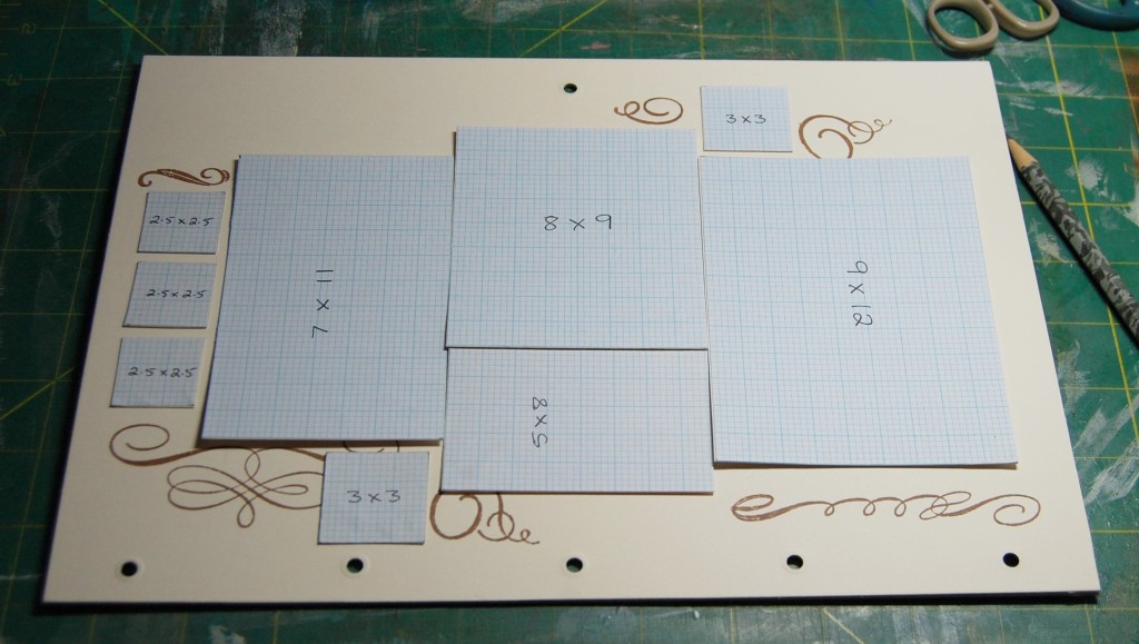
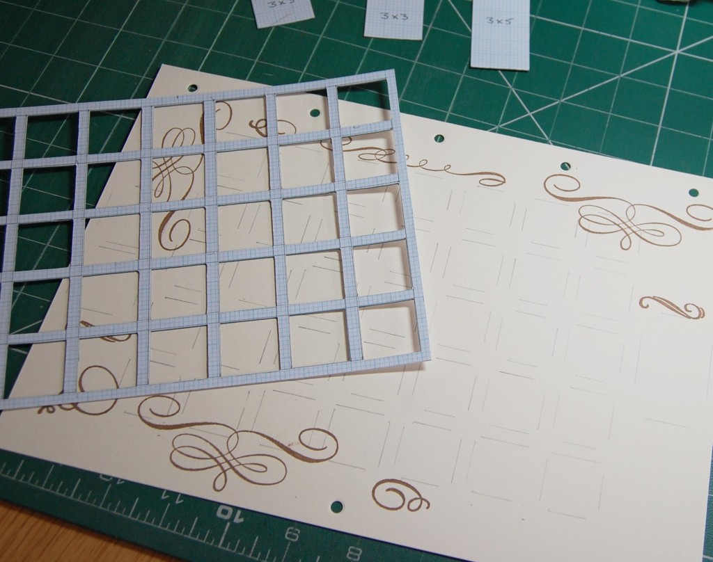
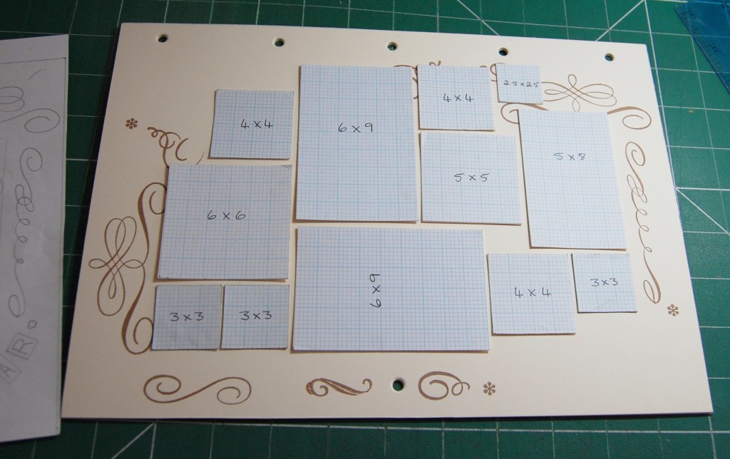
I decided to stick to the script paper mats which would match in with those used on the decorative pages. I would need a grid of 35 small mats to make it look even and accommodate up to 31 dates; the left over squares could then be used for little details like the stamps, buttons and tags used on the main pages.
Each mat would need to be 2.5cm square and 5mm apart from each other, this would then leave a decent sized border around the edges for stamping and additional mats. To ensure the grid would be as accurate as possible across all pages I decided to make a grid template out of card and graph paper, this could then be just placed on the paper and drawn around.
Making a grid template.The grid template cut out and ready for use.A design sheet with the grid transferred to the paper.
Number Crunching
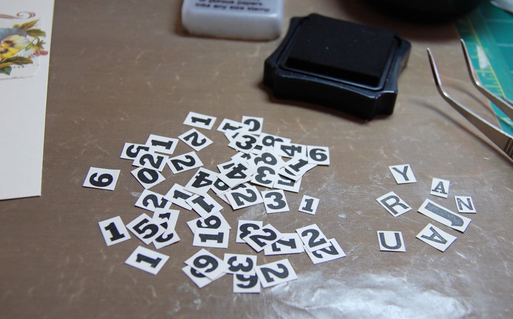
The next problem to solve was to decide where the numbers would come from and what they should look like. Normally I would cut letters and numbers from old books, adverts or magazines, but that just wasn’t feasible with so many numbers required – I would have to print them myself.
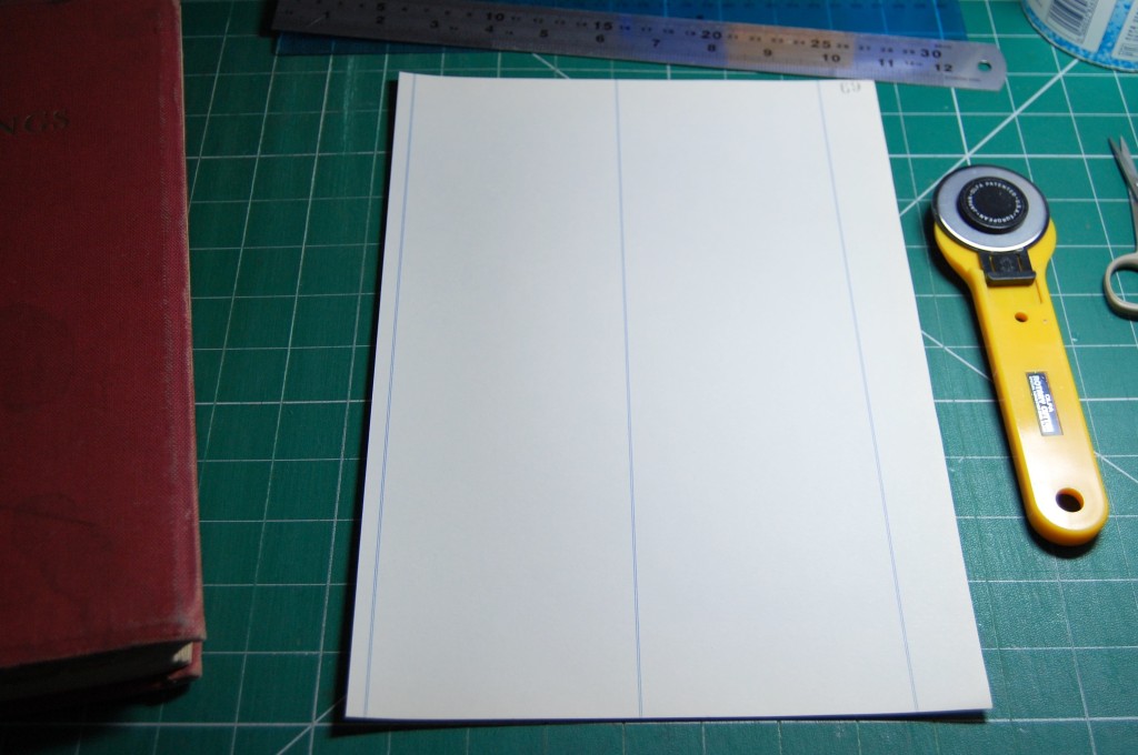
The best way of doing this to make them look authentic would be to choose a heavy, old style font and print onto aged paper. Luckily I had an old cuttings book (bought from an antiques fair), which had lots of unused pages in it. Yes, there were a couple of blue lines on each page, but any numbers printed on the lines could be discarded. The paper was also a nice heavy quality and the creamy colour gave it the aged look I was after.
The cutting book and it’s unused pages.
The pages of the book were larger than A4, so it was just a case of removing a few pages and cutting them down to A4 so they would run through my printer.
One of the pages trimmed to A4 size.
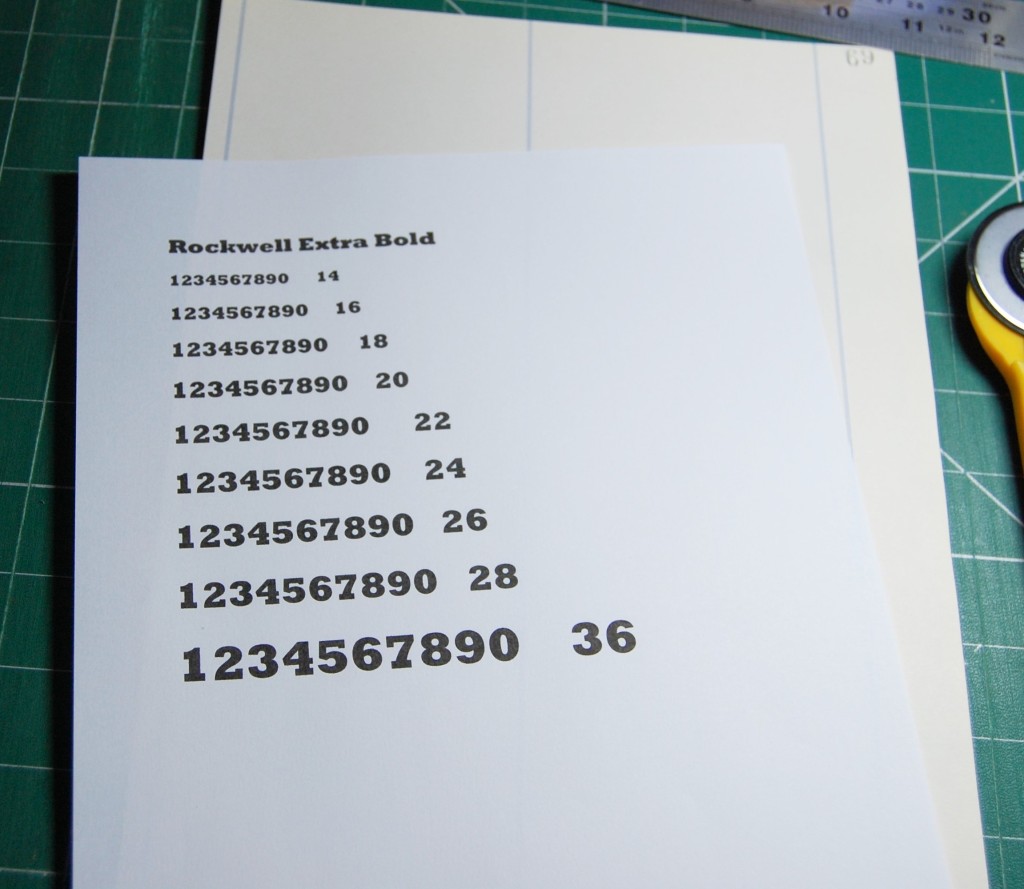
Next, in Word I chose the font I wanted to use, ‘Rockwell Extra Bold’, and printed it out a few times in different sizes to try out on the mats.
Number samples.
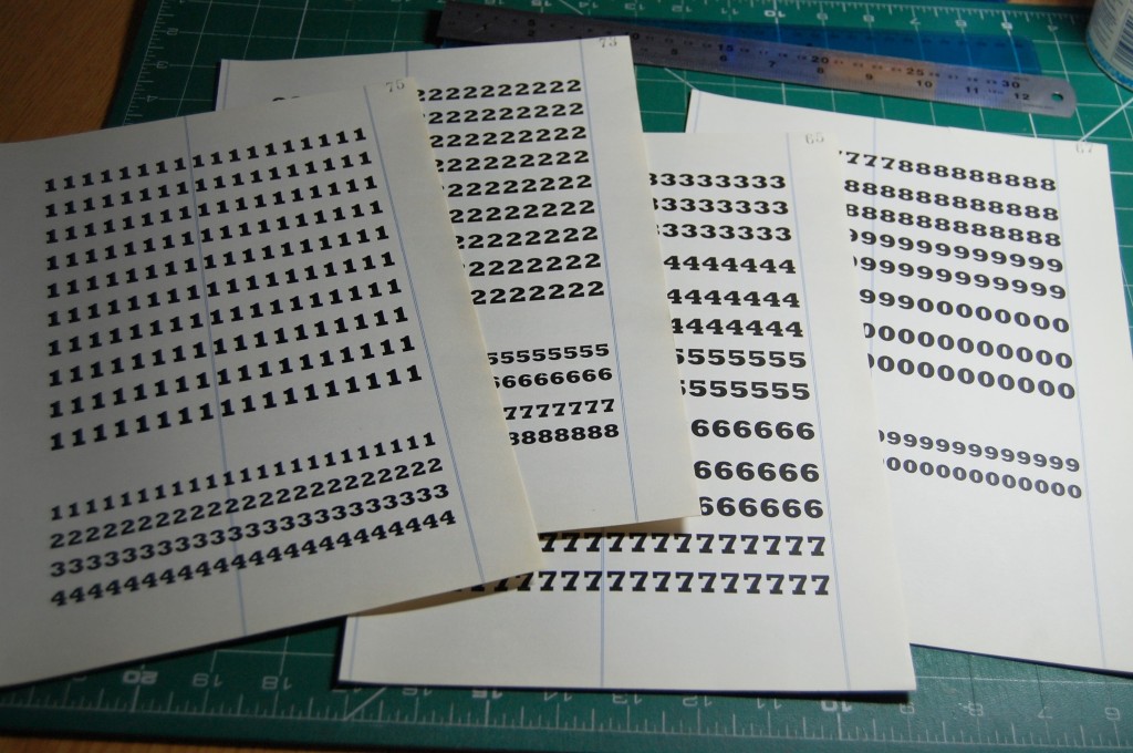
The size best suited to the mats was the 36 count (largest), but I would also need some smaller numbers for using over date specific images, such as over a Valentine’s heart for the 14th of February, or over a Christmas image on the 25th of December. So I decided to print out some of the 28 count numbers too. I had already worked out roughly how many of each number I would need, ensuring I didn’t print too few, or go completely over the top and print too many. I printed a sample sheet of numbers first to make sure they were what I wanted, then I printed them on the cut pages from the book.
The printed number sheets.
Once the numbers were prepared it was just a case of finalizing the design. I decided to put the first three numbers in the centre of the top row, that way, if a month had 31 days, the remaining squares on the rows below would all be filled with numbers. Shorter months would have a spare square or two at the end to be filled with decorative details. Extra mats were added to each side of the date grid for images to be placed in. Stamping would be added to mirror that on the decorative pages and a title added to the bottom right corner.
Finished pencil design of the January date page.
The Front Cover
For the front cover I wanted to represent each month of the year with an appropriate image and make the design similar to the inside designs. Once again I chose to mat on script paper, but instead of some mats touching, I decided to keep a small gap between them all. This meant the front cover would look slightly different, but still fit with the other designs.
Deign for the front cover in progress.
I started out by playing around with different shapes and sizes of templates until I had twelve potential blocks in a composition I was happy with. I then sourced images for each block as in the photo above. I then picked out some random letters for the title which was placed around the two opposite corners like on the inside pages.
The finished design.
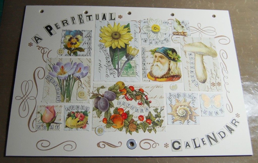
The photo above shows the finished design. The stamping positions have been added along with more of the little details from the body of the calendar, like the tags, buttons etc. Each image has a label too spelling out the name of it’s month.
The front cover was the last part to be designed and once complete it was time to move on to preparation.
Preparation
I like to have all the preparation done before I start making up my project, so as I designed each page all the cut out images were stored with the design in A4 files inside a ring bound folder. The first stage was designing each page and once that was done I moved on to preparing all the script paper mats.
My design folder and the script paper which would be used for the mats.
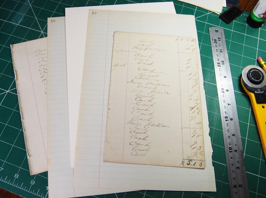
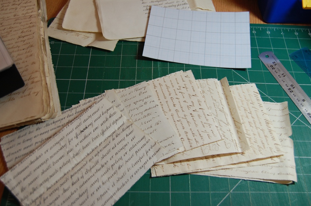
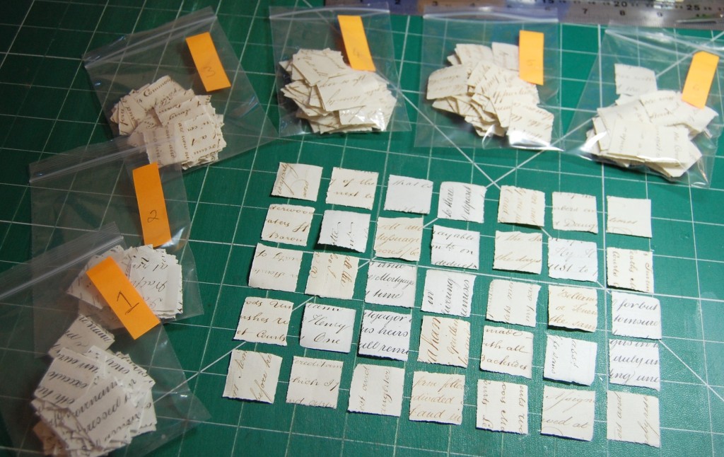
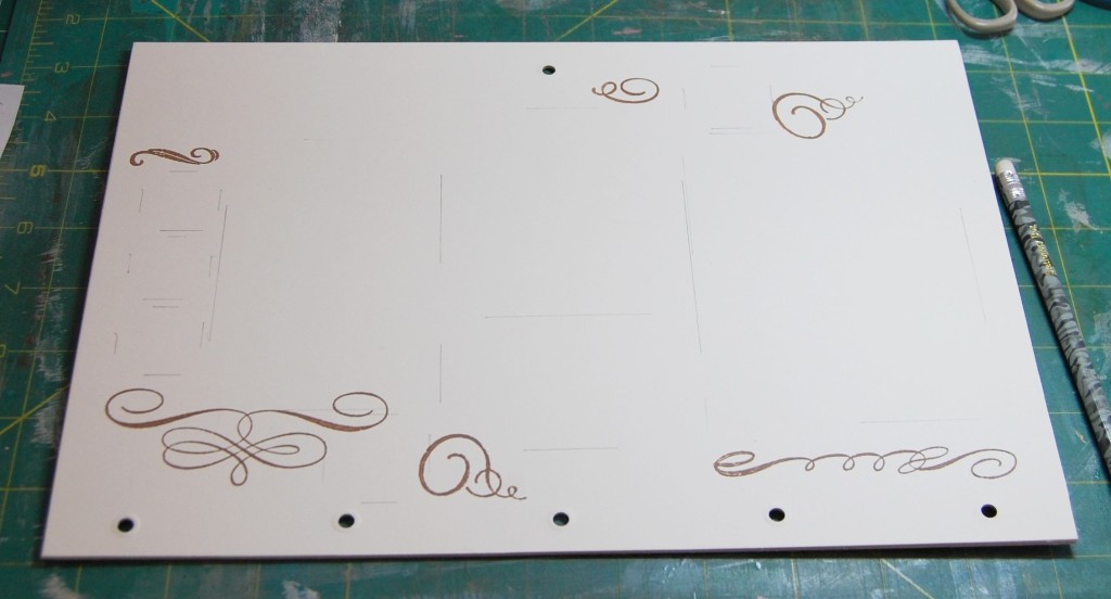
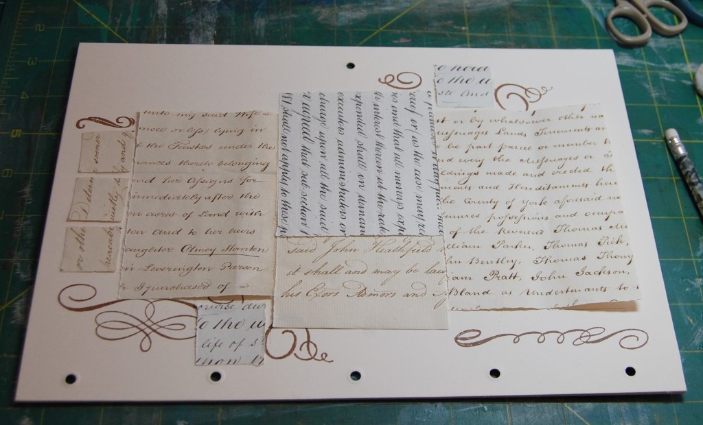
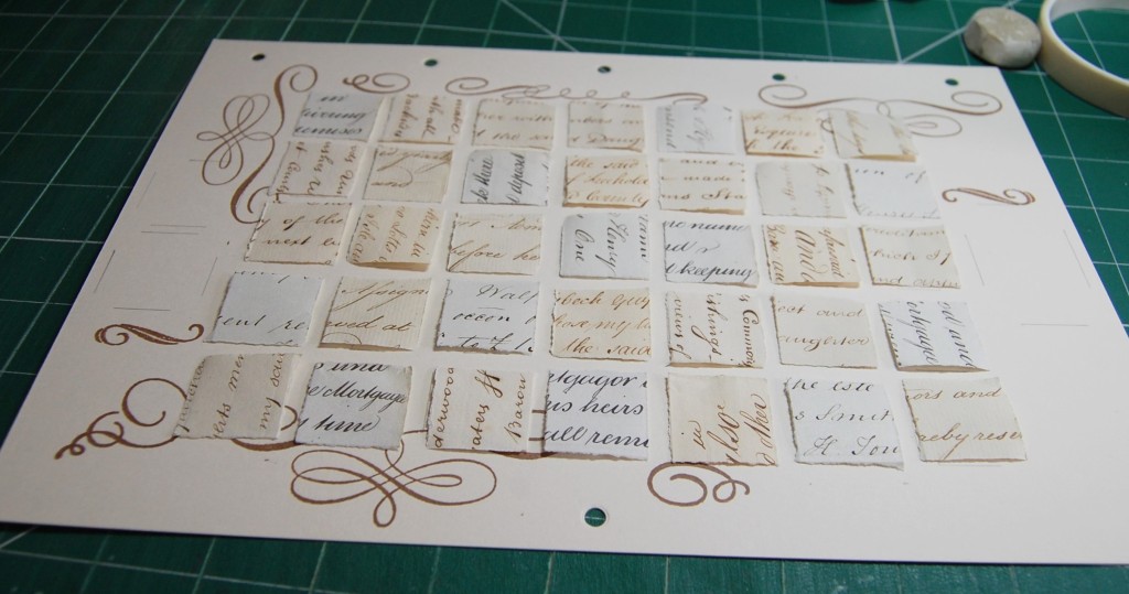
I have a large collection of old hand written legal documents which consist of lovely, thick, heavyweight paper, ideal for mat making. I decided that torn edges would look softer and more natural than completely straight, cut edges and the easiest way to do it would be to batch prepare all the mats I would need across the whole project.
Preparing a batch of papers for tearing into mats.
I started with the dates pages, and with thirty five 2.5cm squares required for each month, I cut a card and graph paper template measuring 17.5cm by 12.5cm. Using the template as a guide, I made twelve mats from a selection of six different papers. Each one would then be torn into 35 smaller squares.
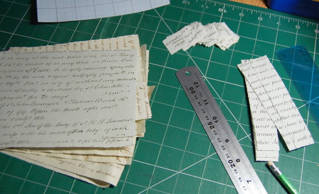
Tearing the paper into 2.5cm squares.
Using a steel ruler held on top of the paper makes it easier to tear against and gives a relatively straight, but soft edge. I tore strips first, them reduced the strips to squares. I continued in this way until all twelve papers had been torn into small squares. In all 420 squares were torn for all the date pages.
Small squares bagged up after tearing.
As I mentioned earlier I used six different papers for the mats, and as I wanted to ensure there would be an even mix of them used on each page I bagged up each type and numbered them 1 – 6. I would then take six squares from each bag and set them out on the grid randomly, facing in different directions, and put the remaining square back in the bag (because 6×6 = 36, and only 35 were needed). This probably sounds quite complicated, but it really isn’t if you do the working out properly before you start.
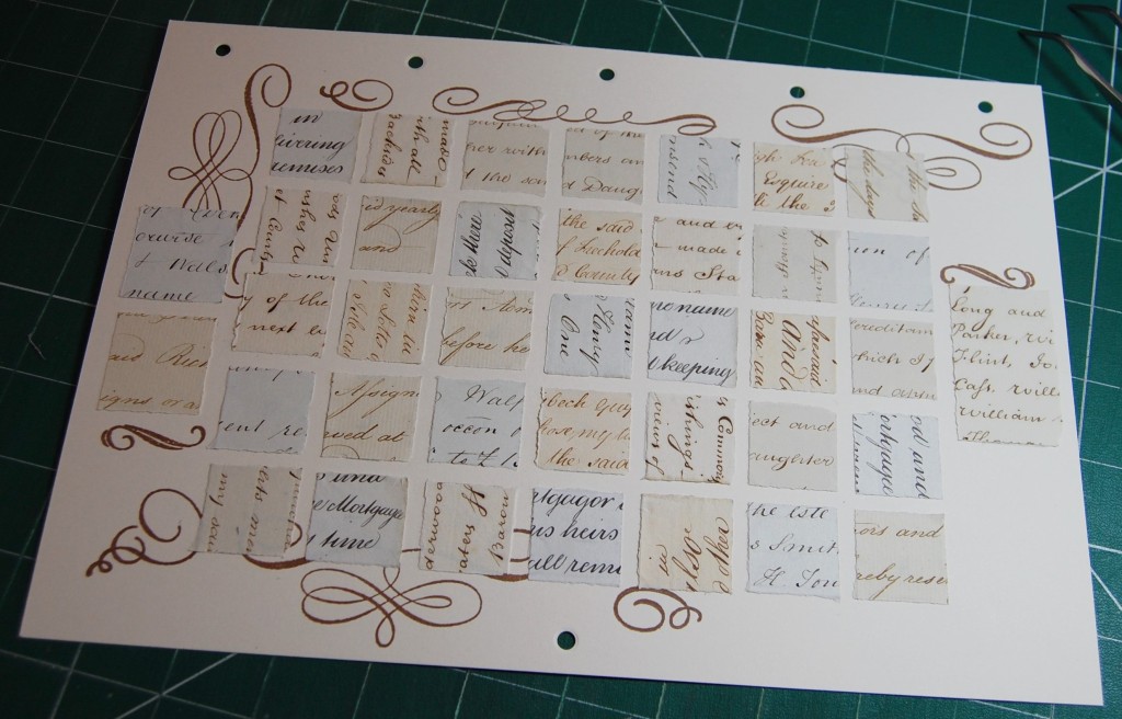
Once the small squares were prepared it was time to move on to the other mats – three larger ones for each date page and then all the mats for the decorative pages.
Prepared mats for a decorative page.
Using my card templates as a guide, each mat was torn to the correct size, and when set out, mirrored the design drawn earlier.
Mats for the January page set out in same way as the design.
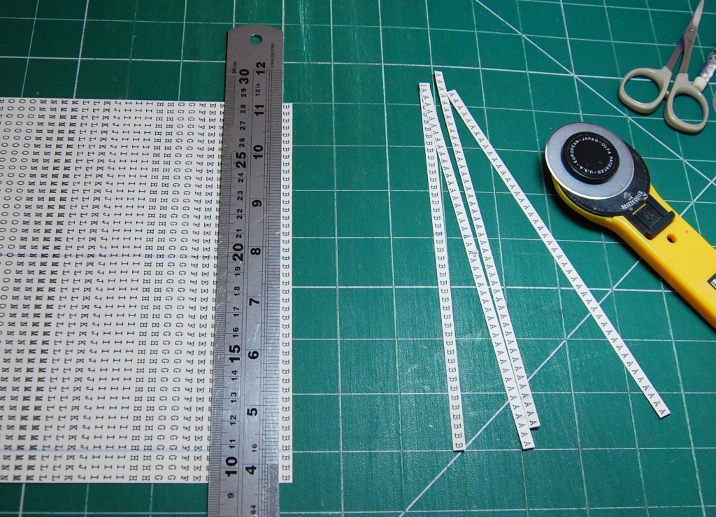
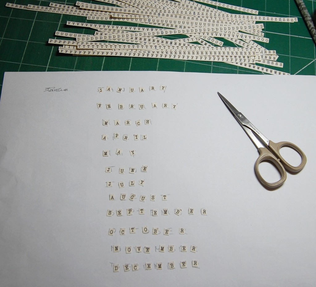
Little Letters
The next thing to do was to prepare all the small letters for the words on the calendar. Normally I would cut individual capital letters from old children’s books, but I wanted them to look similar to the number tiles I’d made. So I typed out some alphabet sheets in an old typewriter font and printed the sheets onto more of the book pages I had used for the numbers. These were then cut into strips using a rotary cutter and steel ruler. Then individual letters could be snipped off to make the words.
Cutting the printer letter sheets into strips.Making the words.
Making the Calendar
With a ring binder full of completed designs, mats, cut out images, letters and numbers all ready to go it was time to actually start making the calendar. So, out came the cream card, mount board and hole punch all ready to start.
Mount board and cream card ready for cutting.
For the front and back covers of the calendar I cut some white mount board (because I didn’t have cream) to A4 size. Mount board is thicker and stronger than ordinary card and is ideal for outer covers on book projects.
As the front cover needed to be cream, I covered both sides of one of the mount board pieces. The back cover would only need covering on one side, the inside, as this would become the December date page. The very back didn’t matter as it would always be hung to the wall.
I used A4 adhesive sheets to bond the cream card to the mount board.
Applying double sided adhesive to the card.
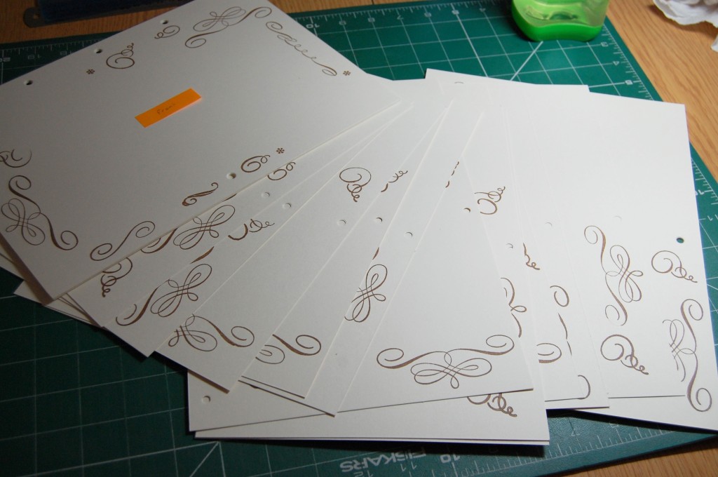
Once the front a back covers were prepared I cut cream card to the size of the template I made before starting designing. As both sides of the card would be used, eleven pages needed to be prepared, and with the use of the inside front and back covers that would accommodate all twenty four sides needed for the calendar.
Cutting the card for the calendar pages.
Once all the pages were ready I then had to decide where to place the book rings so I could punch all the holes in advance. I decided to use five book rings, spaced evenly across the long side of the card.
Measuring for book ring holes.
I used the template to make guide holes for the punching. I stuck some thin hole reinforcements where the holes would be punched. I could then punch holes in the template then use the template over the top of a page to punch through the guides.
Making the guide holes on the template.The template and a punched page.
When finished I had a stack of pages and two covers with perfectly in-line punch holes. I also punched the bottom holes which would hold each page open on the hanging nail.
Stamping the Pages
The next step in the process was to pre-stamp the pages with the scrolls that would be partially hidden under mats. So, using my design sheets as a guide I stamped each image in vintage sepia ink. Stamping that wouldn’t be covered could be added later.
Stamping the scrolls.
Before long I had a pile of stamped pages ready for mats and images to be added. I added a sticky note to each page side indicating which month it belonged to (so I didn’t get them all muddled).
Pages stamped, punched, labelled and ready to go.
Making the Calendar
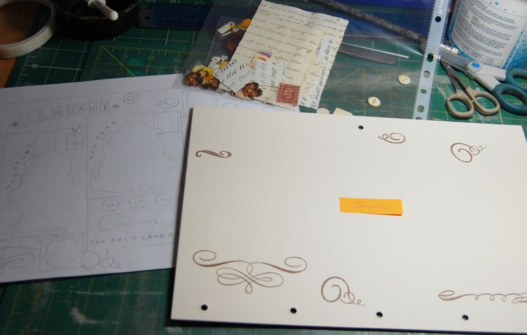
Here is a walk through then of making up the January pages for the calendar.
Preparing to make the January decorative page.
Taking the prepared decorative January page and the file with the all the images and mats in, it was glue and tape at the ready to get started.
Laying out the templates.
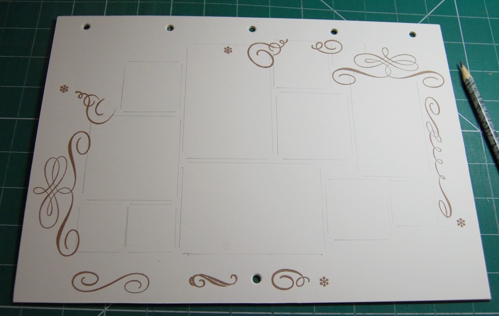
The January page would be constructed on the back of the front cover. To mark out the positions of the mats I set the card templates out on the page and drew around them lightly with a pencil.
Pencil lines mark out the positions of the mats.
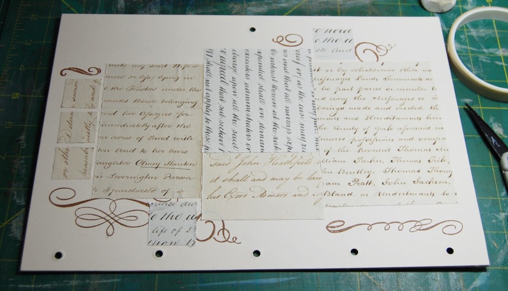
Using the pencil lines as a guide I set out the background mats in the correct places.
The mats positioned.
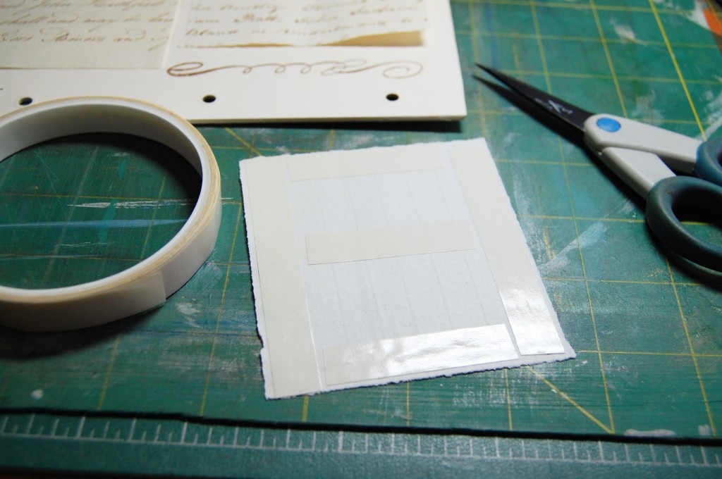
After this, each mat was turned over and double sided tape added.
Adding the sticky tape.
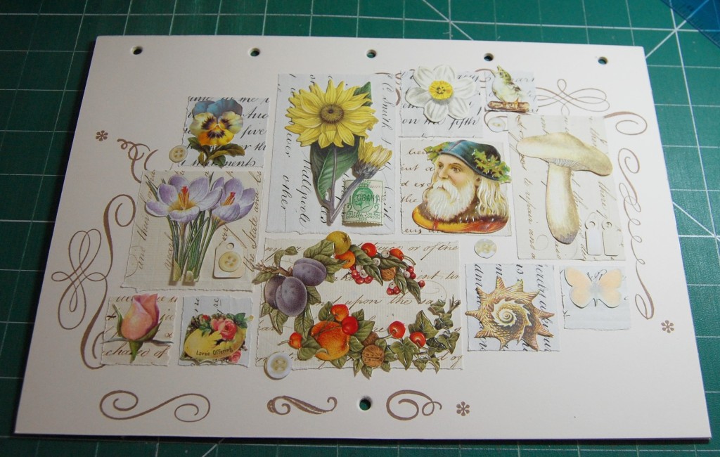
Before long all the mats were stuck down to the page. At this point the extra stamped scrolls could be added.
The mats all stuck down and stamping finished.
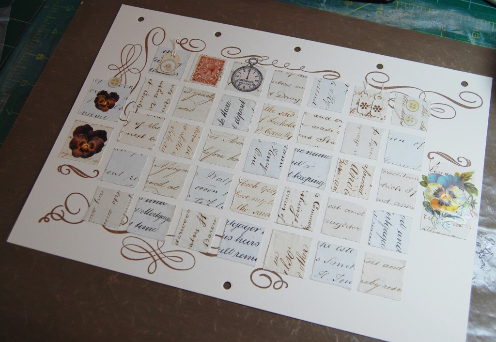
Next it was time to stick all the main images down. I tend to use a mixture of double sided tape and PVA glue on these items. If it’s a largish image I will put some tape in the centre areas and then apply a thin film of glue to the edges. Small images are stuck entirely with glue. A good pair of tweezers is very handy when positioning glued images.
Sticking down the images.
Once the images had been applied details like the buttons and tags went on next. I stamped a tiny flower on the smaller tags and added some linen thread to the holes.
The page with all the decorative elements stuck on.
Next it was time to place the title letters in an arc across the top left corner.
Placing the title letters.
As with all the cut out letters I use, I ink the edges slightly with black ink to help them stand out from the background.
Inking the edges of the cut letter tiles.
Once the letter tiles were inked, they were stuck in place on the page.
The title letters inked and stuck down.
As a finishing touch, a tiny flower was stamped at each end of the title.
A stamped flower is added each side of the title.
Finally, all the other lettering was inked and added to the page. The following three photos show different parts of the design now it was finished.
The finished page.
Making a Date Page
As with the decorative page, the first thing to do was to mark out where the mats would go. Measuring in equal distances from the edges and using the grid template, it was just a case of marking lightly with a pencil all around each square; there was no need to go right into the corners.
Marking out the squares for the mats.
Taking six mats from each numbered bag as prepared earlier, they were placed randomly around the grid, facing in different directions for added interest. Thirty five mats were required, so the left over one went back in the bag.
All the mats set out on the grid.
Sticky tape was applied to the backs of all the mats and each one stuck down. Once complete, the three extra mats at the outer edges were added too.
All the mats stuck down.
Next, the small images were applied.
Small images added.
Next I removed all the numbers and title letters from the bag and inked all the edges, setting them out on the mats as I went along, to be stuck down later.
Inking the numbers and letters.
Once all the numbers had been stuck down, the title added and the last of the stamping done, the page was finished.
The finished date page.
The Front Cover and Finishing the Calendar
The front cover was put together in much the same way as the other decorative pages. Here is the process in pictures.
The design, front cover and bag of elements to put on it.Laying out all the templates to draw around.Pencil guidelines for the mats.The mats all stuck down.Assembling the images.Inking the letters.The completed front cover.
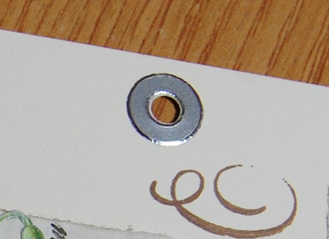
As a finishing touch, silver reinforcement rings in the form of peel-off stickers were added to all the hanging holes, however it wasn’t necessary to add them to all the ring holes at the joining point as this would have required many more rings than I had available.
Reinforcement rings were added to all the pages.
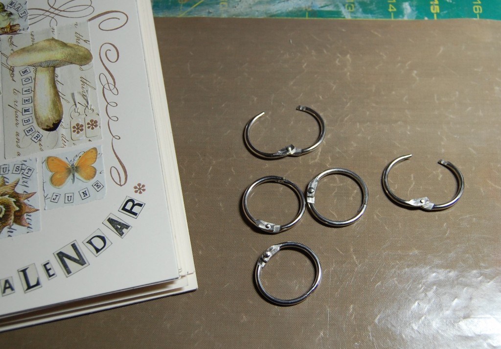
I joined the calendar together using metal book rings. The ones in the photo proved to be a bit too small, so I actually used slightly larger ones.
Book rings for joining the calendar together.
Once the book rings were threaded through all the pages and the covers, the calendar was finished and ready for hanging.
The finished calendar.
See Part One for photos and descriptions of all the pages in the calendar.
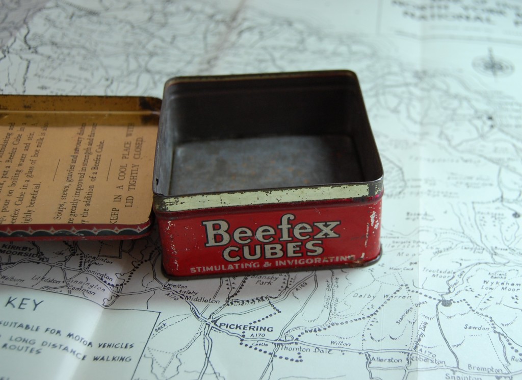
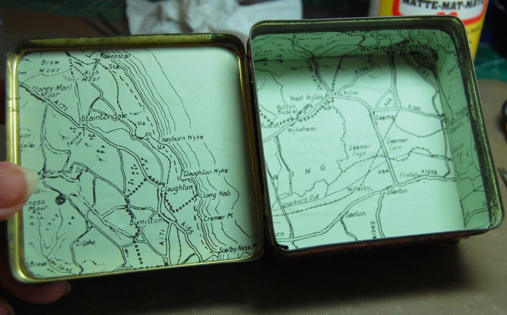
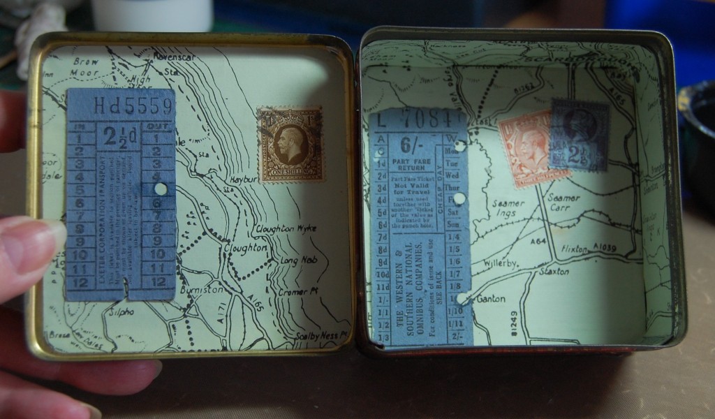
‘Beach Combing‘ is a wooden shadow box display full of sea related items and other interesting objects. It was made to compliment a set of altered tins, which can be found in earlier posts, or by accessing the ‘Altered Tins’ tag in the list in the right side-bar.
Designing
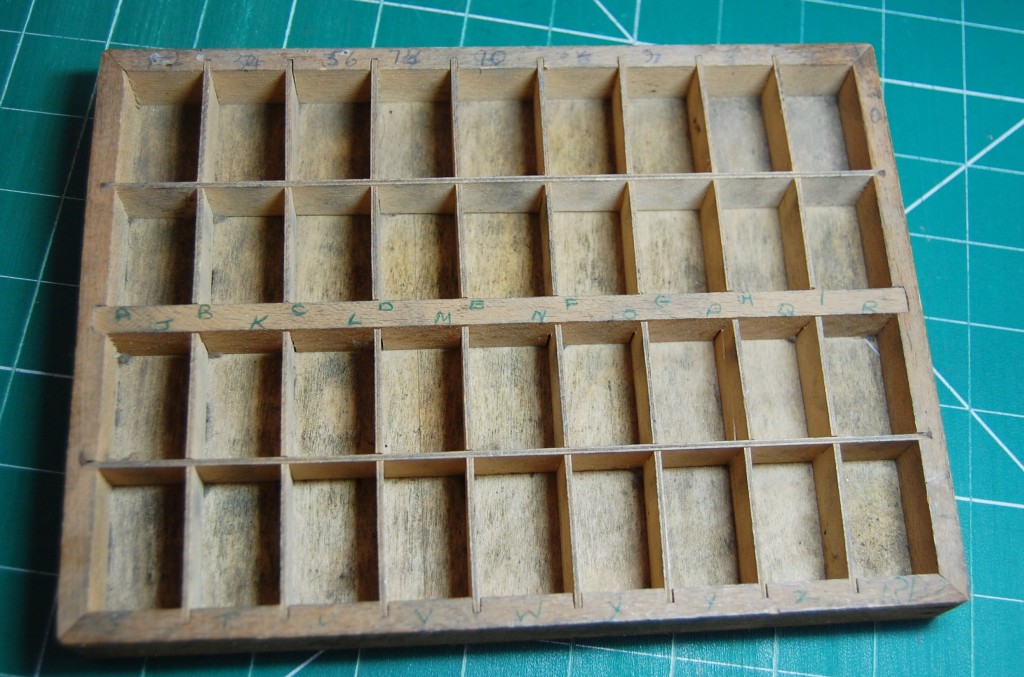
The original wooden tray
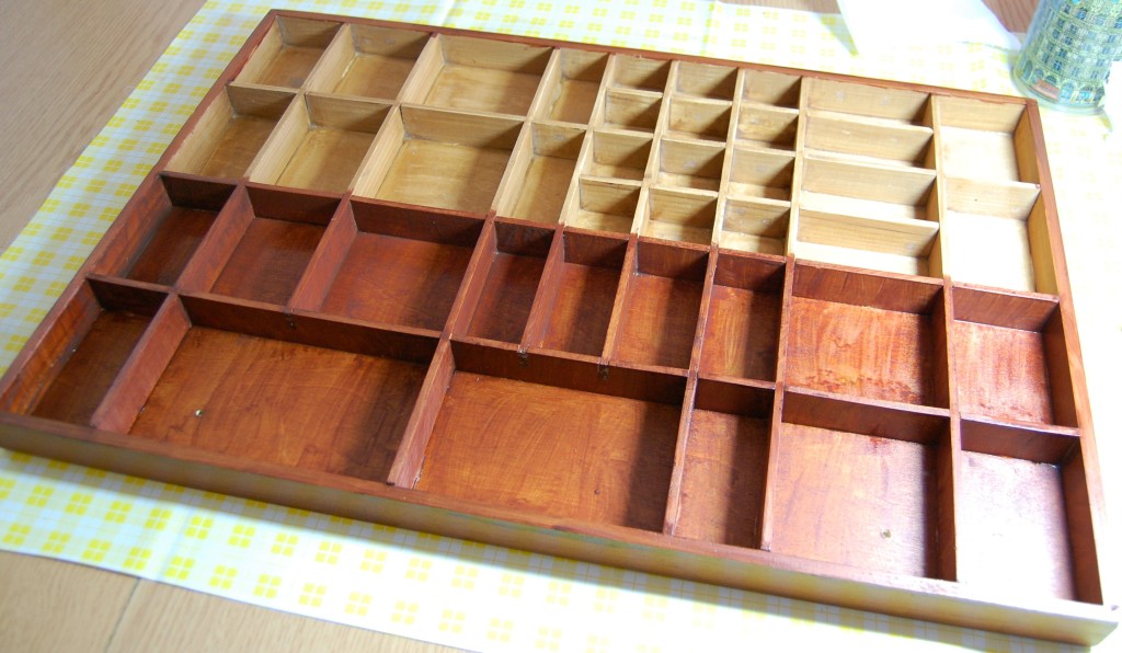
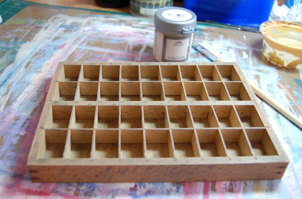
The photo above shows the wooden tray in its original state. Measuring approx 21cm (8 1/2″) by 16cm (6 1/4″), this tray was picked up at an antiques fair. I’m not sure of its original purpose, but someone had written the letters of the alphabet and numbers 0-9 on the edges to correspond with the compartments. So, my guess is it was used in a shop for holding price ticket labels and letters for making up signage on goods, similar to those in this image below.
I had no idea what I’d use it for when I bought it, and it has been in my collection for a couple of years, but an idea presented itself when I was designing the tins and I decided to use it.
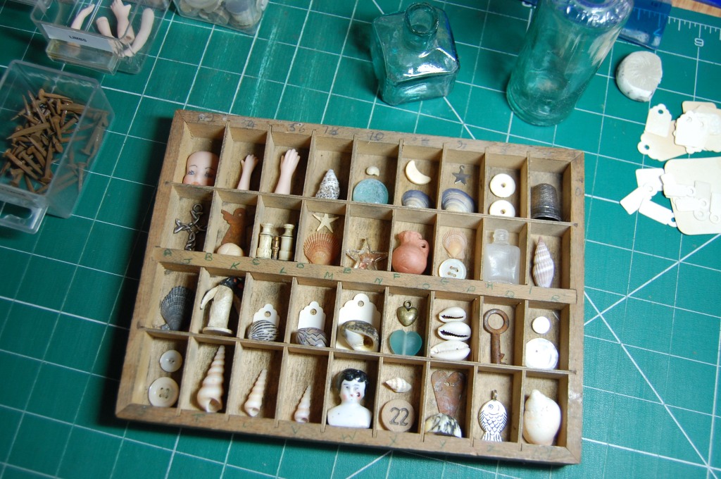
Initial try-out
To get a feel for the project, I gathered together some small items I thought would fit into the compartments, which at 3cm x 2cm meant I would be limited to using some of my smallest items. Once I knew the project could work, I took a photo of this ensemble for future reference, and then emptied it out.
Making the Box
Preparing to paint
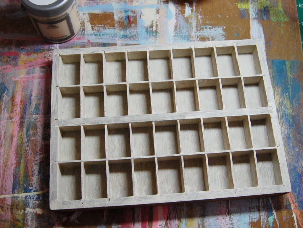
Keeping the box in its original state wasn’t really an option here, the pen marks needed to be erased or covered, and as I wanted a light background to show off the various items, I thought painting it cream would be the best idea.
First coat of paint
After a bit of fine sanding to key the surface, I used an old tester pot of cream emulsion paint to cover the front and sides of the box. The photo above was taken after the first coat of paint was applied.
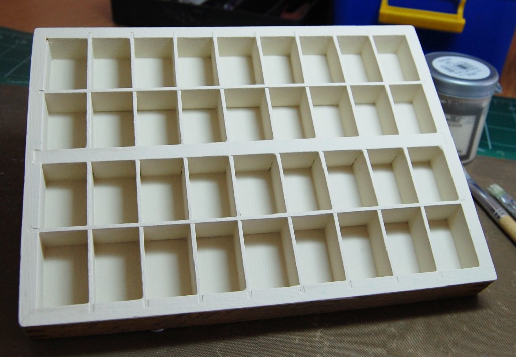
Painting complete
It took about three coats of paint to cover the box completely, but even after that some of the green biro was still showing through, so I had to coat those areas another couple of times until they were totally covered.
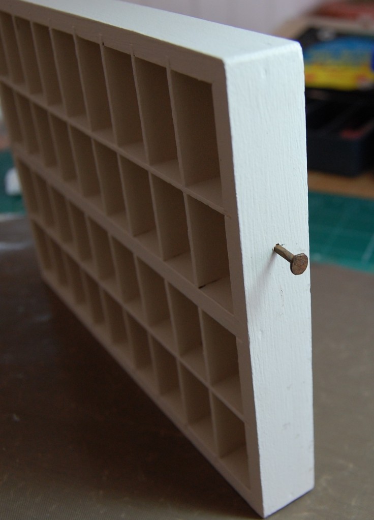
Distressing
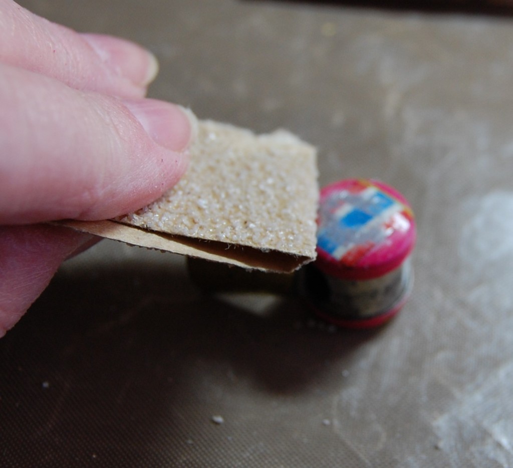
I was in two minds whether to distress the paint or not. I didn’t want to make a mess of it and have to repaint it, so I just gave the edges a very slight sanding for a worn look.
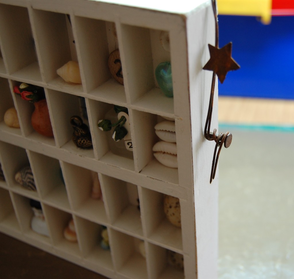
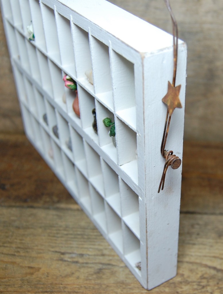
Rusty tacks
I had decided I wanted a wire arc over the box, so I hammered a rusty tack into each side of the box, ready to wrap the wire around at the end.
Objects to use
Now came the exciting part – filling the box with all the trinkets! I had saved all the items from my initial try-out, but nothing was set in stone, I could use, or not use any of these things, my first design was just a baseline to work and expand from.
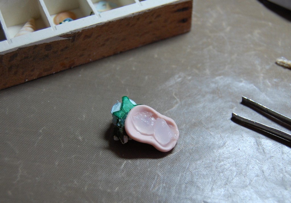
Flowers and head
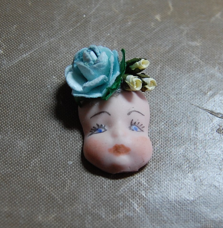
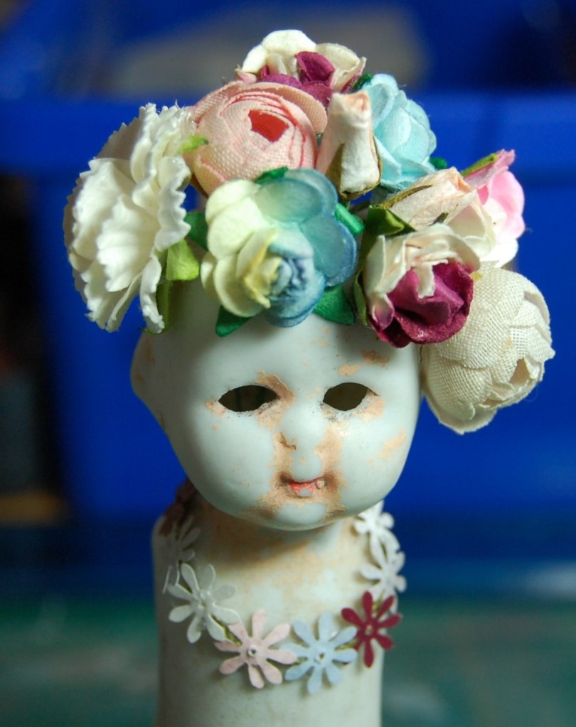
Of the items I was certain had a place in my box, this little ceramic face was one. I decided to dress it up with flowers as a couple of the tins I’d made had dolls with flowers on their heads.
Flowers on head
I snipped the wires off three paper flowers and stuck them to the top of the face.
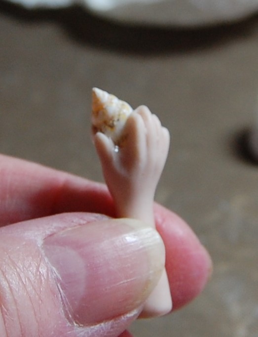
Shell in hand
Similar to the head, I stuck a tiny shell to the hand of a pottery limb so it gave the appearance of being held.
Final try-out
I carried on preparing and dressing items, and gradually the box was filled. The photo above shows all the items laid in before they were stuck, so it all looks a bit higgledy piggledy.
Sticking in the objects
All the objects were stuck into place using silicone glue. They are not meant to be taken out as you might with a printer’s tray display, but it’s not impossible to get them out if the box is to be reused at a later date. However, that is not the intention here.
The finished assemblage
All the items were eventually stuck in and the wire could now be added.
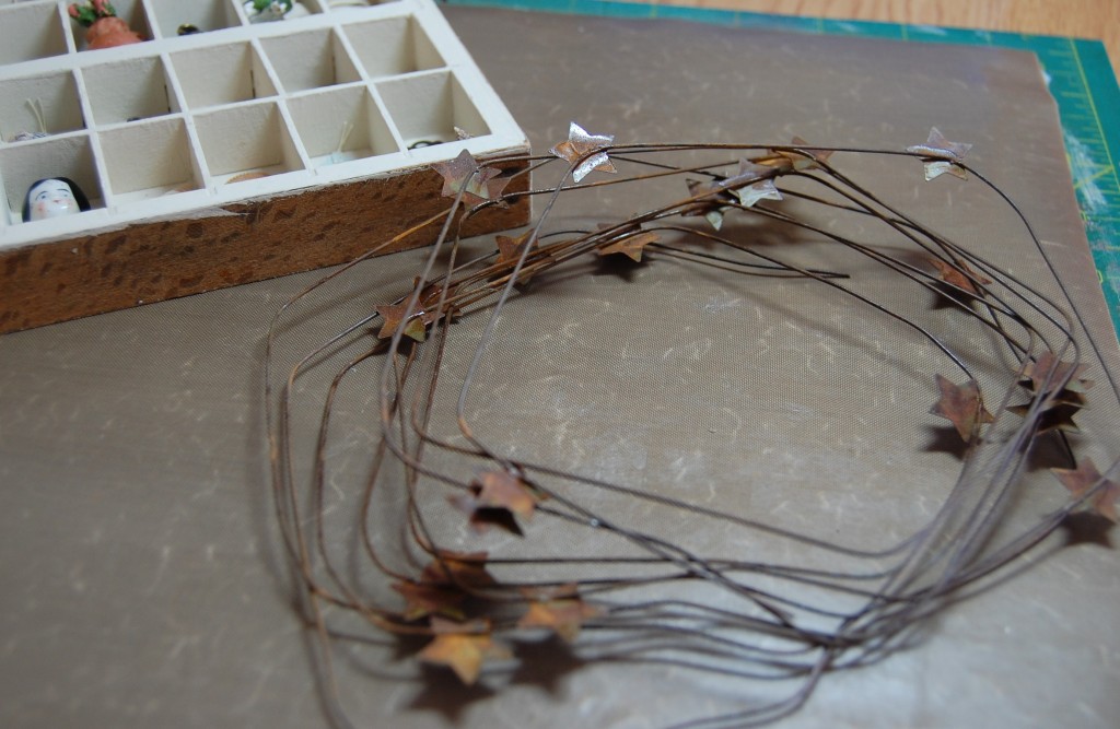
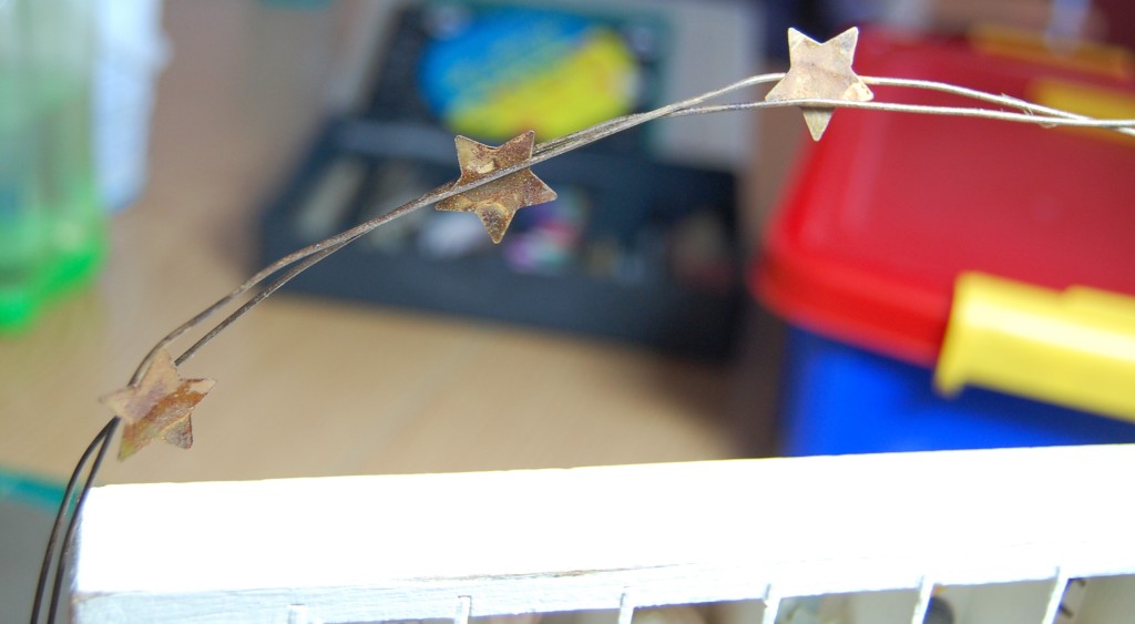
Rusty wire with stars
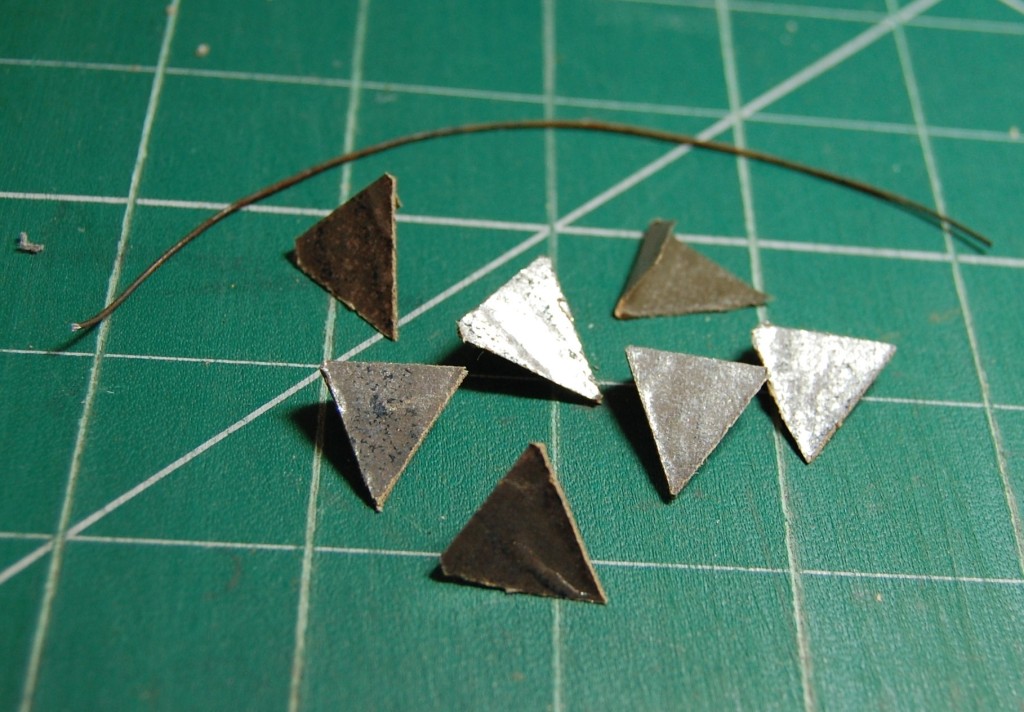
The wire chosen for the box has a rusted finish and stars welded along its length.
Shaping the wire arc
I cut two lengths of the wire and twisted them together slightly, this would make it more substantial looking and allow four stars to be showing as they are quite spaced out along the wire.
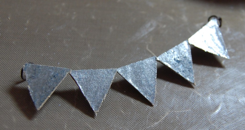
Attaching the wire
The ends of the wires were wrapped around the tacks hammered in earlier, and the ends left to dangle.
The wire in place
Once the wire was attached to the tacks, it was eased into an arc shape and all that need to be done now was stabilise the box to stop it falling over.
Although I don’t have a photo of it, I took a long wooden building block from a set I bought to use in this way, and glued it to the back of the box at base level, giving it a wider standing area. The box was now complete.
Photos
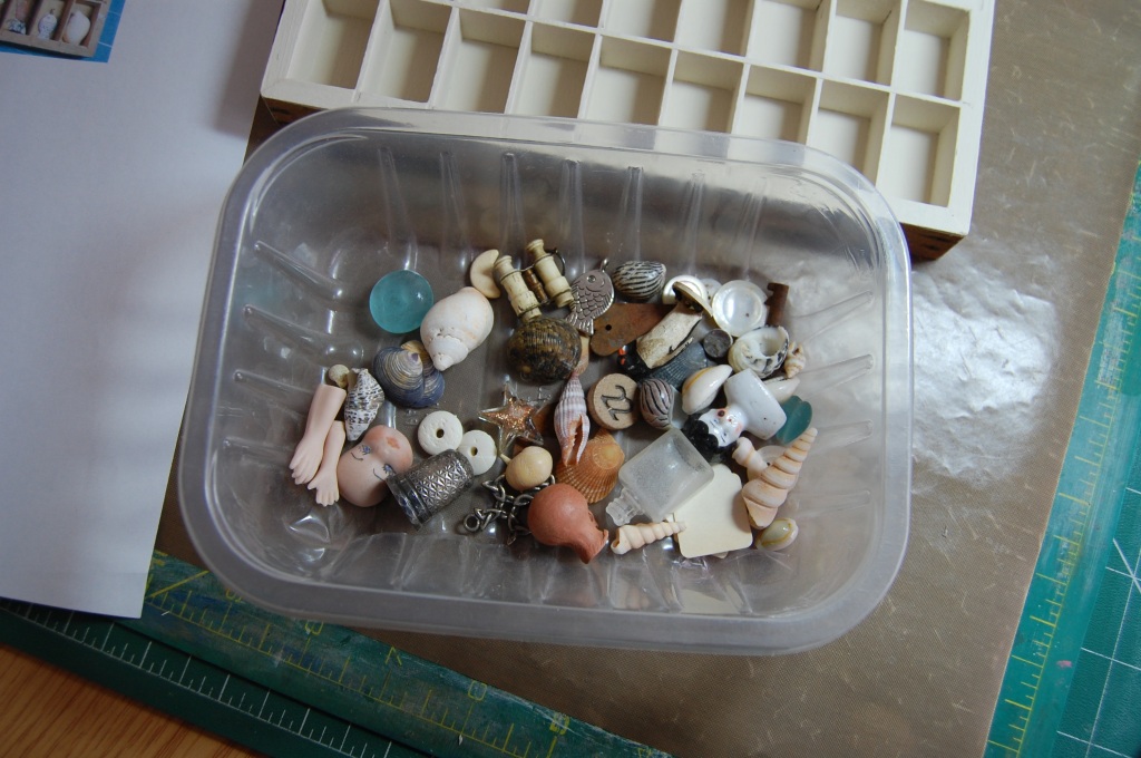
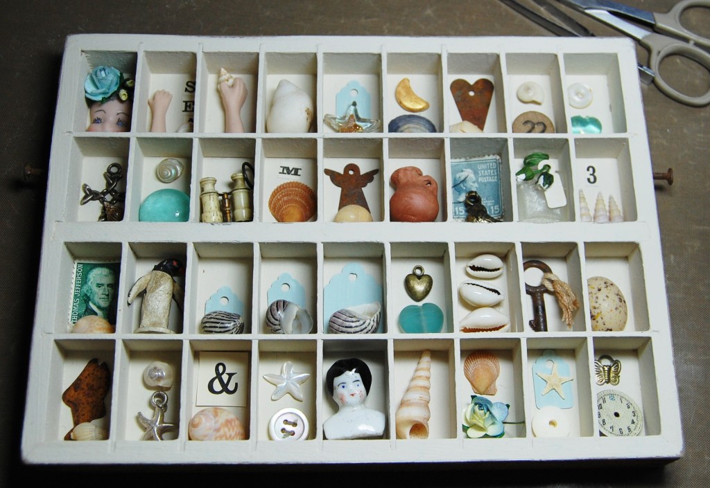
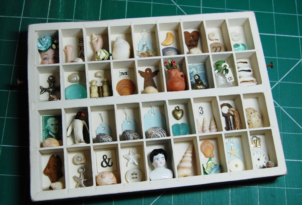
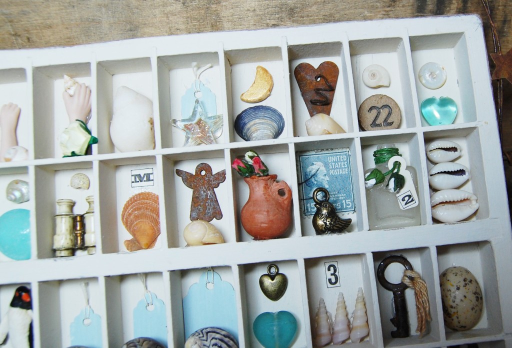
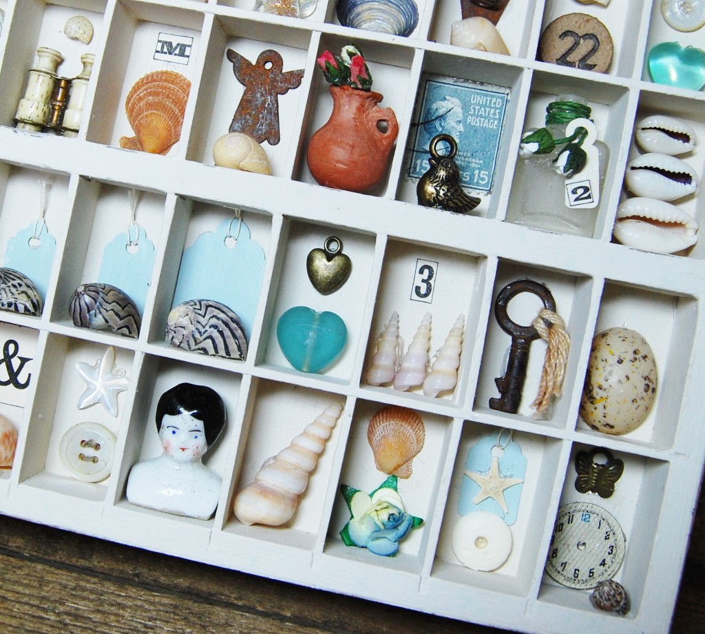
To finish, here are some photos of the finished box – ‘Beach Combing‘. Items used are listed in the close-up photos.
Top, left to middle: ceramic face and flowers / ceramic limb, shell and word ‘SEA’ / ceramic limb, shell and flower / shell / glass star and blue painted tag. 2nd row, left to middle: Silver cross and shell / glass nugget and shell / tiny binocular stanhope and shell / shell and letter ‘M’ / rusty angel and shell.Top row, from glass star: shell and gold painted wooden moon / rusty star with wire curl and shell / wooden game counter and shell / plastic heart bead and button. 2nd row from rusty angel: terracotta jug and flower / stamp and silver bird charm / glass bottle with flowers and tag / 3 cowrie shells.3rd row, left to middle: stamp and shell / plastic penguin / (next 3) 3 shells and three blue painted tags, all graduated. Bottom row left to middle: rusty fish and shell / starfish charm and shell / ampersand and shell / button and mother-of-pearl star / pottery head.3rd row from large shell and tag: glass heart and gold heart charm / 3 screw shells and a number ‘3’ / key with string / half a plastic bird’s egg / Bottom row from pottery head: large screw shell / shell and flower / horn disc with tiny starfish and blue painted tag / watch face with shell and butterfly charm.
This is my latest collection of altered tins. They were made to match in with the pictures I made last year (they can be found under the tag ‘Wall Collage’ in the right hand side bar). Both the pictures and these tins will one day be on display in my lounge, which is badly in need of a makeover.
Eagle eyes will have spotted a ‘non tin’ item in the above photo. That is a repurposed wooden tray which will feature in the follow-up post to this one.
Some of the tins in the photo above already have their own posts on this blog, and can be found in the ‘Altered Tins’ tag on the right of this page. Those posts contain a full walk through of the making processes which I photo-documented as I made them. Not all the tins were photo-documented, and it’s these remaining ones that I want to describe here. So, without further ado, let’s look at the first one.
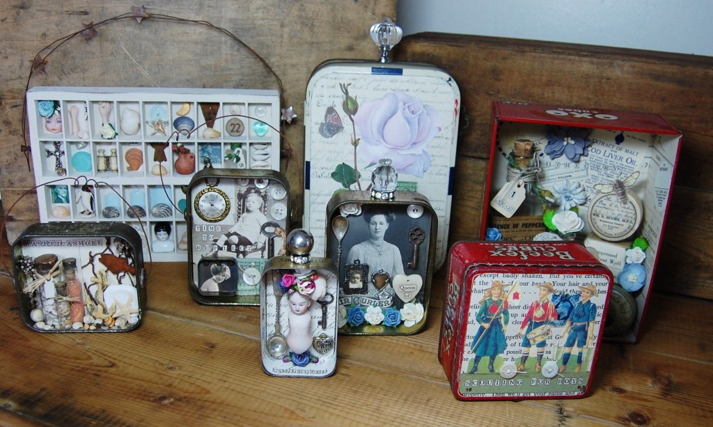
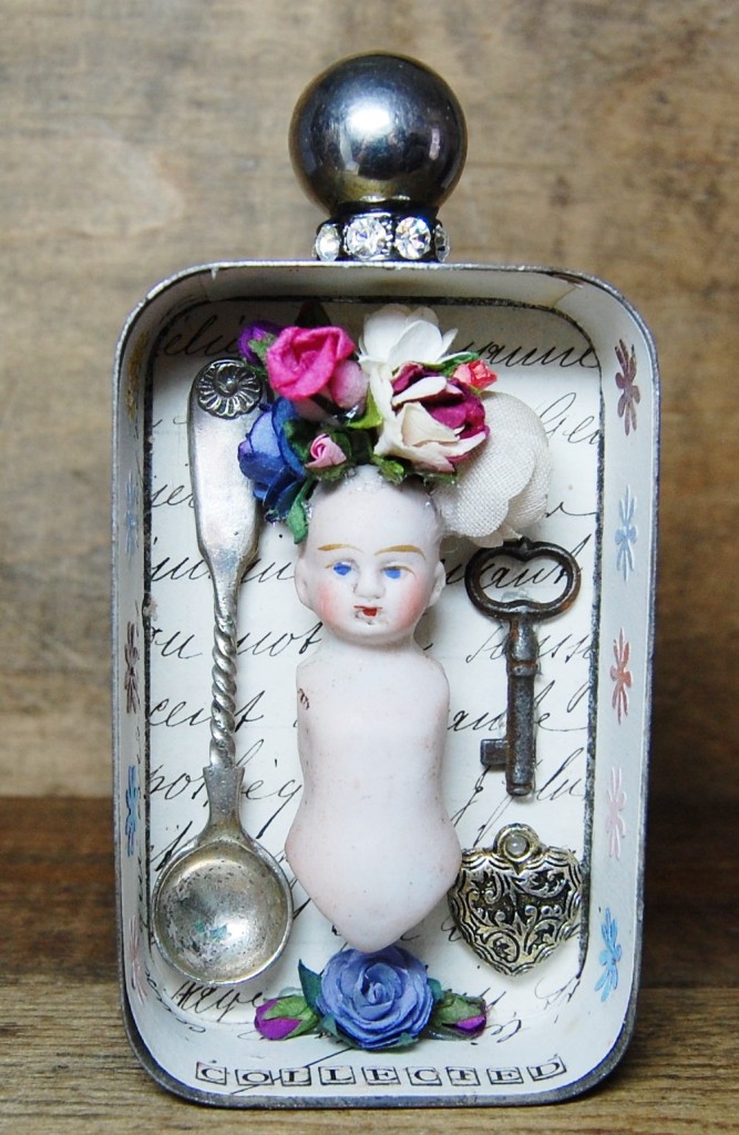
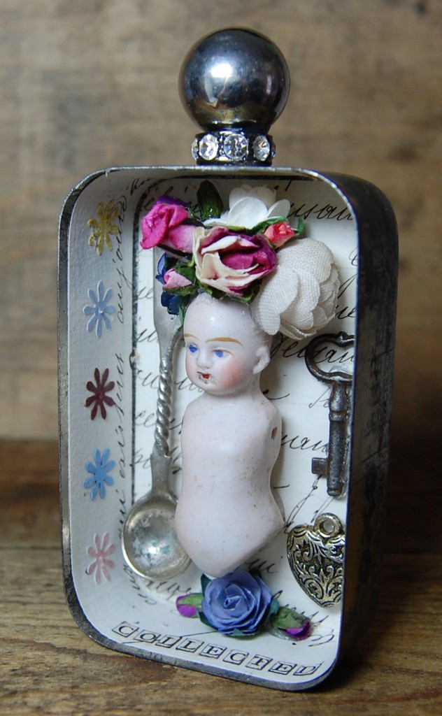
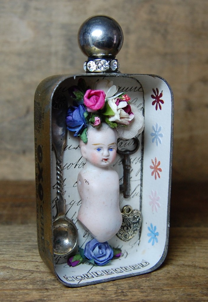
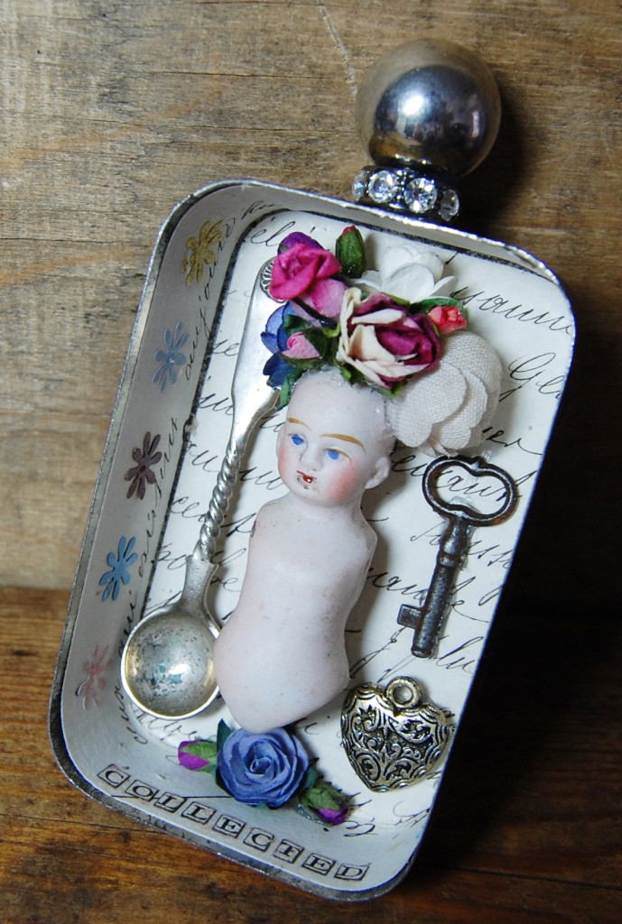
Collected
Collected
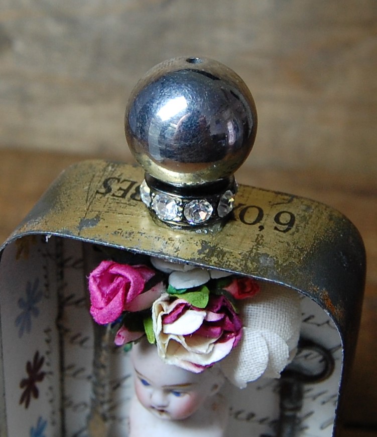
‘Collected‘ started life as a small Oxo tin. I didn’t use the lid for this one (that will be saved for another project), as it wasn’t a hinged type lid.
The tin was lined with old script paper (from an old document), and small punched flowers were stuck on the sides of the interior.
The main object is a small pottery doll’s torso with head. The top of the head was open and hollow, so a small arrangement of paper flowers was inserted into it and stuck down.
Other objects in the tin include, a mustard spoon, a small key and a silver heart charm. Three more flowers were placed in the bottom of the tin.
To finish, a jewellery spacer and silver bead were applied to the top of the tin as a finial.
Photos
More photos of ‘Collected‘.
Queen of Hearts
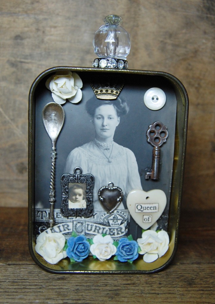
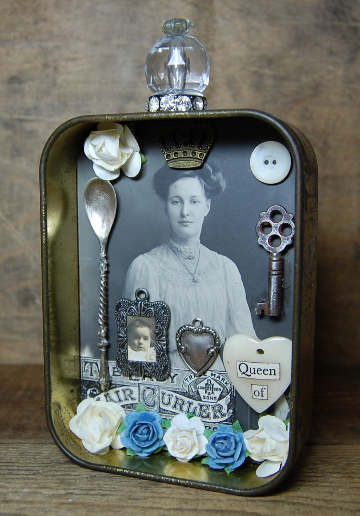
Queen of Hearts
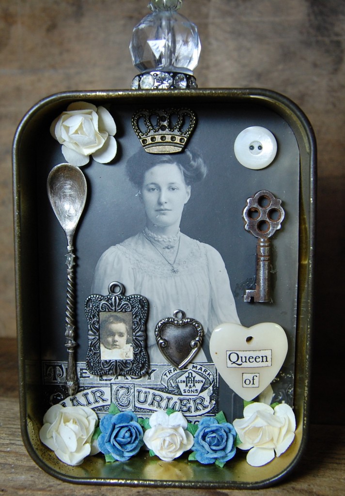
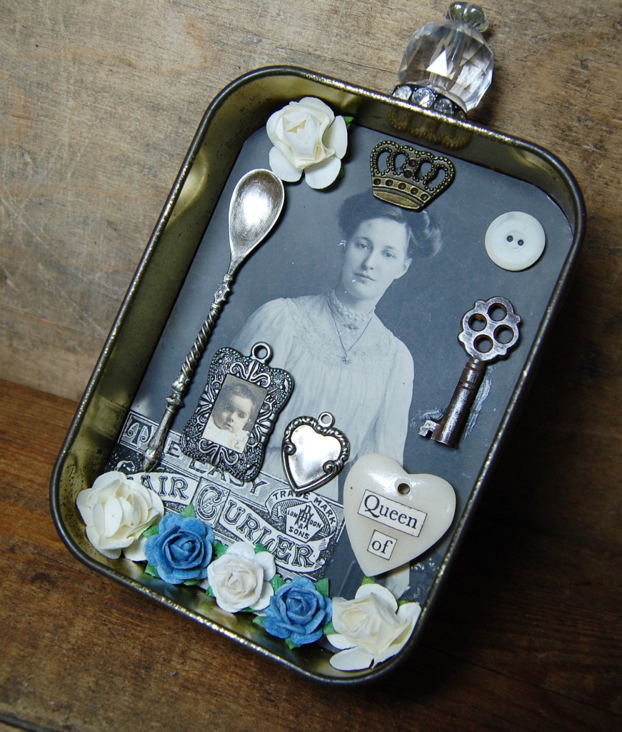
‘Queen of Hearts‘ is made from the base of a tobacco tin. A photo postcard of a lady was inserted into the back and a number of objects were placed around the image.
Objects include – a small advertisement, a mustard spoon, a small metal frame with a tiny image, a heart shaped metal charm, a cream heart pendant, a small key, a crown charm, a button, and some paper flowers.
On top of the tin is a jewellery spacer, an acrylic bead and a flower bead to finish.
Photos
More photos of ‘Queen of Hearts‘.
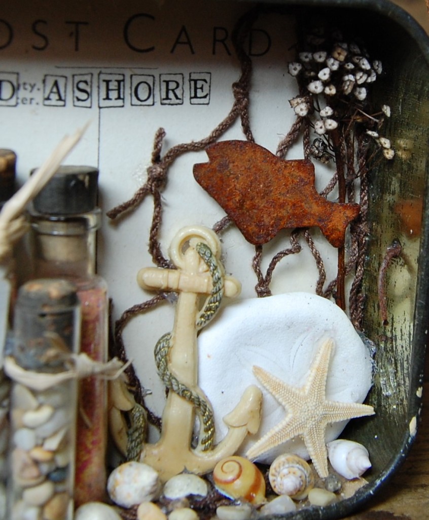
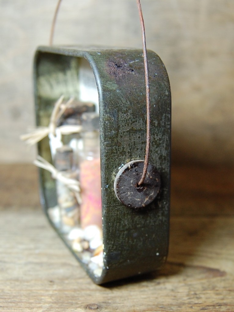
Washed Ashore
Washed Ashore
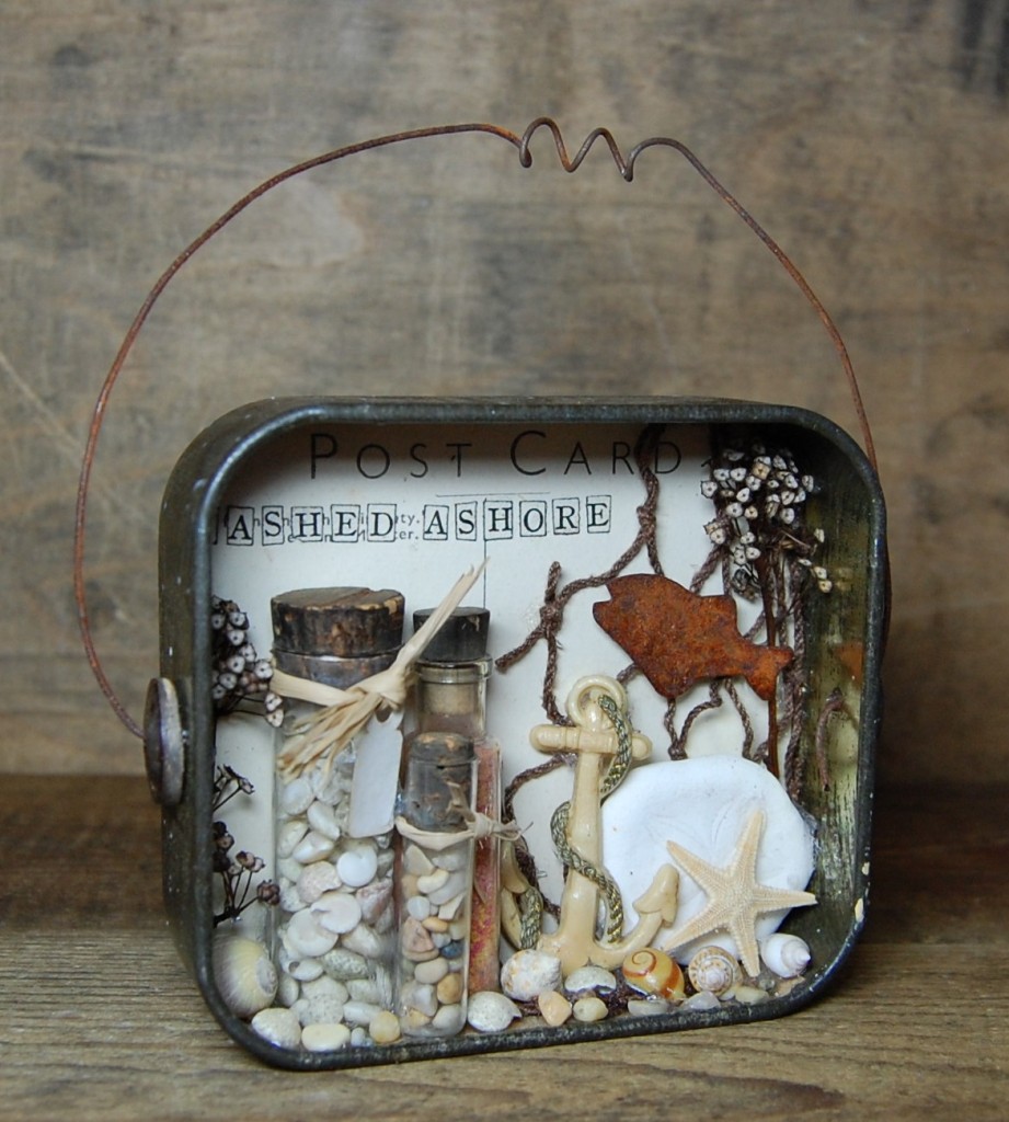
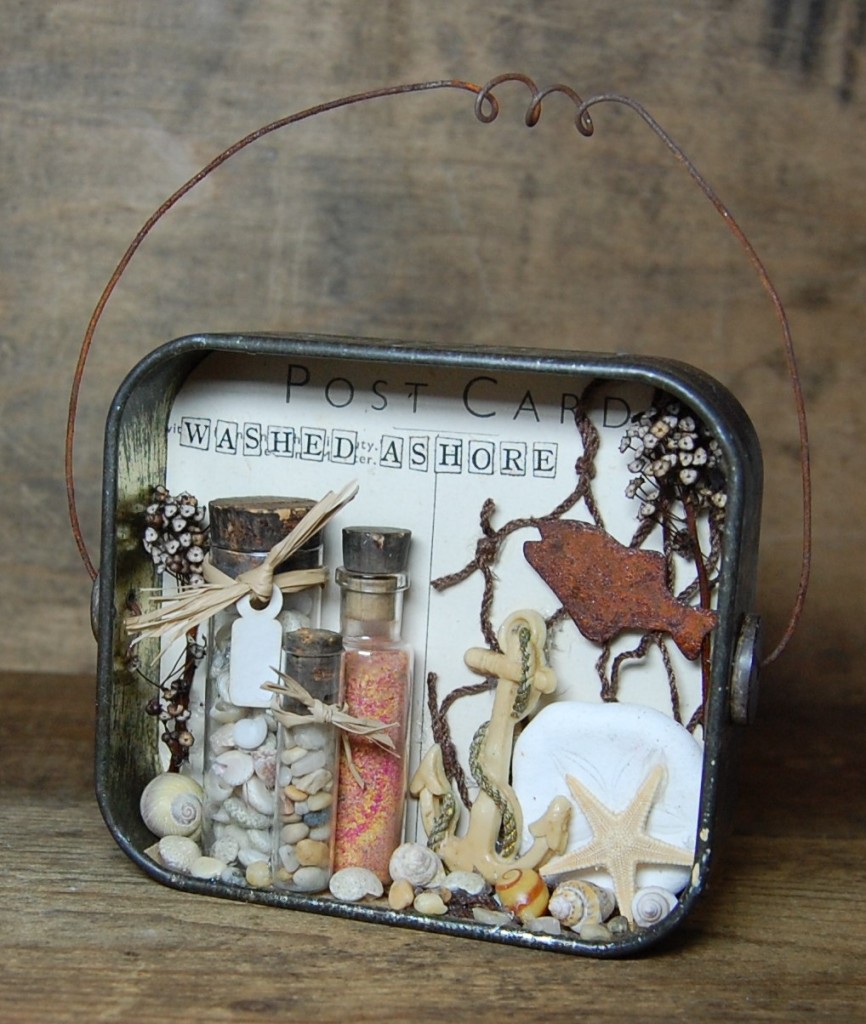
‘Washed Ashore‘ is a sea themed tin which started life as a tobacco tin. A postcard was used as the background and an array of beach inspired items was inserted.
I started out by sticking some fishing net into the back of the tin. Then I filled three small bottles (which all had their original corks); one with tiny shells, one with coloured sand, and one with gravel. Some raffia was tied around the necks of two of them.
I also added a sand dollar (the white circular item), a star fish and a plastic anchor (which was once a brooch). I put in some dried pieces off my ceanothus shrub, and a rusty fish. The bottom of the tin was scattered with shells and gravel.
The tin already had two holes in the sides, so I stuck two horn discs over them and attached a wire arc to reach over the top to finish.
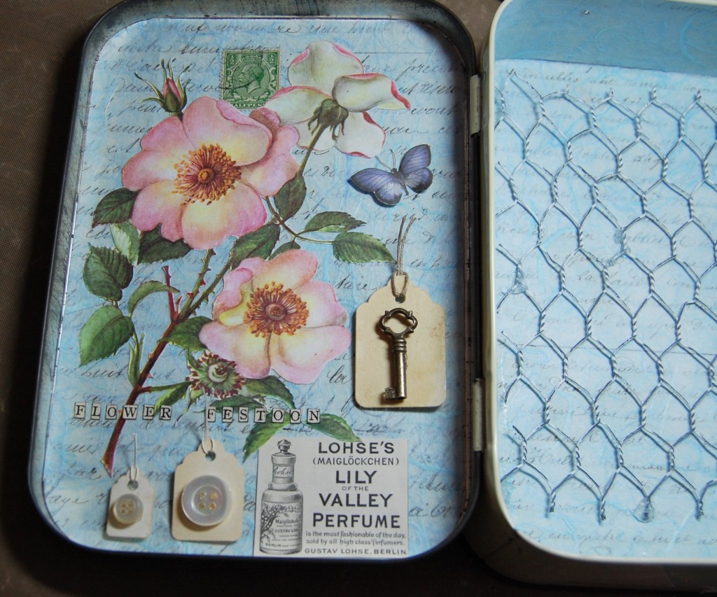
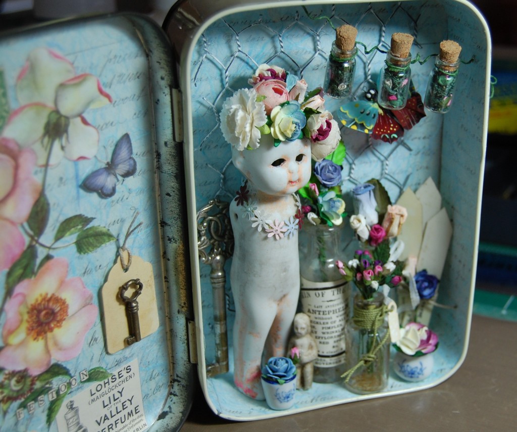
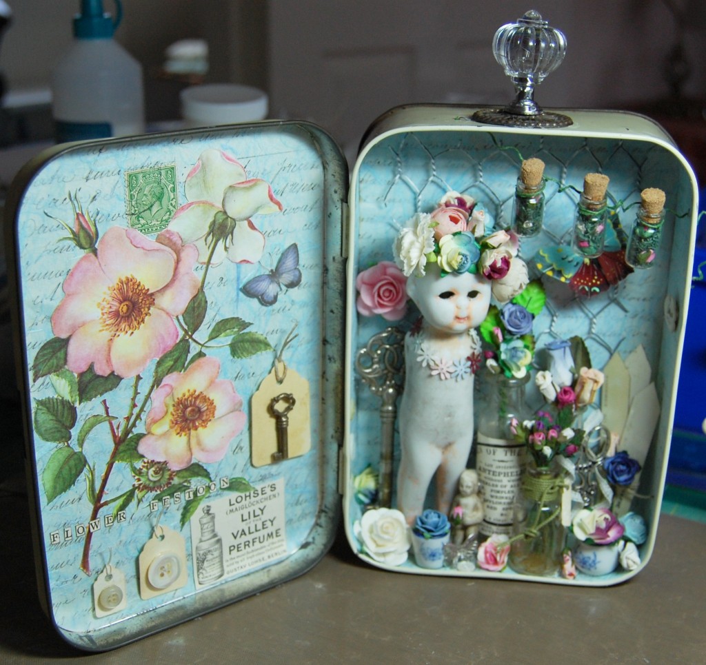
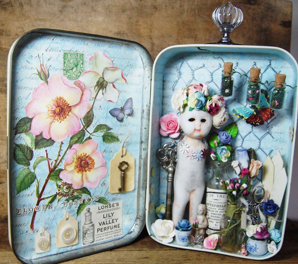
Flower Festoon is a large, pretty altered tin, filled with flowers and old fashioned charm.
Designing
Creating a composition
Sometimes inspiration can just come from the items you collect rather than anything you’ve seen, although on reflection, I can see something here that must have unconsciously influenced me (more on that later).
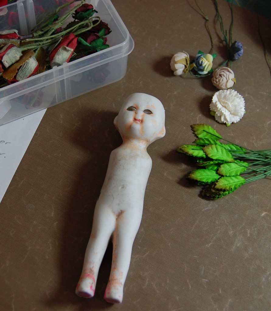
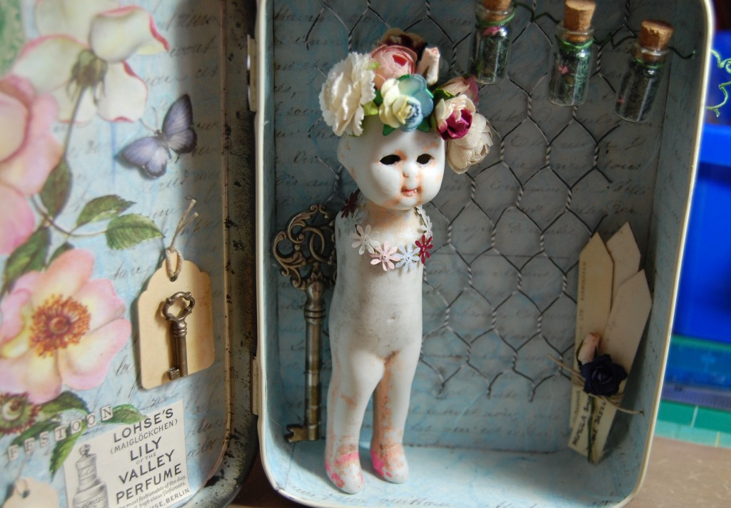
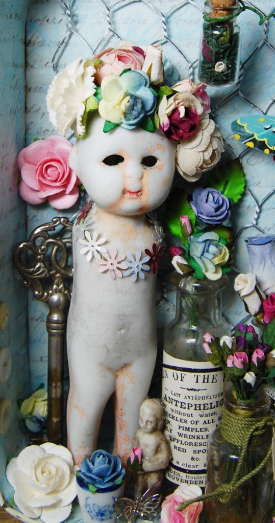
The chosen tin
I wanted to use the pottery doll (see photo above this one), the largest in my collection, and at 13cm (5″) high, she would need quite a large tin. Luckily I had an old First Aid tin in my collection which would be perfect. By standing the doll inside I could try out other things and come to a pleasing composition.
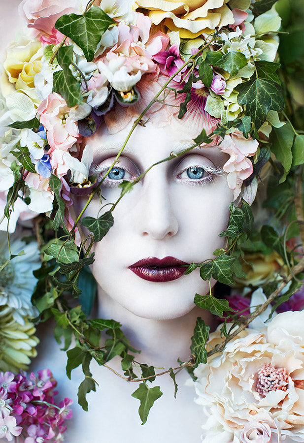
In the end I chose three small glass bottles, some plant labels, a feather butterfly and lots of paper flowers as a basic starting point. I don’t know what made me put some flowers in the doll’s hollow head, but I’m pleased I did because that became key to the design.
This is where I must have had an unconscious light bulb moment, because the flowers in the doll’s head bears a strong resemblance to a photograph by my favourite photographer – Kirsty Mitchell – the photo below is what I must have been emulating when the idea formed – the porcelain face and the tumbling, vibrant flowers covering her head – it’s all there!
The Pure Blood of a Blossom, by Kirsty Mitchell
So, with a basic design established, it was time to make a start and the rest would come as I went along.
Making the Tin
Background/lining papers
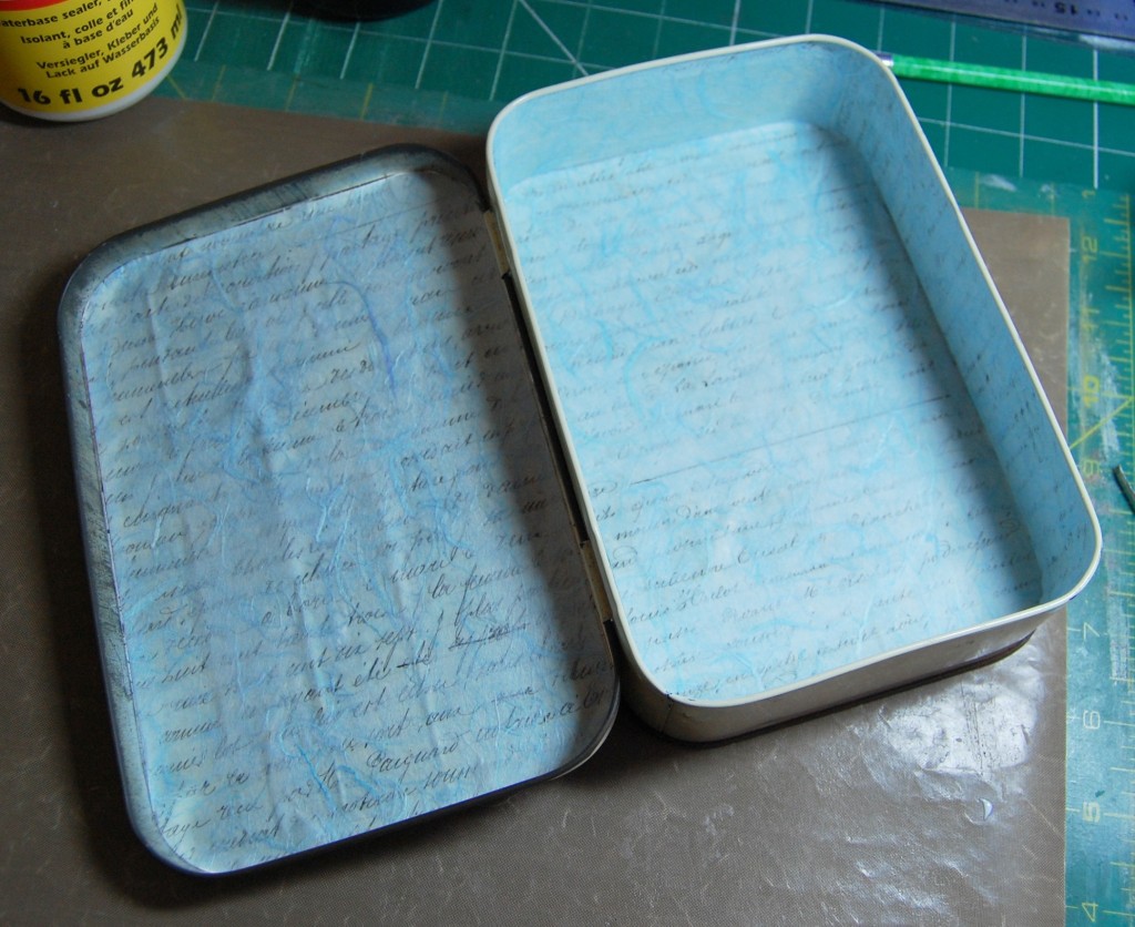
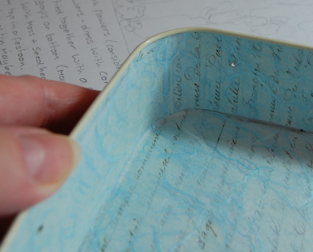
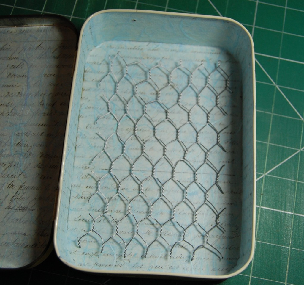
By now, if you’ve been following my other posts, you will know that I always start by lining the tin with a background paper. For this project I wanted to use some old script, but needed to soften it somehow, so it wasn’t too prominent. I decided the best way to do that would be to cover the script paper with mulberry paper, which is slightly translucent. It would allow the text to show through, and just make it look softer. I chose a pale blue for the inside of the tin, and a cream for the lid.
Background papers cut to size
After the tin was cleaned, I measured all the sides inside and the front lid to cut the papers. For the rounded corners I pushed a piece of tracing paper into a corner and creased it around the curve, so that I could flatten it out and cut a template to do each corner as accurately as possible.
Lining the tin
The text paper was stuck in first, followed by the mulberry paper. I used Mod Podge to stick the first layer in as it would be in contact with the tin, but then I used a thin coating of ordinary PVA for the second, more delicate layer.
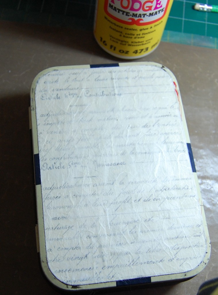
The front of the tin
The front of the tin was covered with the same script paper and cream mulberry paper was used instead of the blue.
Drilling holes
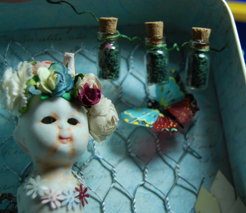
I had in mind to suspend some tiny bottles from the top of the tin, so I got my husband to drill two tiny holes in the side and top to thread a piece of wire through.
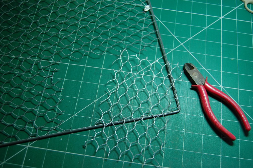
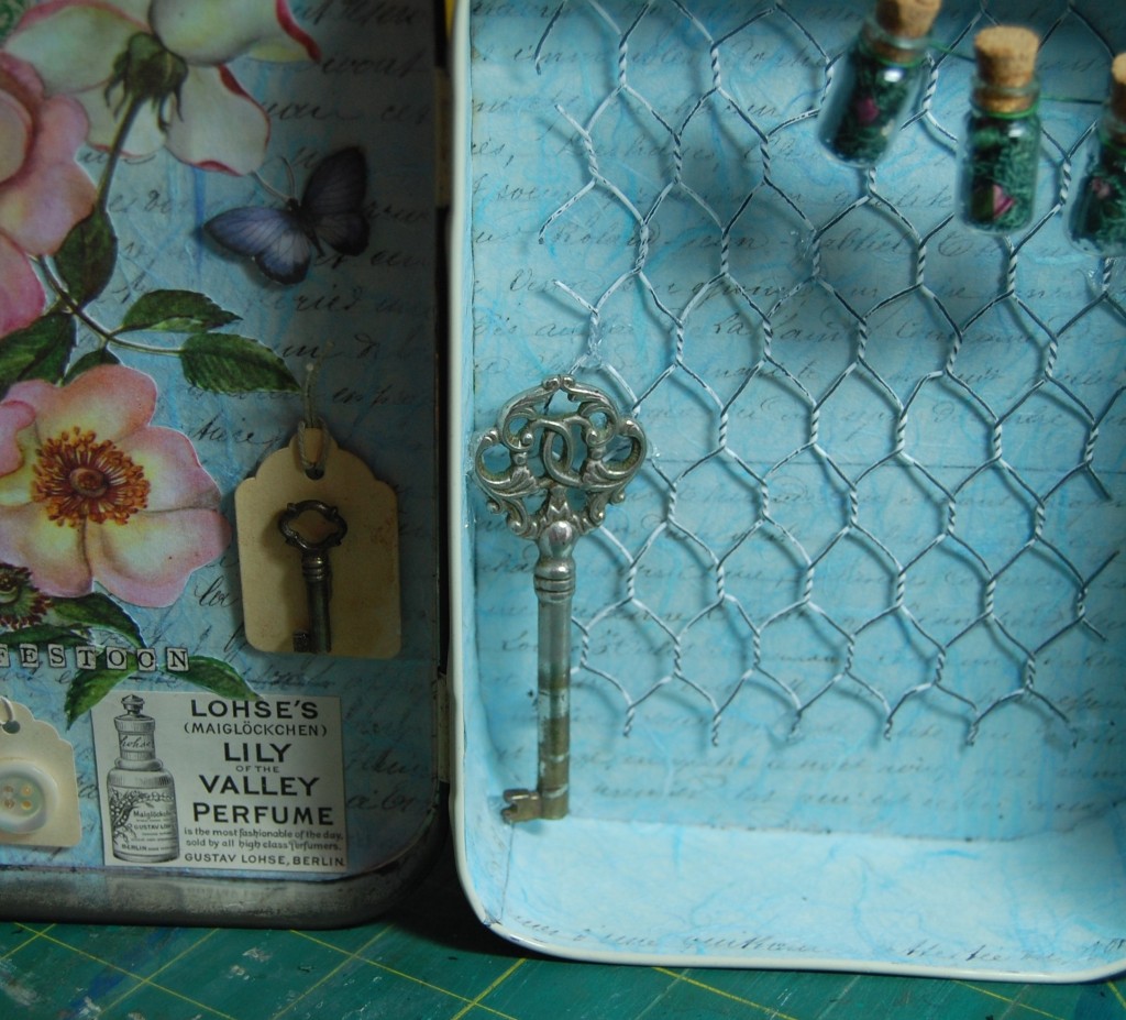
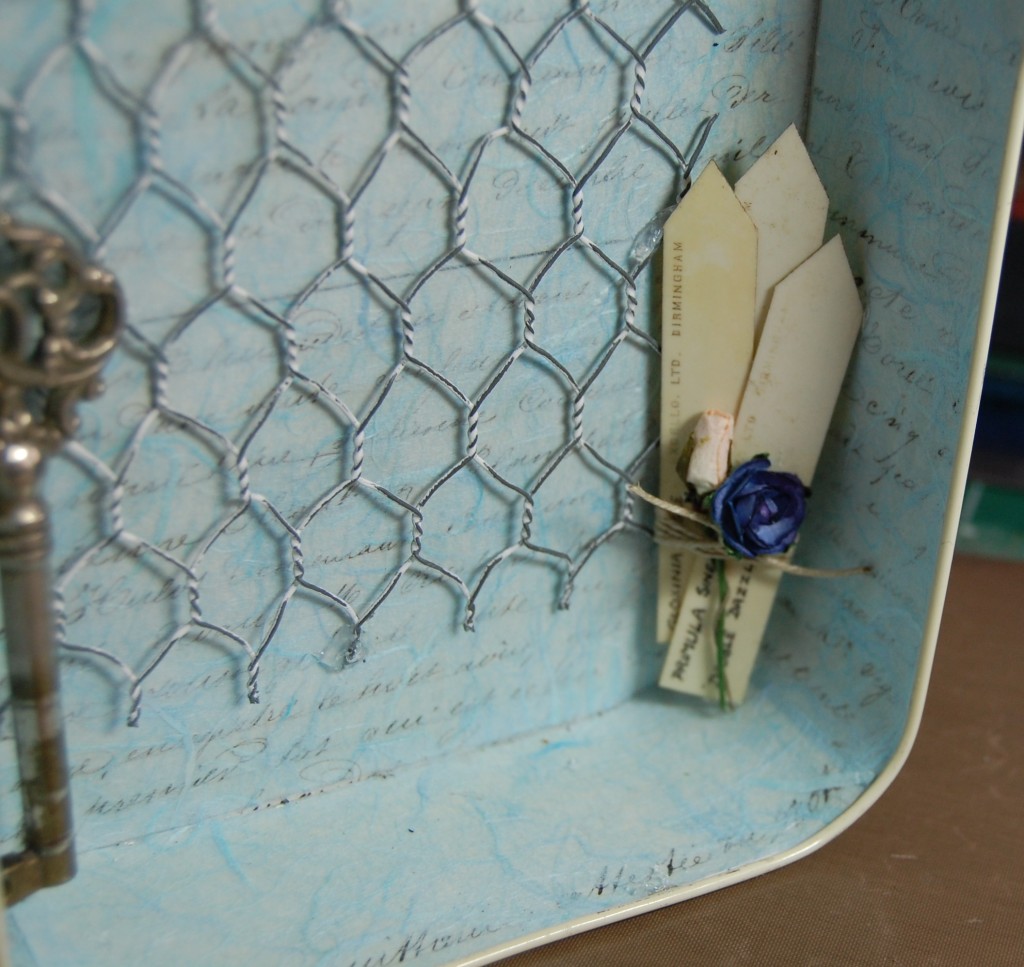
Cutting some chicken wire
I decided to use a piece of chicken wire in the back of the tin, so I got my sheet of craft chicken wire and using wire cutters, snipped a rectangular piece to the size I wanted.
Sticking the wire in place
The chicken wire was stuck into place using a few well placed blobs of silicone glue and then left to set thoroughly.
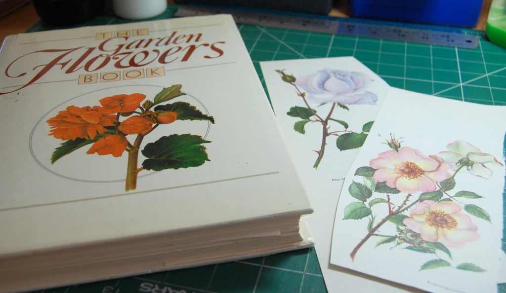
Choosing flowers to cut
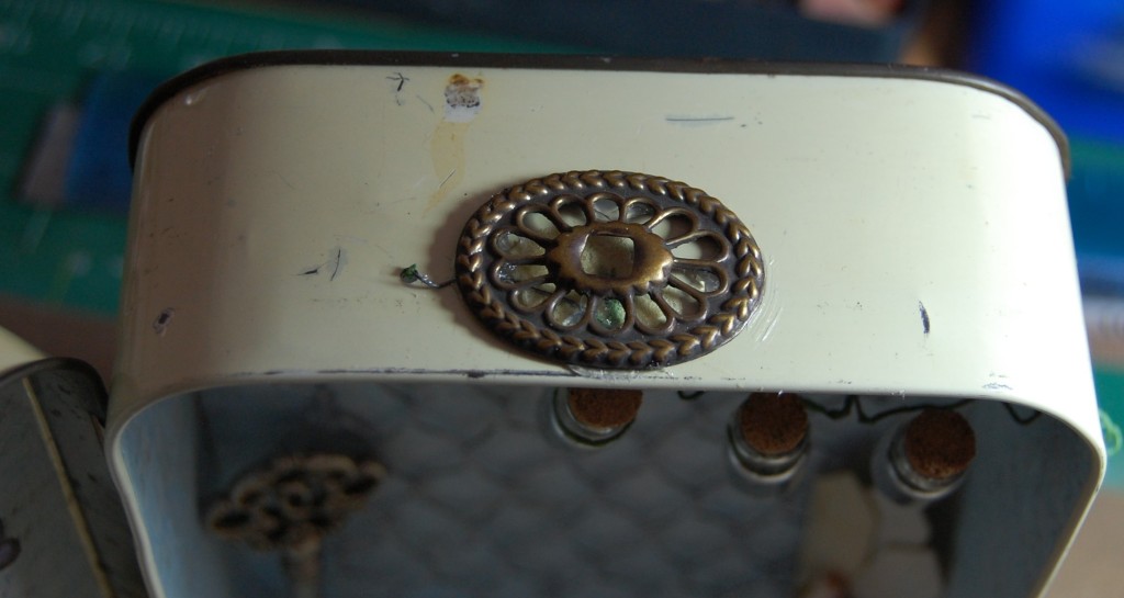
I wanted a couple of decoupage flowers for the tin, one for the front of the lid and one for the inside of the lid. I cut flower illustrations from this old book (of which I have two copies). So I chose a pink rose for inside and a blue rose for the front.
Cut flowers
Using a a pair of fine scissors, I cut out both roses ready to stick into place on the tin.
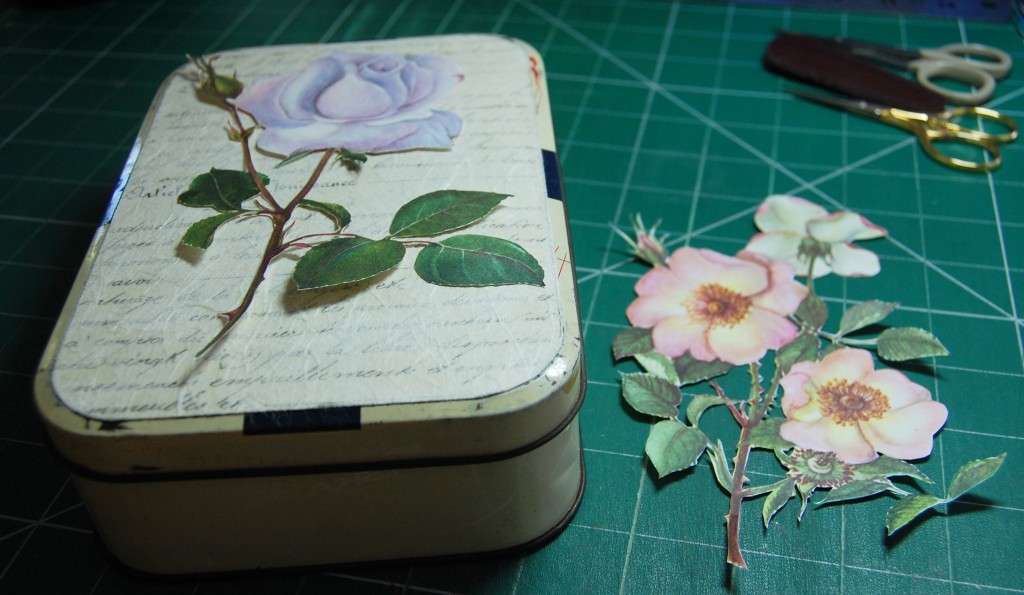
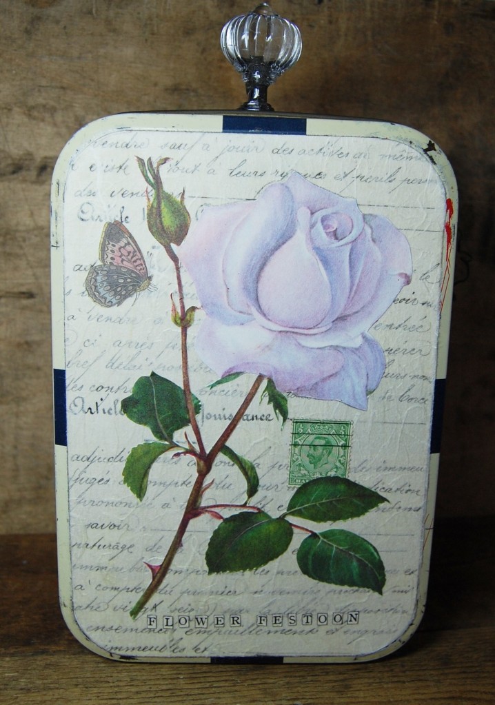
The finished lid
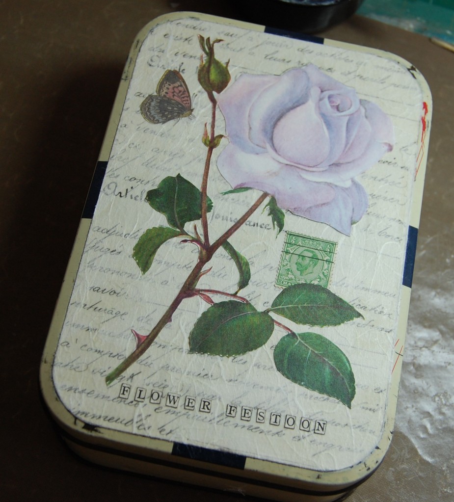
The flower was stuck into place with the addition of a stamp and a paper butterfly. I then used cut out letters to make the title.
The finished inside of the lid
The inside of the lid was completed by sticking in the flower and adding other elements such as, a stamp, a paper butterfly, an old advertisement for perfume, three tea dyed tags, two buttons and a key. The title was also repeated on the inside of the lid so it would be visible when open.
Working on the doll
Next it was time to start work on the main body of the tin, so the pottery doll was first in line for decorating. I didn’t do any cleaning of the doll at all, she had some remnants of paint in some of the creases, but I wanted to keep her in her original state for that vintage look. I gathered all my wired paper flowers and leaves together and prepared to make a start.
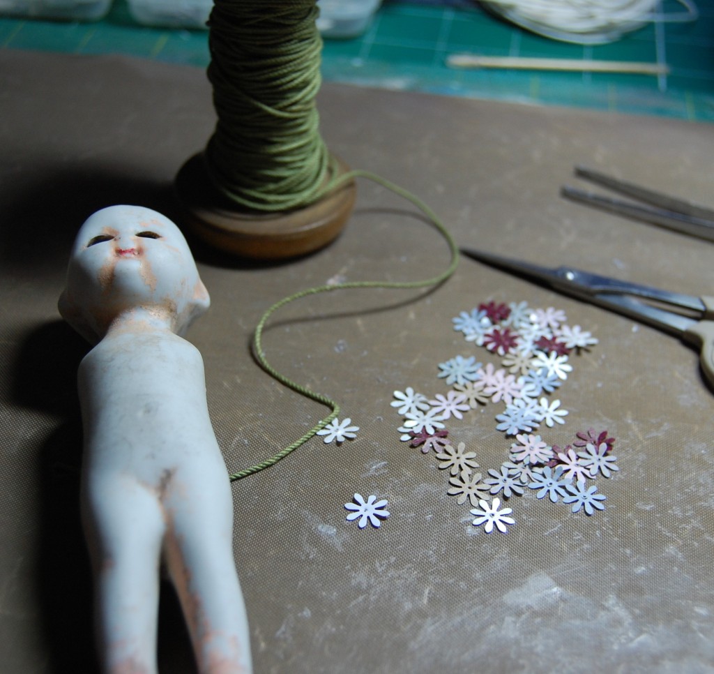
Making a flower garland
As the doll is quite large I felt she needed something around her neck, like a flower garland. I tried some of the paper flowers first but they were just too big and overpowering, so I hit on the idea of flat, punched paper flowers instead, mounted on a thread.
I punched out a selection of flowers in different coloured paper and put a needle hole through each centre. My original idea was to thread them on to the cotton, but when I tried it it didn’t work, but the holes stayed.
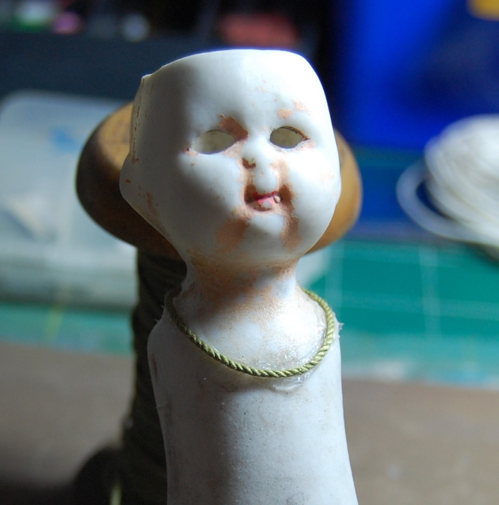
Attaching a cord
I chose a green cotton cord for the garland flowers to sit on, this I stuck on to the doll with silicone glue.
Attaching the flowers
The tiny flowers were stuck to the cord, slightly overlapping to leave no gaps.
The finished garland
Once the garland was finished it was left to dry before doing any further work on the doll. The garland adds just enough detail to an otherwise very bare doll.
Head matters
With the garland now dry I could start on the flower arrangement in the hollow head. The photo above shows the top of the doll’s head ready for filling.
The hole in the head
The doll is completely hollow as you can see from the above photo, so the wires on the flowers needed not to be trimmed and could just hang down inside.
Sticking the flowers in
After an initial try-out to see how I would place the flowers, I added a little silicone glue to each flower and stuck them to the sides of the head as shown.
The finished flowers
I kept building up the arrangement, sticking each flower to it’s neighbours as it was inserted until the whole head had been covered.
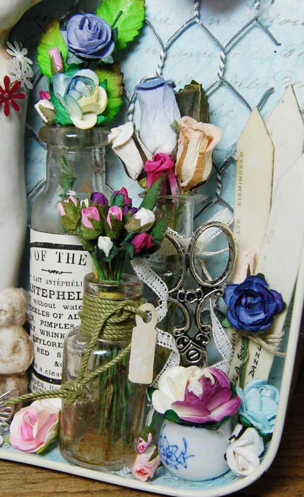
Decorating the bottles
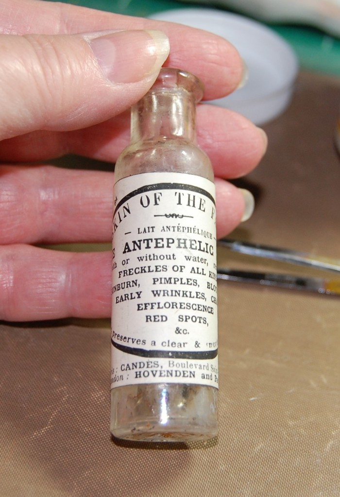
I had chosen three small bottles from my collection which needed some decorating. I don’t clean the bottles as I like the milky and stained interiors. The bottles were dug up from Victorian tips by friends of mine, who kindly passed a load on to me. I gave them an initial wash in warm soapy water when I got them, but never tried to remove the more stubborn stains from the interiors.
I wanted to put a label on the large bottle, so I found a suitable advert in my collection that would look like a label and stuck that on with Mod Podge glue.
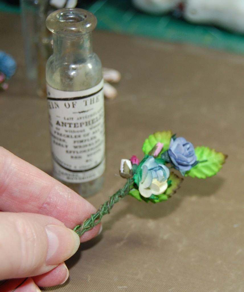
Making a bunch of flowers
Next I chose a small number of flowers and leaves and twisted the wire stems together to make a small bunch of flowers to go in the bottle.
The finished bottle
The bunch of flowers was inserted into the bottle and a little silicone glue was added to where the flowers touched the glass, to keep them in place.
Three finished bottles
The other two bottles were finished in a similar way, with a piece of lace ribbon added to the middle sized one, and a green cord wrap with a tag added to the small bottle.
Plant labels ready for assembling
These plastic plant labels have a lovely vintage look and the neat handwriting on them just makes them look even better! My intention here was to stick them together and add a rose.
The finished labels
The plant labels were stuck together with silicone glue to make a slightly fanned arrangement. I then wrapped linen thread around the middle and inserted a couple of flowers.
Making the bottle festoon
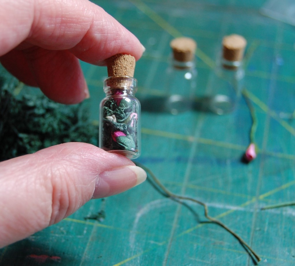
I mentioned earlier that I had two holes drilled in the tin so I could suspend some tiny bottles, well these are those bottles. These aren’t old bottles, they are modern ones bought from a craft supplier, complete with corks.
I filled each bottle with reindeer moss and a few tiny paper rosebuds, cut from their wire stems.
Wiring the bottles
I took a length of green florists wire and twisted it around each bottle creating kinks and curls in the spaces between. The process was quite fiddly and I had to replace the wire and start again a few times before I got it right.
The bottle festoon in place
Once the bottles were wired up I inserted it into the tin, with the wire ends protruding from the holes made earlier.
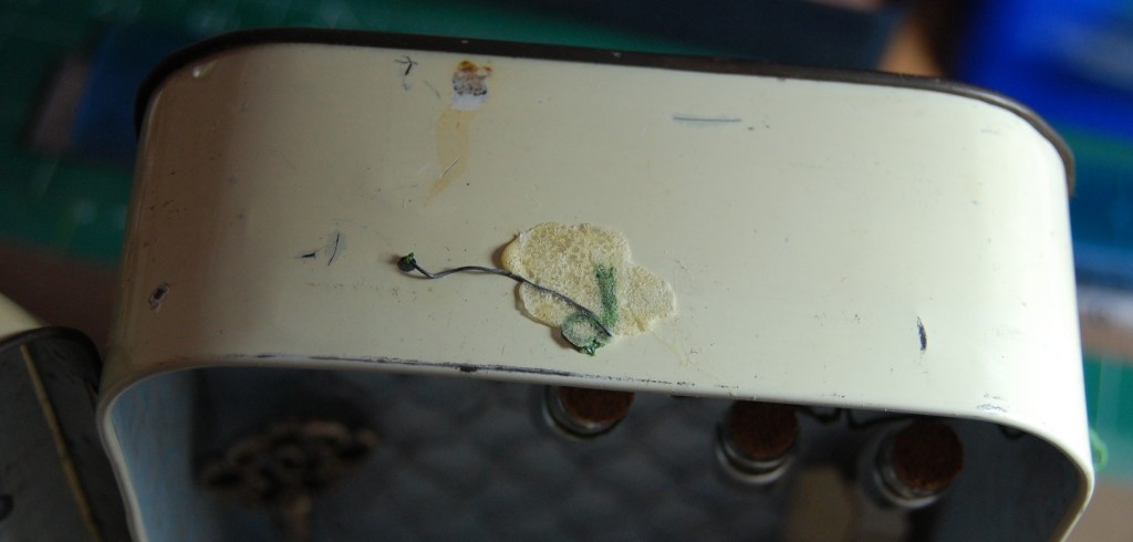
Covering the wire end
The wire coming out of the top of the tin was secured with a little Gorilla glue (which spreads as you can see!). This glue blob would be covered by a finial, so it wouldn’t be seen.
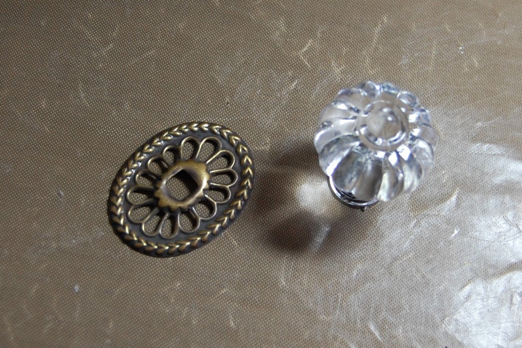
The finial pieces
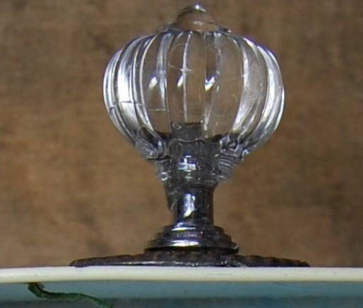
To make the finial I chose a metal door handle escutcheon and an acrylic drawer knob.
Fixing the escutcheon
A few blobs of silicone glue and the escutcheon was stuck down, covering most of the wire end.
The finial
The acrylic handle was then stuck on top of the escutcheon as a finishing touch.
A key for the tin
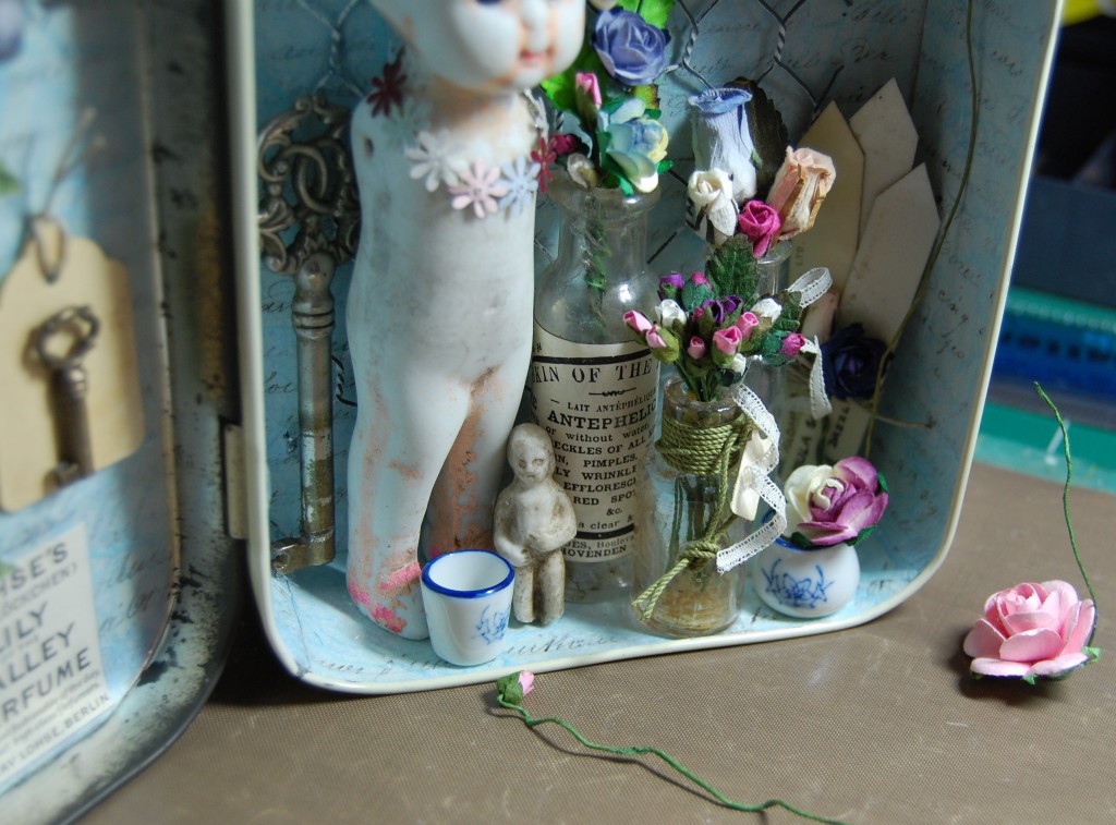
It was now time to start assembling the rest of the interior. I found a fancy key to add to the composition.
Sticking the key in place
I stuck the key into the corner of the tin with some silicone glue. I’m always amazed at the strength of that stuff; the key is quite heavy yet just a couple of blobs and it stayed in place with no extra help!
The plant labels
The plant labels were leaned into the opposite corner, again with the help of some silicone glue.
Adding the doll
The main element of the tin was added next – the doll. A little silicone glue was applied to her feet and touch points on her back where they would contact the back of the tin.
Adding a butterfly
I have a number of butterflies made from painted feathers and wire, so I chose one in a complimentary colour and stuck it to the back of the tin.
Finishing the composition
With the larger bottles added, I tried out a few ideas to get more detail into the tin. The photo above shows the items before they were finished and stuck in.
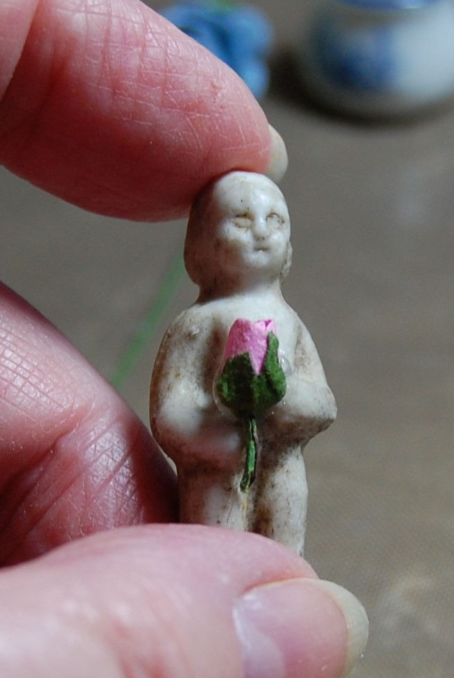
The tiny figure
Another pottery figure was chosen to stand in front of the doll, I finished it with a tiny rose bud, to look like it’s being held.
Almost finished
The tin was now almost finished. The addition of some dolls house plant pots and a small pair of scissors (not seen on this photo) gave the tin added interest. All I need to do now was fill the gaps with flowers.
The finished tin
The tin was now finished and has turned out to be one of my favourites.
The Finished Tin
To end, here are a few photos of the finished tin – Flower Festoon.
The frontInsideThe dollUpper portion detailLower portion detailDetailInside lid detail
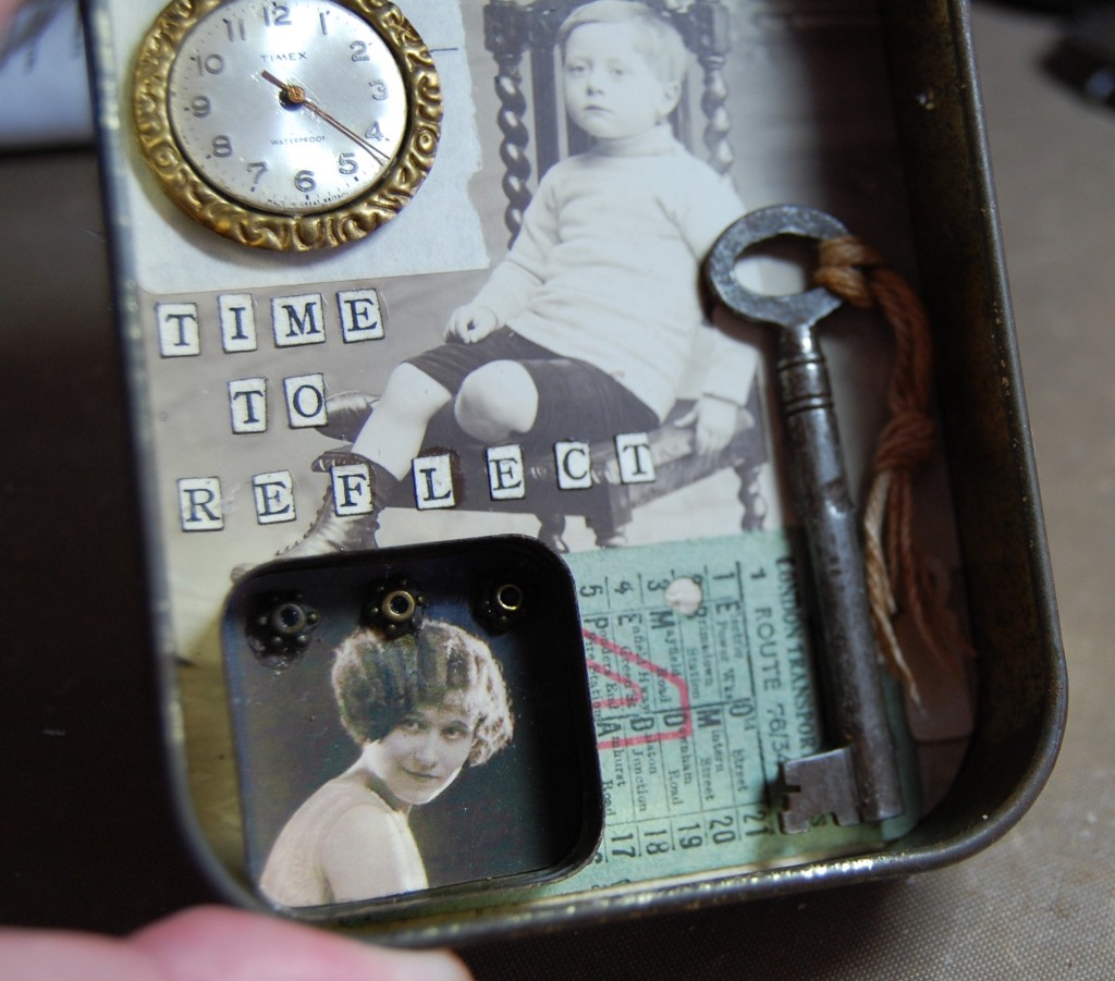
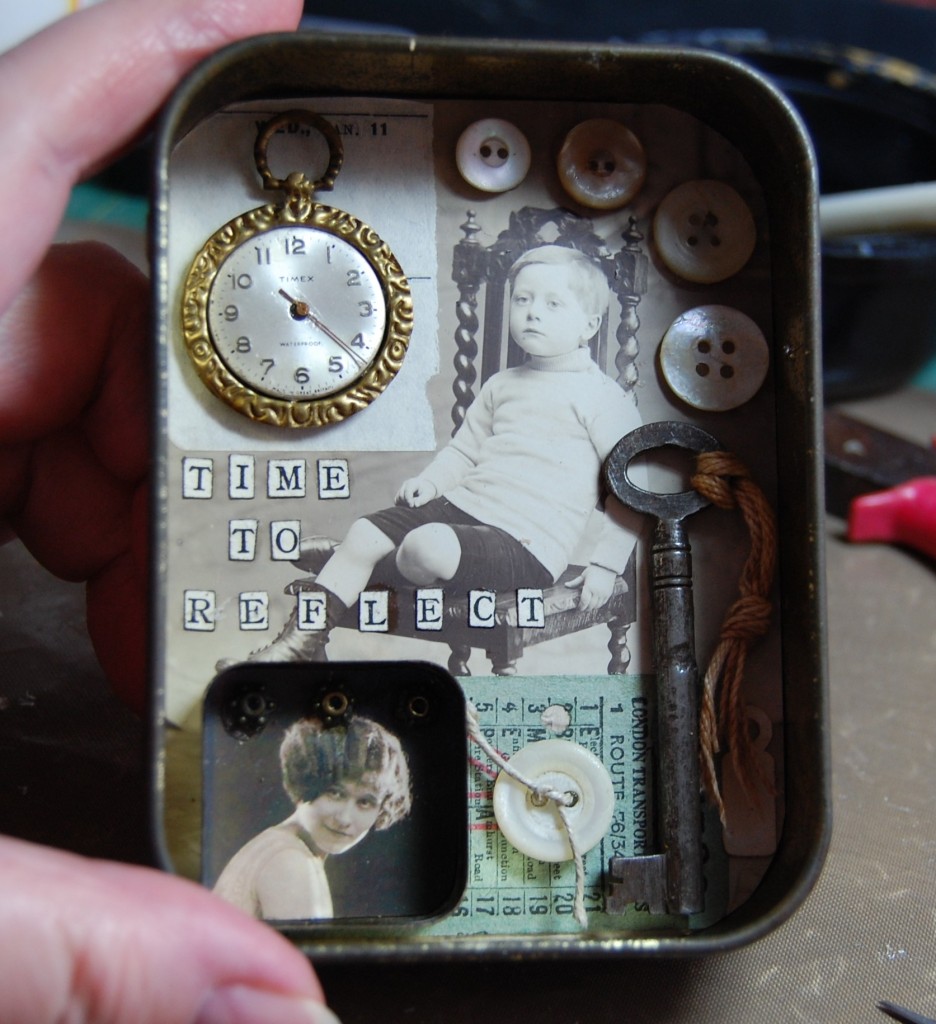
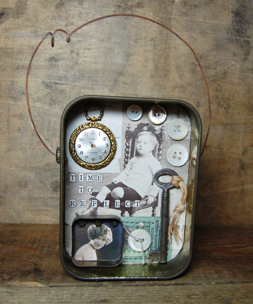
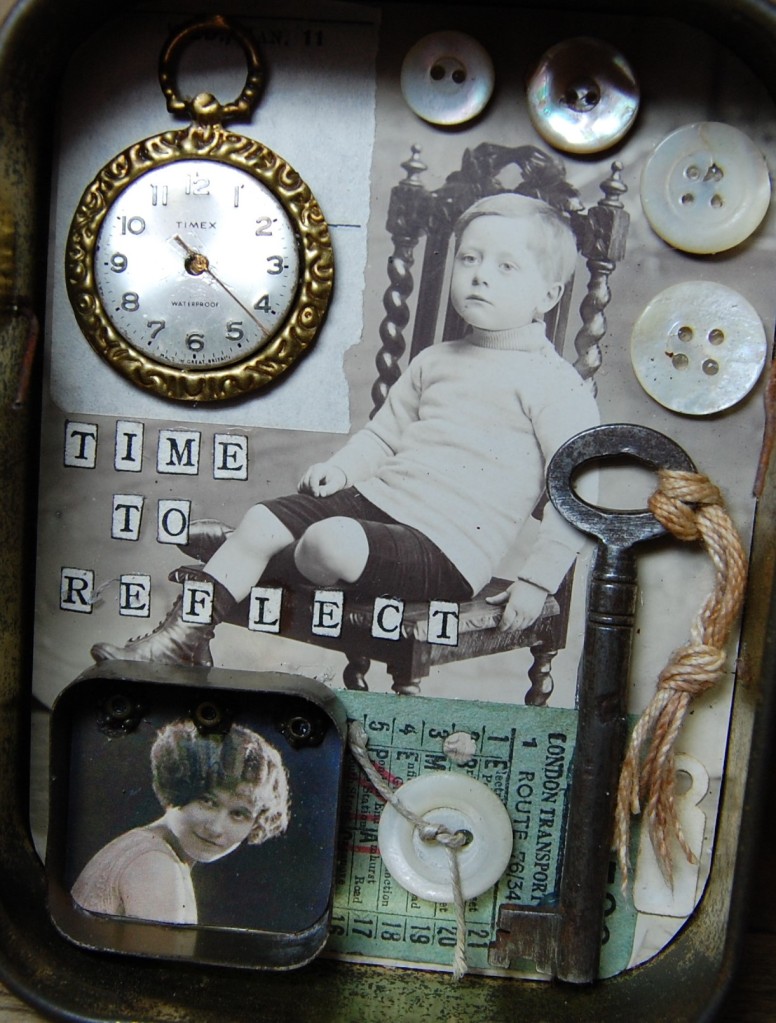
Time to Reflect is a gentle old fashioned assemblage. The second of a series of seven, this tin puts an old tobacco tin to new use.
Designing
Trying out the design
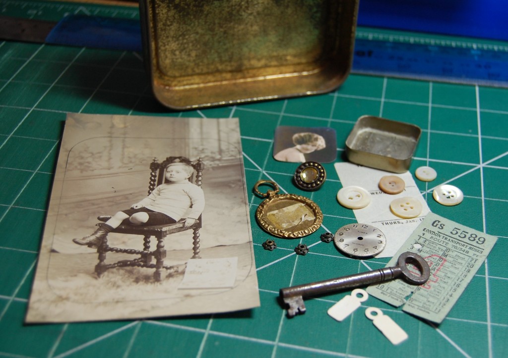
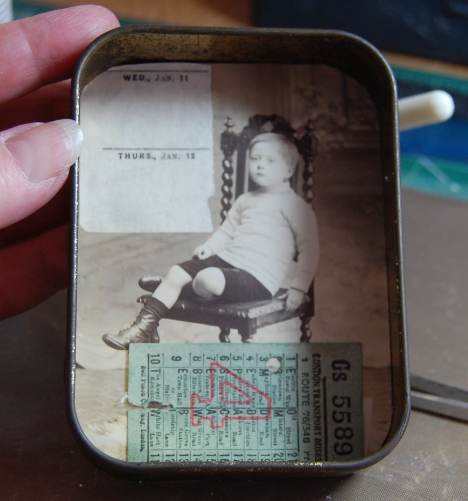
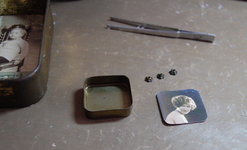
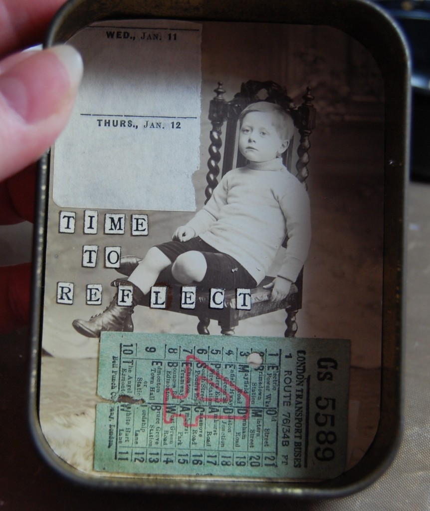
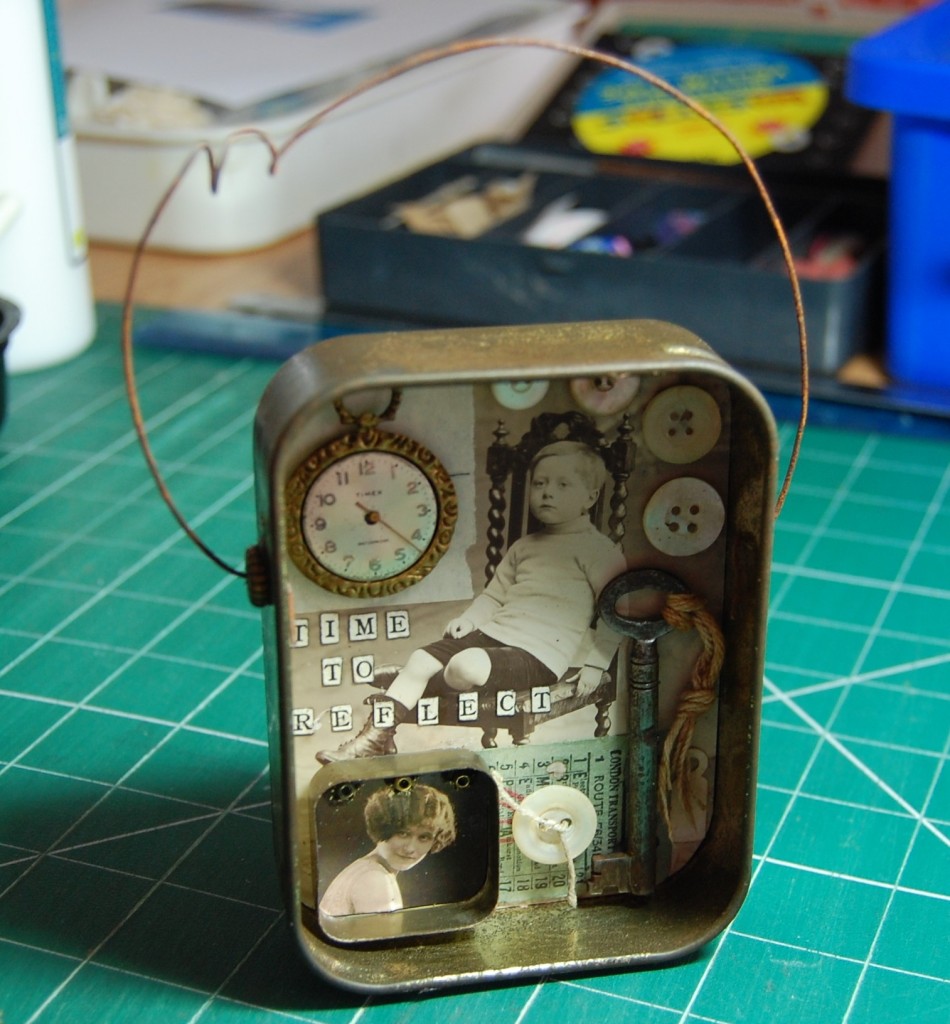
Postcards always make nice backgrounds. Most of the time you will see me use the back of the postcard (where the writing goes), but sometimes it’s nice to use the picture side too. I have a number of portrait photos on postcards and the one I chose for this project featured the seated boy. His position made it ideal for placing objects around him, so I chose some random items from my collection to put with it.
Making the Tin
Making a start
As with any tin project I make sure the tin is clean and dry before starting, it helps the glue to stick and prevents any bumps or dirty marks getting on the work.
Next I measured the base of the tin and marked out the lines to cut on the postcard.
Placing the photo background
Once the postcard had been cut out and checked for size, I glued it to the back of the tin with Mod Podge Glue.
Although I haven’t shown it here, I also punched two tiny holes into the sides of the tin for inserting a wire arc later. As my husband and his drill weren’t available I had to improvise and use a bradawl and brute force to make the holes.
Adding more to the background
Once the background was in place I added a couple of ephemera items over the top. These can provide anchor points for smaller items and pull them together. In this case I used an old bus ticket and part of a diary page. These were stuck in next.
Working on the details
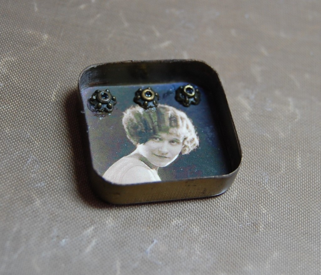
I then started work on one of the elements of the design. I took the base of a tiny tin and cut an image to fit. I then found three metal charms to add detail.
The completed inner detail
I stuck the image into the tin and added the charms to the top half of it. The glue looks a little messy here, but doesn’t show on the finished tin.
Adding the title
To make the title I cut letters from an old children’s book and inked the edges before sticking them into the back of the tin. This has become my trade mark way of adding text to all my art works and I am now the proud owner of several very holey children’s books!
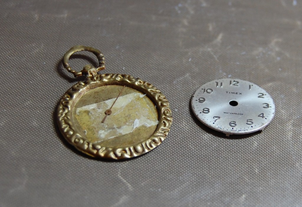
The ‘pocket watch’
This is another of those improvised items made to resemble something I didn’t have in my collection.
Although I do possess a few pocket watches, they were too large and bulky for this tin, so I found a gold charm ‘frame’ and married it with an old watch face and tiny hand. As you can see the gold frame had been used before and contains remnants of old sticky tape. Sometimes I will take old projects apart if they are tired and crumbling, so I always salvage as much as I can and re-use them in other projects.
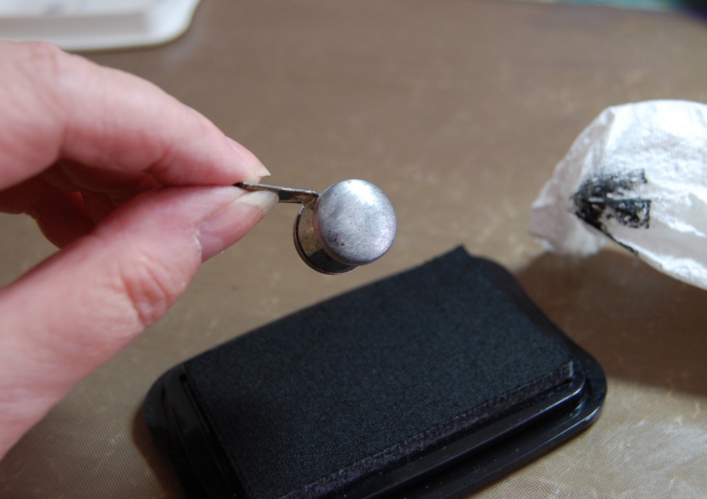
Sanding is the key
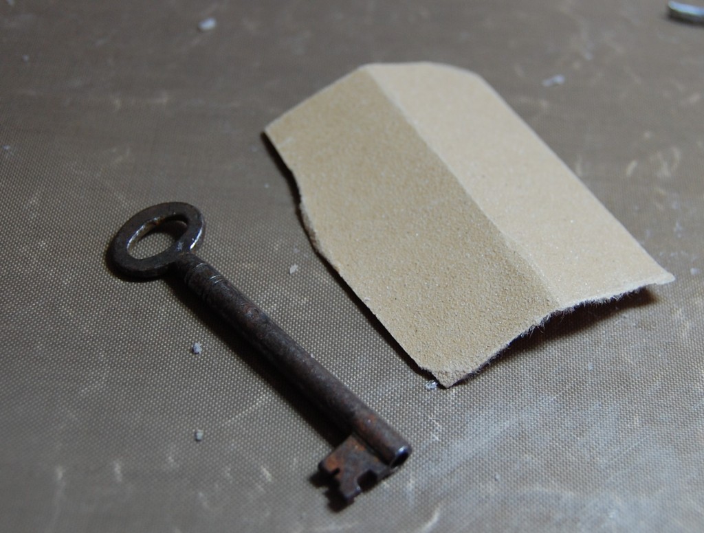
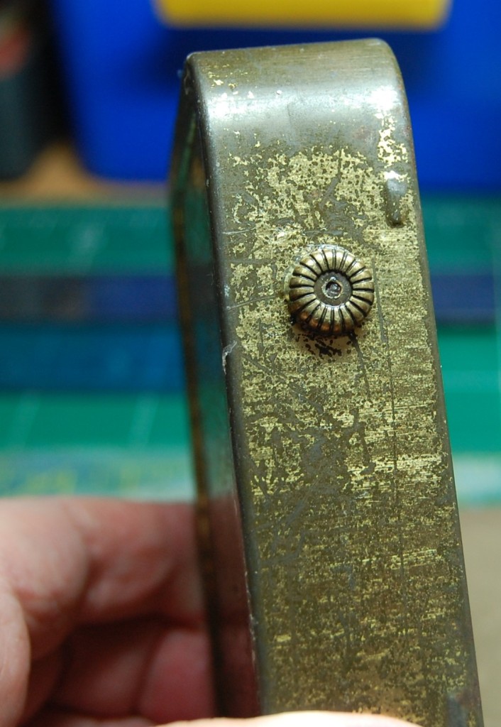
Like most of the keys in my collection, the one I was intending to use in the tin was showing signs of rust, so it was out with the trusty sandpaper again to clean most of it off. A quick wipe with a damp cloth and they come up looking fresh and polished.
Adding more elements
A piece of old string was tied to the key before it was then added to the assemblage, along with the smaller tin and assembled ‘pocket watch’.
Finishing the tin interior
All that was left to add were a few pearl buttons and the tin interior was complete. Now it was time to revisit those holes I had made at the start.
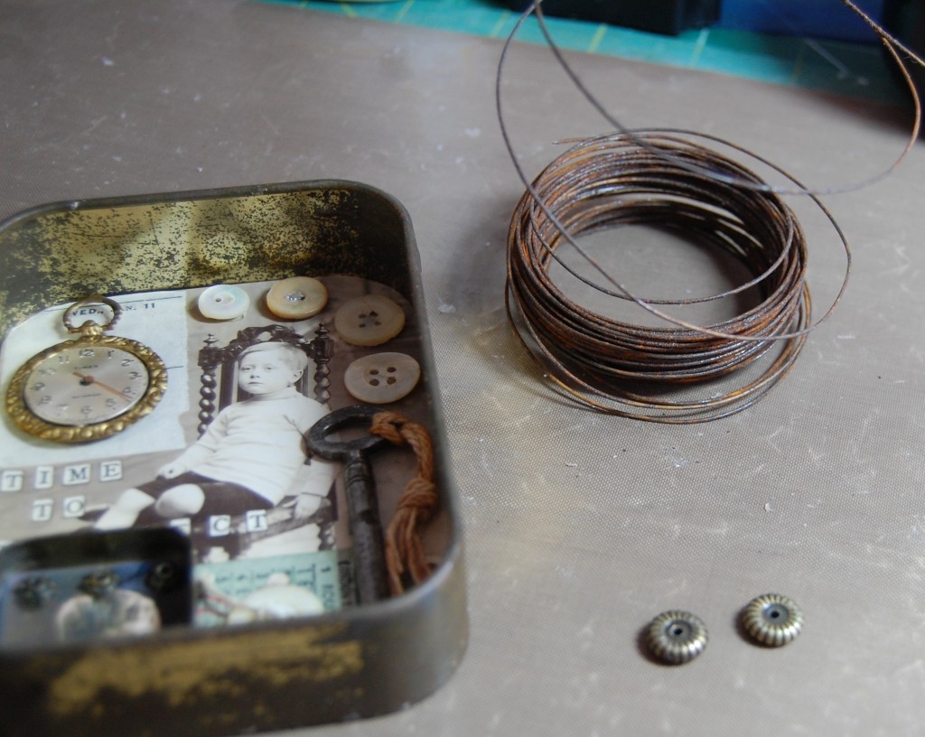
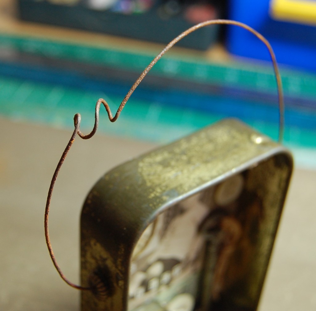
Adding a wire arc
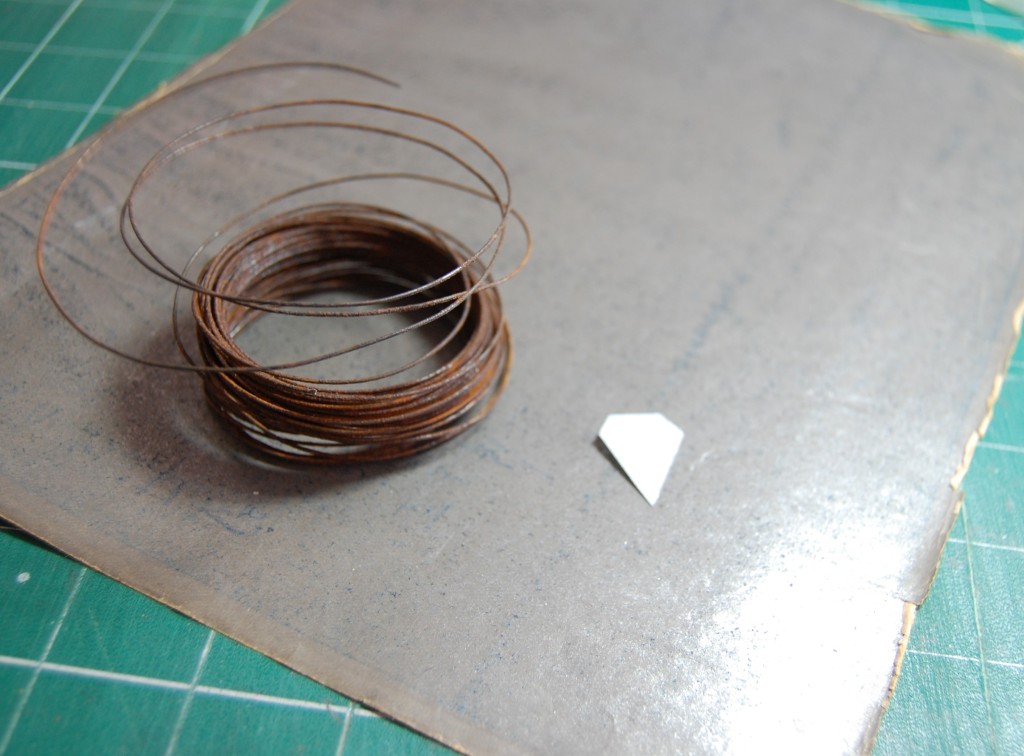
I chose a reel of heavy gauge rusty wire (yes, you can buy rusty wire) and a couple of metal jewellery spacers.
Sticking on the jewellery spacers
The jewellery spacers were stuck over each hole with a little silicone glue. The spacers don’t serve any other purpose than to look attractive and cover a hole that might be a bit ragged. I sometimes use knuts as hole covers, or stick bolts on the sides of tins for the wire to be wrapped around where no hole has been made.
Attaching the wire
I cut a piece of the wire, roughly estimating how much I would need. I then wrapped part of it around my round nosed pliers to create the coil, and pulled it to open it out a little.
I then shaped the wire into an arc and threaded one end through one of the jewellery spacers and hole in the tin, emerging on the inside. I left about 1.5cm of wire in the tin and just bent it down until it lay flush with the inside of the tin.
The finished tin
I then arced the wire over the top of the tin and cutting any excess wire off, just left enough to thread through the other hole and bend down inside. Once in place you can adjust the shape of the arc until you have the shape you want. Nothing is done to stick the wire in place, it will just remain in position on its own. The tin was now complete.
The Finished Tin
To end, here are a few photos of the finished tin – Time to Reflect.
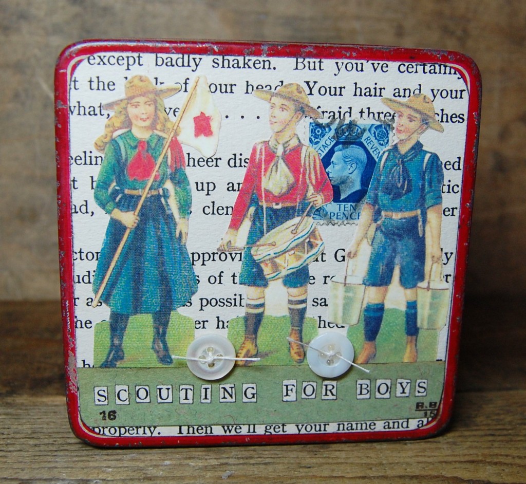
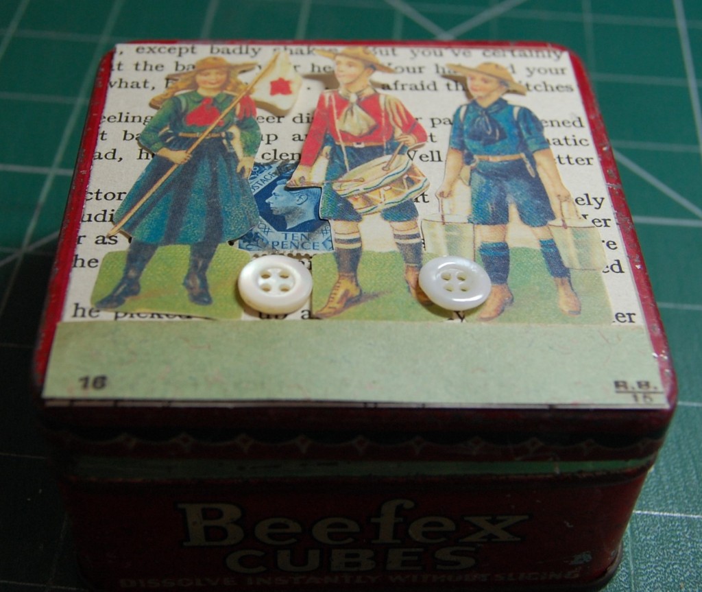
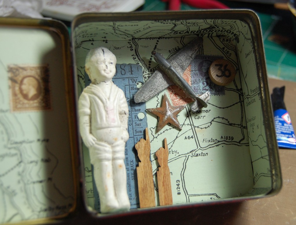
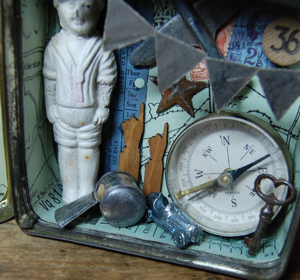
Scouting for Boys is the second in a series of seven altered tins made to be grouped together as a single display. This is one of two lidded tins that I made and features a more masculine design.
Designing
Gathering items to use
The idea for this design started with the little pottery figure. I’m not sure he’s supposed to be a Boy Scout, but his clothing suggested that, so I chose this as my theme. I had a nice square tin he would fit into, so I chose a few other ‘masculine’ items to put with him.
Composition try-out
I placed the items I had chosen in the tin to find the best composition. This would just be an initial idea of placings to build on later.
Front thinking
With a hinged lid you have to take into account there are three design points to cover – the outer lid front, the inside of the lid and the main body of the tin. With this in mind I set about a front cover for the tin.
I had some vintage scraps of scouts so I put them with a page from an old children’s book, added a stamp, a banner at the bottom for the title, and a couple of buttons. When displaying the tin, it is most likely you would have it stood open, so the front requires minimal decoration as it won’t be seen for the most part.
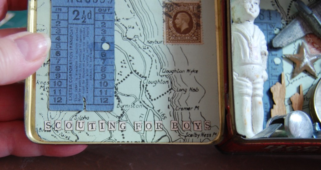
Background matters
The first thing you stick into a tin is the lining, or background, so it’s important to get it right. The right background for an assemblage can enhance and show your designs to the best advantage. The background also needs to match your theme. With this theme I felt some vintage map paper would suit, especially as I was intending to add a compass. This blue/green map was right for the overall colour scheme of my project and wasn’t too overpowering with it only being green and black.
Making the Tin
Adding the lining
Once the tin had been washed and dried, I measured all the insides and cut the map accordingly.
The finished lining
The map paper was then stuck into the tin using Mod Podge glue. I don’t do anything else with it, no sealing, no inks, no varnishes, just let the background be well… in the background!
Adding details
Before we move away from the background, it is at this point where you would add any further details to it. Blocks of colour can be added in the form of old tickets, stamps and any other ephemera that suits. Here I added a couple of old bus tickets and some stamps.
Preparing items
With the tin lined and ready it was now time to start on the contents. Sometimes it’s best to leave an object in its original state, but in other cases it may require a little ‘alteration’. In the case of this whistle, I didn’t think the pink paint and German flag quite suited the theme, so something would have to be done.
Removing the paint
The easiest way of getting paint off a metal item is to use some coarse sandpaper and just rub it off. It will leave scratches but these can be used to your advantage, as we will see.
Inking the metal
With all the paint removed, the whistle was quite shiny and needed to be a bit ‘duller’ for that vintage look. I took a black ink pad and a piece of kitchen towel and rubbed some of the ink onto the surface of the whistle. All those scratches I mentioned earlier trapped the ink and it stayed on the surface.
Pointing to more sanding!
The next items to need some attention were the two pointing hands. These are not vintage, but modern craft items. Made from wood, these lazer cut shapes come on a sheet and you just press them out. Obviously they looked too ‘new’ and required some aging to take them down a bit.
Aging the wood
They were first sanded with fine sand paper to get the top finishing off them, then as with the whistle, a little sepia ink was rubbed into the surface giving a more authentic feel.
Materials for making bunting
Sometimes the one thing you need to finish a project isn’t readily available and you have to make it yourself. This was the case when I came up with the idea for some bunting in the tin – not just any bunting, but metal bunting, to go with the theme. Now I do have some thin metal sheet for crafting, but last time I tried cutting small things out of it I nearly cut my finger ends to ribbons! So an alternative was sought. I looked in my file of old book fly-leaves and found this very old metallic looking paper (see photo above), it would be perfect for the bunting, and it would save my fingers! So I drew a little template for the flags and cut them out.
The cut bunting
A short length was cut from the roll of rusty wire, and this would be used to hang the flags from.
The finished bunting
Each flag was folded over the wire and stuck down with PVA glue. The ends of the wire were then coiled into little circles at the ends for fixing into the tin.
Adding the objects
It was now time to start adding the objects to the tin. Starting at the back, I placed the metal plane, rusty star, wooden game counter and pointing hands in first. Then the scout went into the corner. All items were stuck in using silicone glue. The rest of the items were then added, ending with the bunting.
Working on the title
Wherever possible I like to make sure the title of the piece is on show. So, although the front of the tin would have a title, I also made one for inside. The letters were cut from an old children’s book, their edges inked and then glued to the background.
More preparation
The main focus of the inside of the lid was a dial from a vintage car – hence the clips around the edge. I decided to leave the clips as they were as they told a story of where the dial had come from. I then found two old clock hands with peeling cream paint. I decided to clean the paint off the hands just as I had with the whistle. Sanding the hands soon brought all the cream paint off and they were given a rub with some black ink to take the shine down.
Assembling the inside of the lid
With the preparation complete, all the remaining items were glued into place. Starting with the dial, which was placed first, the clock hands were stuck on top. The fact that they are oversized adds a bit of interest I think. I then added a small coin which finished this part of the tin off.
Items for the front of the tin
The last part of the tin to be assembled was the front. As explained earlier, the items I chose for the front included book page for the background, a postage stamp, three vintage scraps, a scrap of green paper for the title and two pearl buttons.
Assembling the pieces
I first rounded the corners of the book page with a punch and inked the edges in black. I then assembled all the other elements, the stamp, the scraps, and the lettering before sticking the page to the tin.
Finishing the tin
Finally, I tied some linen thread through the holes in the buttons and stuck them in place. The tin was now complete.
The Finished Tin
To end, here are a few photos of the finished tin – Scouting for Boys.
Inside the tinThe inside of the lidClose-up detail
Hello! I am Alison, The Magpie Crafter. I just love turning old scruffy bits of paper into works of vintage art. I am a Yorkshire magpie and love to find 'owt for nowt'!